VOTE, volunteer to give rides to those that can't make it otherwise if you can
Political Memes
Welcome to politcal memes!
These are our rules:
Be civil
Jokes are okay, but don’t intentionally harass or disturb any member of our community. Sexism, racism and bigotry are not allowed. Good faith argumentation only. No posts discouraging people to vote or shaming people for voting.
No misinformation
Don’t post any intentional misinformation. When asked by mods, provide sources for any claims you make.
Posts should be memes
Random pictures do not qualify as memes. Relevance to politics is required.
No bots, spam or self-promotion
Follow instance rules, ask for your bot to be allowed on this community.
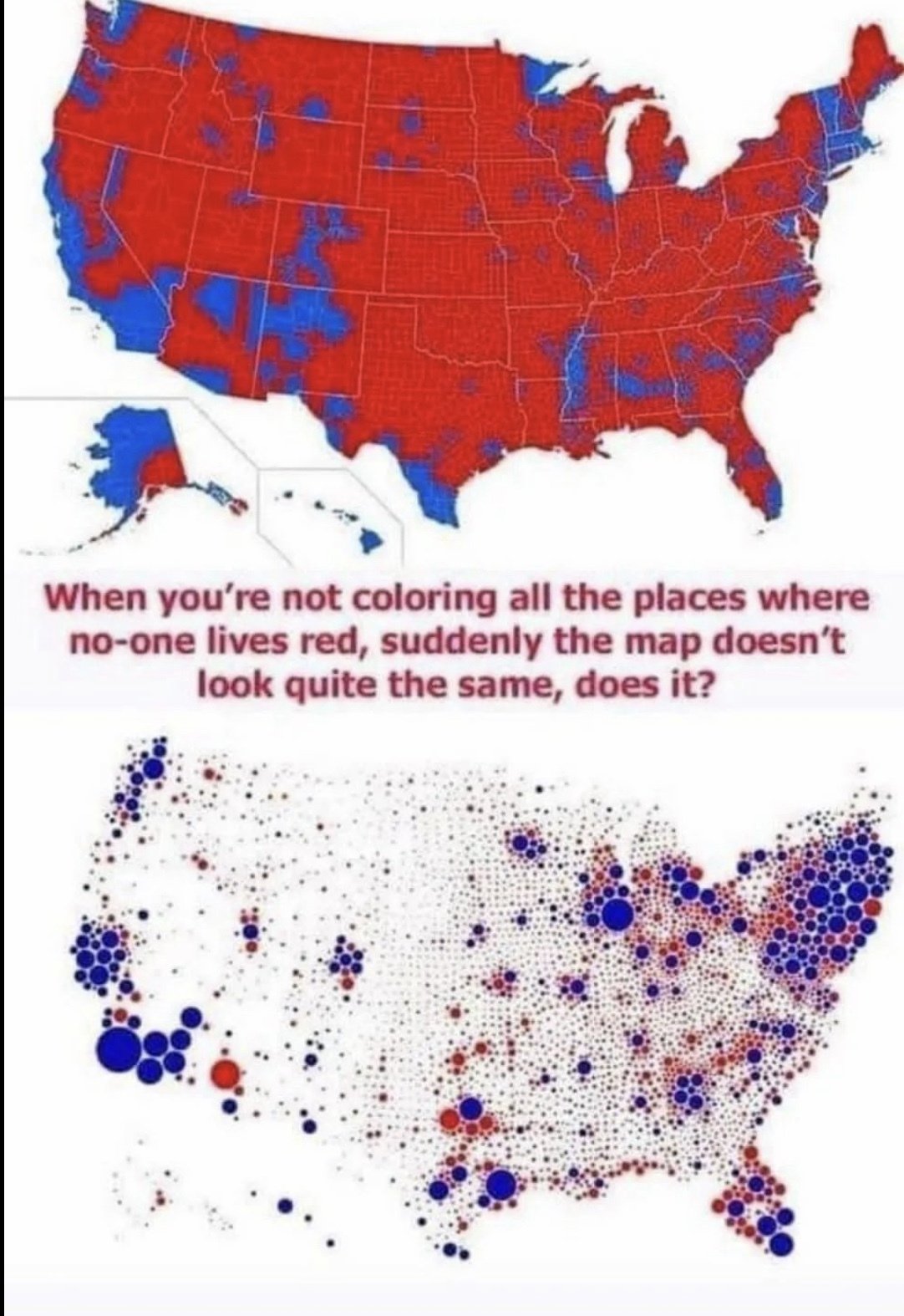
Guess i am no one. I live in one of those red areas. Oh and aint no sand out here just lots and lots of clay
I doubt anyone will disagree with me but "look at how red this map is" is the stupidest arguement.
Last year after ana election my dad reposted a map on Facebook like this but for the single issue on our states ballot. The comment from the original poster was something like liberal cities decided this all counties need representation. Of course the counties that weren't blue were mostly populated by cows.
But like seriously this was a direct popular vote on a single issue you can't get a more representative election than that one.
My favorite thing to do with these people is to ask them "okay, would it be alright if these issues were decided on a per-county basis then?", if they say no they've outed themselves as just wanting to hold as much control over others as possible from a minority position, if they say yes ask again but with individual towns, if they say yes to that, then you narrow it down to individual people, then they tend to get mad when they realize what you've done
Land doesn't vote. People vote.
there's no lying like lying with maps
(for those ggr nerds, yes, "the map was a lie")
Especially Google maps, they persuaded my friend to turn right and now he thinks corporations are people.
never considered online service maps much as political maps, but of course they are. What gets mapped as POI tells people what they are to find interesting and what not vice versa.
Invariant of the day: In any square mile of the USA, there are 25 Republican voters, the rest of them either vote Democrat or not at all.
It doesn't work of course. Suffolk County, MA (Boston) has a partial pressure of about 1kGOP/mi^2^. Nevertheless, it's closer than you might expect considering how many square miles don't even have 25 human beings.
In my head I read that as "one kiloGOP per square mile"
That's what he wrote.
Why he had to mix metric and freedom units, though, I don't understand.
When this baby hits one point one kiloGOPs we're gunna see some serious shit
You can read it out loud that way too. KiloGOP has three syllables.
Just a few hundred miliGOPs is enough to fuck up a city council.
We need to get the EPA on this. It’s pollution.
How come they always color the places that don't have anybody there as red?
Why can't blue take it?
Keep in mind both of these maps are grossly misleading. Or at least one is being presented in a misleading way.
One is just coloring an entire county the way the majority voted. This is why those huge (land) counties are all red, because at least 1 more person in it votes for trump than Biden (presumably, I don't know what the map is actually based on but it's a safe bet). So that's why "the sand" is regularly colored red. Although saying noone lives these is misleading.
Which leads me to the second map is probably a noble effort to show some population scale, by reducing all of the counties to a circle the relative size of their population, but it's being misrepresented here as if that's where all of the people in those counties live, which is certainly false. Just look at the center of the country, it's basically a grid of small dots. Do people honestly think the population is distributed like that?
The most frustrating thing about this is everyone in this thread is complaining about how Republicans are too stupid to understand why the map is colored the way it is...while being absolutely fooled as to why the other map is the way it is.
Because of the way the US handles elections.
Here's a link to my other comment that explains it as I (a laymen) understand it as I was taught in school.
It’s the same reason all around the world: India, China, Australia, Venezuela, Romania, Kenya: Hicks.
Hicks are everywhere. And they vote for regressive authoritarians for any number of reasons, most of them wrong.
Fear... Humans have an evolutionary and natural fear of the unknown... If you live way out in the middle of nowhere, pretty much everything outside your tiny bubble is unknown, and therefore scary. Then assholes come in and use that fear to their advantage. "Everything you're afraid of IS horrible and out to get you! Vote for me and I'll protect you"
Probably because 40 out of the 50 voters in those counties voted red.
They are probably coloring whole counties, where the second map just makes a dot for each country proportional to population.
Thank you for actually understanding what the second map says. It's shocking how many people in these comments were so easily fooled into thinking that is where the people live in the second map.
Cartography is super cool.
