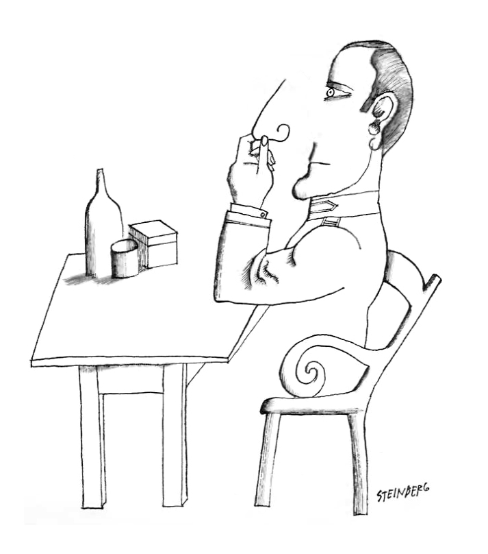
Wine so bad nowadays, you have to turn your nose off
Ask Lemmy
A Fediverse community for open-ended, thought provoking questions
Please don't post about US Politics. If you need to do this, try [email protected]
Rules: (interactive)
1) Be nice and; have fun
Doxxing, trolling, sealioning, racism, and toxicity are not welcomed in AskLemmy. Remember what your mother said: if you can't say something nice, don't say anything at all. In addition, the site-wide Lemmy.world terms of service also apply here. Please familiarize yourself with them
2) All posts must end with a '?'
This is sort of like Jeopardy. Please phrase all post titles in the form of a proper question ending with ?
3) No spam
Please do not flood the community with nonsense. Actual suspected spammers will be banned on site. No astroturfing.
4) NSFW is okay, within reason
Just remember to tag posts with either a content warning or a [NSFW] tag. Overtly sexual posts are not allowed, please direct them to either [email protected] or [email protected].
NSFW comments should be restricted to posts tagged [NSFW].
5) This is not a support community.
It is not a place for 'how do I?', type questions.
If you have any questions regarding the site itself or would like to report a community, please direct them to Lemmy.world Support or email [email protected]. For other questions check our partnered communities list, or use the search function.
Reminder: The terms of service apply here too.
Partnered Communities:
Logo design credit goes to: tubbadu
He’s nosy.
Are you certain it is a "cartoon" and not just art?
If it's got cultural context, I'm not sure of it, but otherwise it looks like it's just got a theme of incompleteness that the brain fills in similar to some optical illusions like the Kanizsa triangle. The man has no legs, the chair is incomplete, the table's top edge isn't there, the nose.
I do notice some decoration on the collar and shoulders that might point to it being a specific person. Do you know which issue it is from 67?
Looks like this cartoonist liked visual jokes.
I don't think there's an answer beyond "New Yorker."
The goal of a New Yorker cartoon is to make you go, "huh." That's all. I'd even go so far as to say punchlines or "points" are probably seen as gauche to New Yorker editors.
Although the comments seem to have figured out there is no meaning. If I were to force a political meaning out of this, I'd say it have to do with someone being nosy. Perhaps there was some journalist who'd found smth big recently, had it been 5 year later I would've said Watergate.
One google search shows the biggest event in the US in 1967 being the Detroit riots (I'm not 'merican), but perhaps this calls the cops as being nosy in the affairs of others.
In 1967 Vietnam protests were really gaining steam. This was the year of the Pentagon march with Jerry Rubin, Abbie Hoffman, and countless other activists. If there was a political meaning to this cartoon, it could have been related to the war and its backlash.
'Merica shoving its nose in Vietnam where it ought not have.
The sort of 'military' style to the guy's jacket makes me think you are on to something.
Hes about to do cocaine
I find it interesting that despite everything being all skewed and disconnected, yet there is not one single piece (except the artist name that doesn't count) that is separated from the whole. We are all in this together, whether we want to be or not.
(the only exception seems to be a single arm bulge/shadow thing, but I hope you get what I mean overall)
I don’t have an answer, but looked up the artist to add some context for discussion:
Ah, so he was really a modern artist and not a cartoonist! That explains everything, thank you!
His take on mid-century Major League Baseball is sort of equal parts adorable and unsettling. Other highlights of the issue: A Houston family is paid $75 to test a fallout shelter for 3 days, canned raw meat, and Chef Boy-R-Dee as mildly exotic party fare.
See page 58 (archive file pagination) for the Saul Steinberg piece.
Was there a caption?
I also feel like the New Yorker targets issues and trends of its time, so it might be hard to know what this is about with some context of events around the time the issue was published.
I don't know. Not with this version. A reverse image search didn't help.
The artist is just playing with foreground vs background; his body carries on from the open space under the chair, and the 3d nose becomes a curled wire when removed from its normal context.
There's no 'joke' to get, except for your brain getting confused.
The nose still has a surface area after being removed, as you can tell by the index finger disappearing behind it.
Isn't there some message to get? Are you sure? The person seems to be part of some military organization, possibly, going by the costume. So maybe this is some jab at something political that happened with the military around this time? Let me think, when was 'Nam? 🤔 [Looked it up] Yeah 'Nam was going on at this time. (Although the Vietnam war went on for a long-ass time – almost 20 years – so it could have been anything. But still.)
I guess the nose not being shaded like the rest of the body is a clue there. I didn't even think about that. Thank you.

