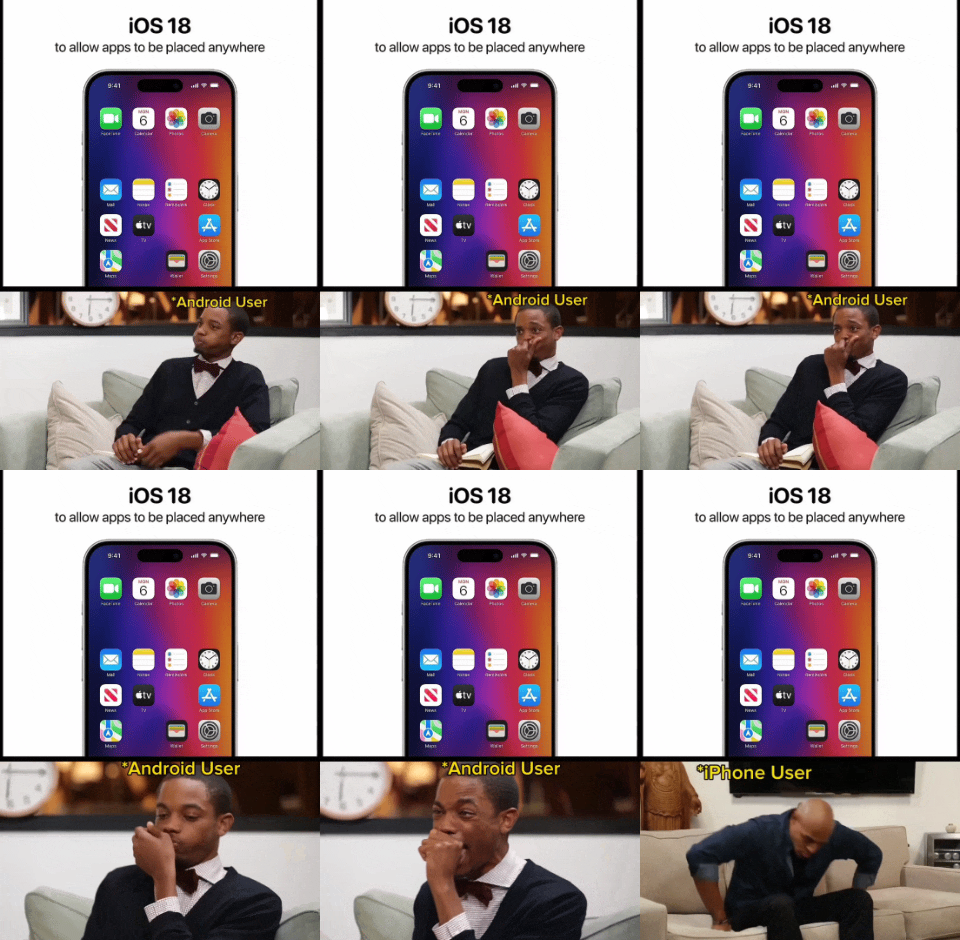
Reminds me of this https://youtu.be/9BnLbv6QYcA?si=gRyq1w2l4X6HYgC-
Memes
Rules:
- Be civil and nice.
- Try not to excessively repost, as a rule of thumb, wait at least 2 months to do it if you have to.
Here is an alternative Piped link(s):
https://piped.video/9BnLbv6QYcA?si=gRyq1w2l4X6HYgC-
Piped is a privacy-respecting open-source alternative frontend to YouTube.
I'm open-source; check me out at GitHub.
I don’t get it, I’m on iOS 17 and can move them around? I came from a pixel and I was surprised that you could. And you can also stack widgets which is nice
Welcome to 2013, Apple fans! Maybe in 5 more years you'll get ~~homescreen widgets~~ customizable layouts (change number of apps per row etc). In 10 you might get custom launchers!
I remember having this feature on my jailbroken iPhone in like 2009. Wild that it took this long.
This was not allowed before. Until just recently, the technology didn't exist to place icons anywhere in the grid. They would automatically smoosh up into orderly rows starting at the top-left with no gaps between icons. Apple is continuing to develop cutting edge innovation, though, and now you will be able to leave entire rows and columns empty, or any specific icon space you choose!
Seems like a trivial programming task even my junior noob ass can handle.
I they didn't need Steve jobs to think for them they wouldn't have bought Apple.
Tbh the default launchers for mobile are garbage. Scrolling around looking for icons on a desktop like environment is not intuitive. Everyone's home screens just become a junk drawer of every app they've ever downloaded.
They can rip Niagara launcher from my cold dead hands I'm never going back to icon panels
Genuinely the only way I want to use my phone. Everything I use daily is on the home screen, everything else I have to go searching for. White background, black icons, all notifications turned off. Simple and easy!
Niagara is wonderful. Clean feel and only minor issues. Best one I have used in years
To be fair, as both an iOS and Android user, the way android moves icons around drives me crazy , I much prefer the iOS “shift everything down” approach
Isn't that launcher dependent?
Not sure, I have a Pixel and use the stock everything
As an exclusively Android user, I couldn't agree more
Get a new launcher in your life!

