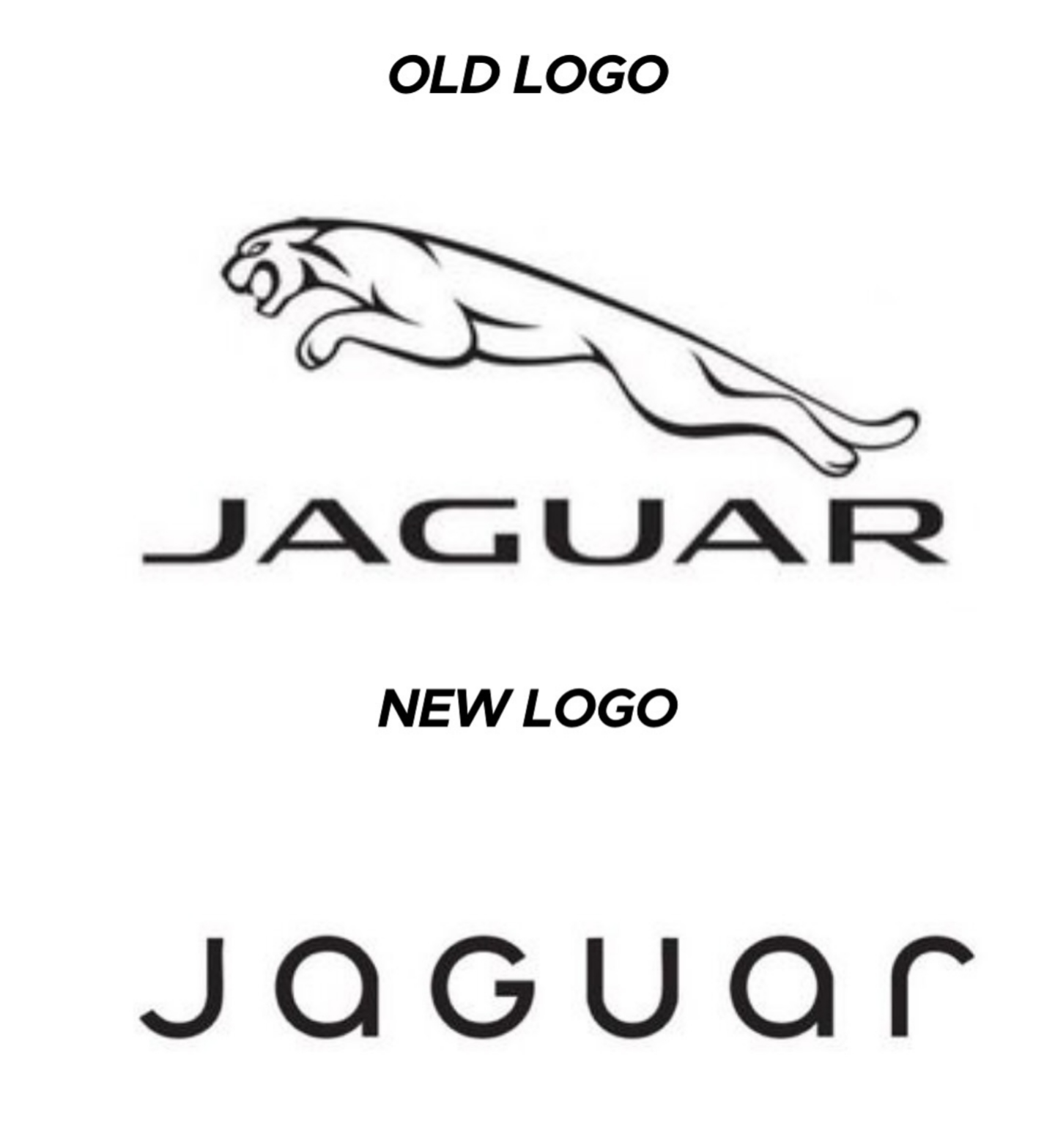
They kindly did the needful with the logo.
Lemmy Shitpost
Welcome to Lemmy Shitpost. Here you can shitpost to your hearts content.
Anything and everything goes. Memes, Jokes, Vents and Banter. Though we still have to comply with lemmy.world instance rules. So behave!
Rules:
1. Be Respectful
Refrain from using harmful language pertaining to a protected characteristic: e.g. race, gender, sexuality, disability or religion.
Refrain from being argumentative when responding or commenting to posts/replies. Personal attacks are not welcome here.
...
2. No Illegal Content
Content that violates the law. Any post/comment found to be in breach of common law will be removed and given to the authorities if required.
That means:
-No promoting violence/threats against any individuals
-No CSA content or Revenge Porn
-No sharing private/personal information (Doxxing)
...
3. No Spam
Posting the same post, no matter the intent is against the rules.
-If you have posted content, please refrain from re-posting said content within this community.
-Do not spam posts with intent to harass, annoy, bully, advertise, scam or harm this community.
-No posting Scams/Advertisements/Phishing Links/IP Grabbers
-No Bots, Bots will be banned from the community.
...
4. No Porn/Explicit
Content
-Do not post explicit content. Lemmy.World is not the instance for NSFW content.
-Do not post Gore or Shock Content.
...
5. No Enciting Harassment,
Brigading, Doxxing or Witch Hunts
-Do not Brigade other Communities
-No calls to action against other communities/users within Lemmy or outside of Lemmy.
-No Witch Hunts against users/communities.
-No content that harasses members within or outside of the community.
...
6. NSFW should be behind NSFW tags.
-Content that is NSFW should be behind NSFW tags.
-Content that might be distressing should be kept behind NSFW tags.
...
If you see content that is a breach of the rules, please flag and report the comment and a moderator will take action where they can.
Also check out:
Partnered Communities:
1.Memes
10.LinuxMemes (Linux themed memes)
Reach out to
All communities included on the sidebar are to be made in compliance with the instance rules. Striker
If I wanted to give it a bold facelift I'd just use the top one and remove the letters. Gives it an arrogant, "if you have to ask what this is..." vibe, which is probably a good thing for them.
I prefer the new font but dislike the removal of the jaguar logo.
I love how the new logo could be literally done in less than a minute on fucking microsoft office. They didn't even bother with a cool looking font, just generic curvy shit
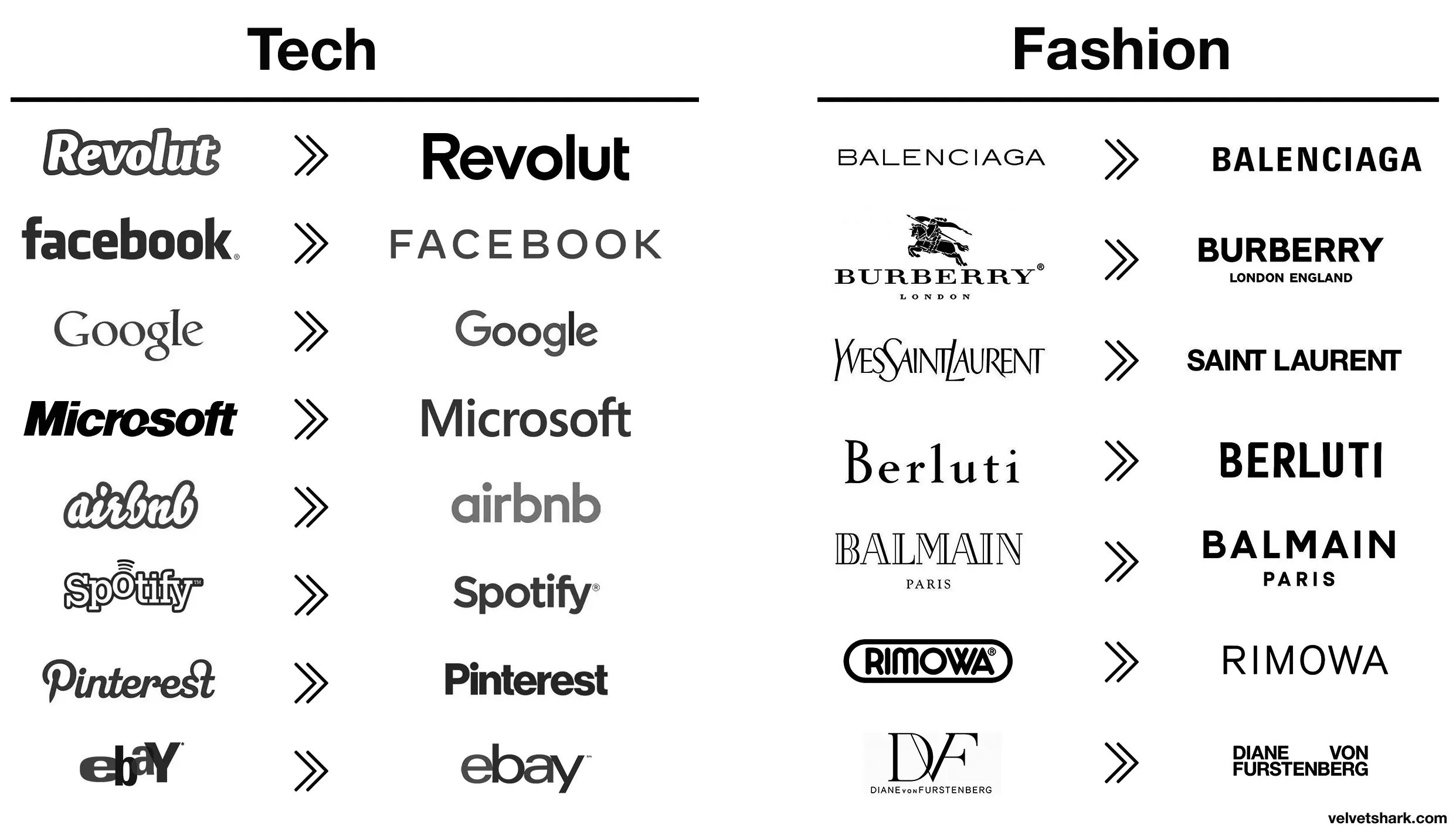
Better:
- Revolut (though a fintech company named after a revolution lacking the charge at the end is still moronic in several ways)
- airbnb (from awful to meh)
- Spotify (same)
Worse:
- Pinterest (original fit the platform and what it is/was pretty much perfectly. Current is meh)
- eBay (both are bad IMO, but at least the original was bad in a playful and eye-catching way. The new one is just more meh
- Burberry (the stag was notable and signalled a history of old-fashioned quality that's suitably rugged. The new one is meh AND insecure about people knowing which London they're from)
- Rimova (yet another fashion brand apparently afraid of being noticed
- DF (from one of the best and most fashion-appropriate logos to an absolute eyesore and kerning nightmare that invites vandalism)
- Jaguar (From absolutely iconic and great in every way to even uglier than the new DF one. I hope whomever came up with that got both fired and beaten and I'm a pacifist.)
The rest just go from meh to slightly different meh 🤷
Spot on.
Those old fashion logos are actually sick. Concerning that an industry that sells style would make these their logos.

What's this?
What's this?
There's color everywhere
What's this?
What's this?
There's magic in the air!
UwU what’s this?
Notices whiskey tumbler 🥃 OwO, did Don Draper-sama leave this for me? picks it up and sips nervously so smooth loosens tie Notices ad campaign pitch on the table 📄 O-oh my, the client is gonna love this… or will they? 👉👈 nuzzles storyboard Y-you like the tagline? “Happiness is just a purchase away”? rubs temples dramatically Advertising is so hard lights cigarette Client-sama, pwease approve my pitch, I worked so hawd on it 🥺👉👈 smolders in existential dread
It takes a heroic amount of cocaine to make something so devoid of taste and see it through.
I dont understand modern logos principles. How tf is that recognizable. Also animals are fun. Stop getting rid of animals from icons.
Somewhere in Jaguar HQ, a marketing firm convinced the CxO suite that the most pressing problem facing the company was that the logo was wrong. So, in the interests of the shareholders they write off the goodwill value of the existing brand and dump millions of euro into this.
But who cares?
Sure, the idiots at jaguar are flushing their brand, but who cares?!? It's their shit pile to destroy, after all...

Hah don't worry, the existing brand is utterly fucked now. One of the worst, most unreliable and badly made cars on the market
One of the worst, most unreliable and badly made cars on the market
But enough about Tesla.
It's still a prestige brand in the eyes of the masses. It might not be as good a brag down at the country club, but letting the plebs know that you can afford a car that costs more than their house still has value.
A starting price jaguar f-pace ev is about the same price as a Ford explorer, jsyk.
I too am something of a joguar
Top looks like it belongs on a nice sports car.
Bottom looks like you can find it on a new Multipla.
No, the Multipla deserves better.
Bottom text looks like it belongs on some short-lived product for flavoring water or a gas station energy drink.
That font is awful. The G looks completely unrelated to any of the other letters.
The G looks completely unrelated to any of the other letters.
I see this, since half of the letters appear to be uppercase, and the other half lowercase:
JaGUar
Yeah, I see that, too, but at least everything else is all smooth curves. The hard angle on the g makes it stick out as super different.
JaGUar
JaGUar
"We're a tech company now!" logo

