377
More info about it here: https://www.ghacks.net/2024/08/13/windows-11-start-menu-is-getting-a-new-layout-to-organize-your-apps/
I love how microsoft never learns their lessons.

This is a most excellent place for technology news and articles.
More info about it here: https://www.ghacks.net/2024/08/13/windows-11-start-menu-is-getting-a-new-layout-to-organize-your-apps/
I love how microsoft never learns their lessons.
Cool, will this one work, or will it still go unresponsive and/or fail to find the app called the exact thing you typed?
it only changes the look, not how search works, unfortunately for windows users
After Microsoft Edge decided to import all my chrome passwords and data I decided to get rid of windows as much as possible.
oh yeah, now one can accidentally close the Start menu by clicking in the gap between the panels.
Oh for fucks sake, auto categorization is one of the thing I dreaded the most on iOS because it's almost always incorrect and it doesn't fit my usage at all. Hopefully it will be possible to disable this crap.
Microsoft can not stop fucking up. I have to wonder what the turnaround is like on their UI teams that every god damn version needs a complete rework.
I love how modern UI = eating up as much space as possible, while displaying as little information as possible. Glad I can watch this shitshow from afar.
Can write reskin Windows 11 to look like 95/98?
Cuz that would be cool. Just hide all the bullshit. Have a functional desktop again.
You can't rewrite windows to look like that, but you can make linux look like this:
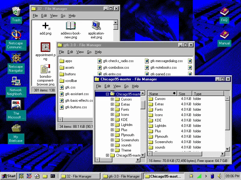
That's awesome.
Ugh, fine Microsoft. I'll finish my migration to Linux this weekend.

I like the Phone Companion bar too. The folder grid is reminiscent of Windows 8 and is a nod to iOS… I guess haters gonna hate, but this seems like a nice improvement.
Looks like someone at Microsoft saw someone's iPad and went "That's what we need! Icons in boxes that need an extra click to be used!" and their MBA boss figures they'll get a bonus for "increasing user engagement" by making everything take two actions instead of one now.
Sigh.
From the linked article:
One interesting thing about it is that clicking on an icon instantly launches the app, without opening the folder.
Another 500k lines of new code? Yay more bloat!
Oh cool, good to see the power button is still on the other side of the fucking menu. You know, the thing that I'm clicking on 90% of the time I'm opening the Start Menu? Why have that easily reachable like in past versions of Windows? Silly me I guess.
Alt+F4
Power options: sleep after 5 minutes
Power button action: shutdown
You're welcome
This isn't the first time Microsoft has done this, I remember this being a huge gripe for me with Windows 8/8.1
Strangly this UI always reminds me of the hospital scene from Idiocracy... Click the icon for where it hurts
With Windows 8, they all hurt.
Hey that was when they thought it was also a smart idea to force that shit tablet view on users...
I didn't mind it actually. Like I don't mind the GNOME overview or whatever the thing that comes up when you press Meta is called
Then you wouldn't notice all the fun and exciting recommendations they have for you! /s
genuine question, why do you click that button? Why not use the physical button on the device?
Software shutdown button presser chiming in.
There's two reasons I tend to use the software button. I know for a fact that clicking "Shut Down" will actually shut down the computer. If I press the hardware button, the computer usually is configured by default to sleep. Yes, I could change this default behaviour on all the devices I use, but then there's the second reason:
From a psychological perspective, I tend to associate the hardware button as a "only use if system is locked up" button.
Yep, if you're in charge of managing hundreds of computers, you don't want to guess at what it'll do. We have our defaults but also have people who make exceptions depending on their own work needs. Tbh, I rarely use that button anyhow though, I right click on the start menu to get that menu instead and use shutdown, restart, or log out.
ha, oh look another revision no one asked for.
i had to use this recently, and its all kinds of useless now. the 'search' didnt find my installed app, the 'all apps' list is a click or two in, and then absurdly inefficiently styled.. the win98 start menu was easier for me to navigate.
With more room for ads, I hope?!
i assume that's what the sidebar is for
The sidebar looks like it's dedicated to phone access?
it is, that was just me trying to be funny
My bad, I got whooshed
