this post was submitted on 26 Mar 2024
1 points (100.0% liked)

MapPorn

3562 readers
1 users here now

Discover Cartographic Marvels and Navigate New Worlds!

Rules

  1. Be respectful and inclusive.
  2. No harassment, hate speech, or trolling.
  3. Engage in constructive discussions.
  4. Share relevant content.
  5. Follow guidelines and moderators' instructions.
  6. Use appropriate language and tone.
  7. Report violations.
  8. Foster a continuous learning environment.

founded 2 years ago
MODERATORS
(page 3) 14 comments
sorted by: hot top controversial new old
[–] [email protected] 0 points 1 year ago (4 children)

I'm a man, USA. In my personal experience, which doesn't mean very much, I've noticed that men seem unable to accept catastrophy. They try to reason or wiggle a way out of it. Woman seem more at ease when dealing with horrible events.

If I had to guess, it is a difference in perception and experience. Perhaps men are groomed to be "providers, problem solvers," and so they despair at unsolvable problems, while women are told not to "overreact," and to "support" others in times of crisis. Like a weird inverted effect of patriarchal society.
load more comments (4 replies)
[–] [email protected] 0 points 1 year ago (5 children)

Considering various social taboos around suicide, I'm not sure how reliable such data is.

load more comments (5 replies)
[–] [email protected] 0 points 1 year ago (28 children)

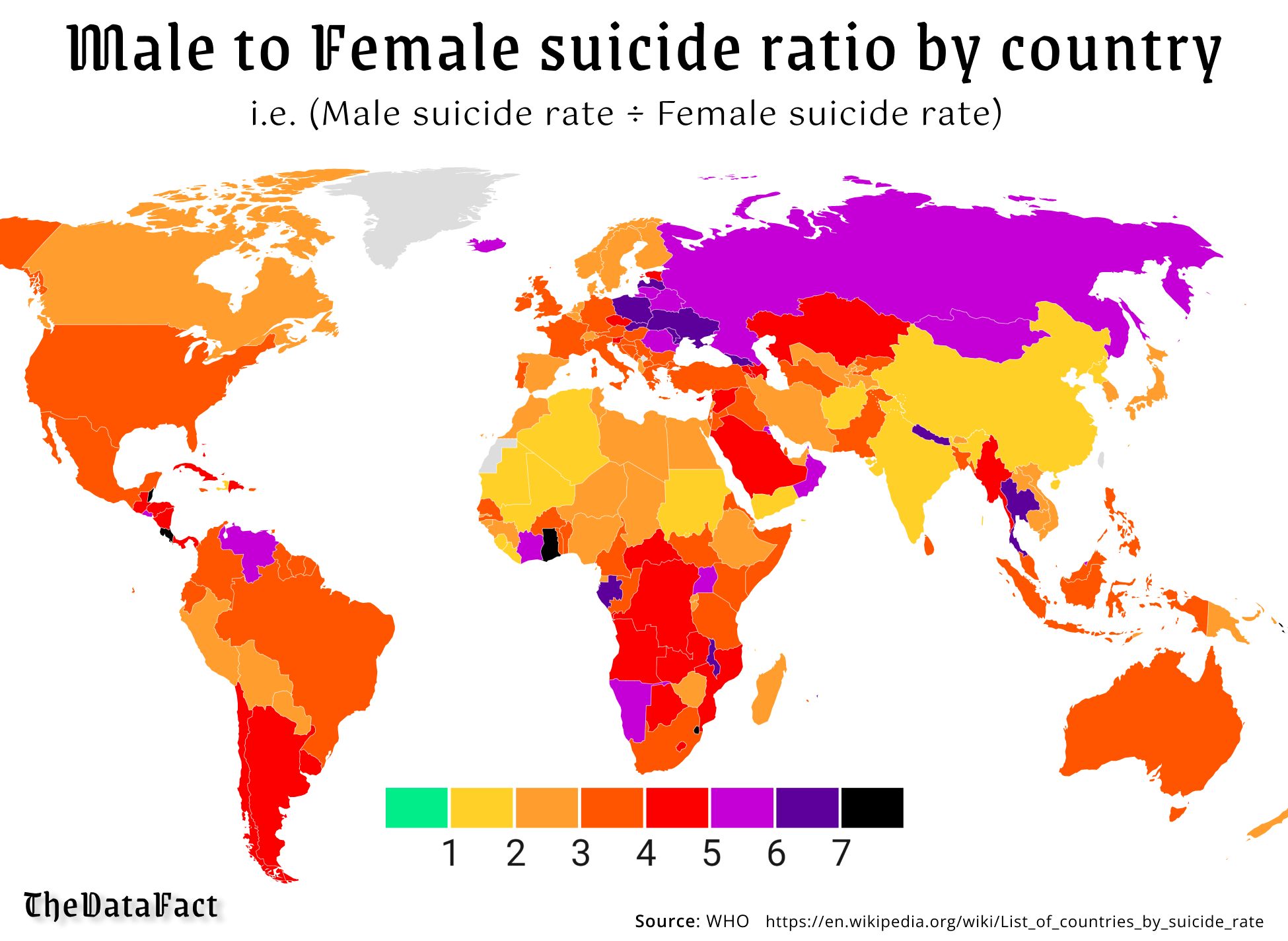
If you're having trouble understanding what this map means, it means that the suicide rate for men is higher than for women everywhere, notably 5 to 6 times higher in Eastern Europe and Russia, and 8 times higher in a couple of Central American countries and West Africa.

I wonder what makes men the world over decide that suicide is the best option.

[–] [email protected] 0 points 1 year ago (5 children)

I would imagine toxic masculinity.

Men are encouraged to be stoic and not express their emotions.

Most men don't have a single friend they can talk openly about their emotions with.

load more comments (5 replies)
load more comments (27 replies)
[–] [email protected] 0 points 1 year ago (2 children)

It would be interesting to find a way to also represent the overall rate. Some of these countries really stand out for their high male:female ratio even though their overall rates are not particularly high.

[–] [email protected] 0 points 1 year ago

Yeah, data could be skewed for countries with very low populations. That could be why Greenland is left out, despite data being available from the wikipedia page that the data is taken from.

[–] [email protected] 0 points 1 year ago (1 children)

Total numbers aren't relevant for ratios unless the numbers are low enough that the ratio swings wildly from year to year.

[–] [email protected] 0 points 1 year ago (3 children)

Low numbers could also mean that the tracking/reporting in that country isn't very good and therefore the data isn't reliable.

In some cultures suicide has a very negative stigma attached to it, which can result in suicide deaths being reported with other causes.

load more comments (3 replies)
[–] [email protected] 0 points 1 year ago (2 children)

So why is higher make suicide green?

[–] [email protected] 0 points 1 year ago (1 children)

For every female suicide, zero males commit suicide! Hooray! /s

In Greenland there was 1 polar bear attack per female suicide.

[–] [email protected] 0 points 1 year ago* (last edited 1 year ago)

In Greenland there was 1 polar bear attack per female suicide.

I choose that this infers someone’s lover killed themselves after they died from a polar bear.

[–] [email protected] 0 points 1 year ago (3 children)

Pretty sure green would be male/female suicide parity (for every man to commit suicide, there would be a woman as well). I'm pretty sure the scale indicates more men than women commit suicide the further up you go. That being said, it is not a very good graph, and also doesn't show total numbers, which would be interesting to see.

[–] [email protected] 0 points 1 year ago (1 children)

I'm pretty sure that green goes from 0 to 1, i.e. from 0 male suicides to suicide parity.

[–] [email protected] 0 points 1 year ago

That would be correct.

There are clearer ways that this data could have been displayed tbh. There are colors on the map that don’t fit into the scale - the map colors are continuous, but the scale would suggest that they are discrete.

load more comments (2 replies)
load more comments
view more: ‹ prev next ›