this post was submitted on 26 Mar 2024
1 points (100.0% liked)
MapPorn
3562 readers
1 users here now
Discover Cartographic Marvels and Navigate New Worlds!
Rules
- Be respectful and inclusive.
- No harassment, hate speech, or trolling.
- Engage in constructive discussions.
- Share relevant content.
- Follow guidelines and moderators' instructions.
- Use appropriate language and tone.
- Report violations.
- Foster a continuous learning environment.
founded 2 years ago
MODERATORS
you are viewing a single comment's thread
view the rest of the comments
view the rest of the comments
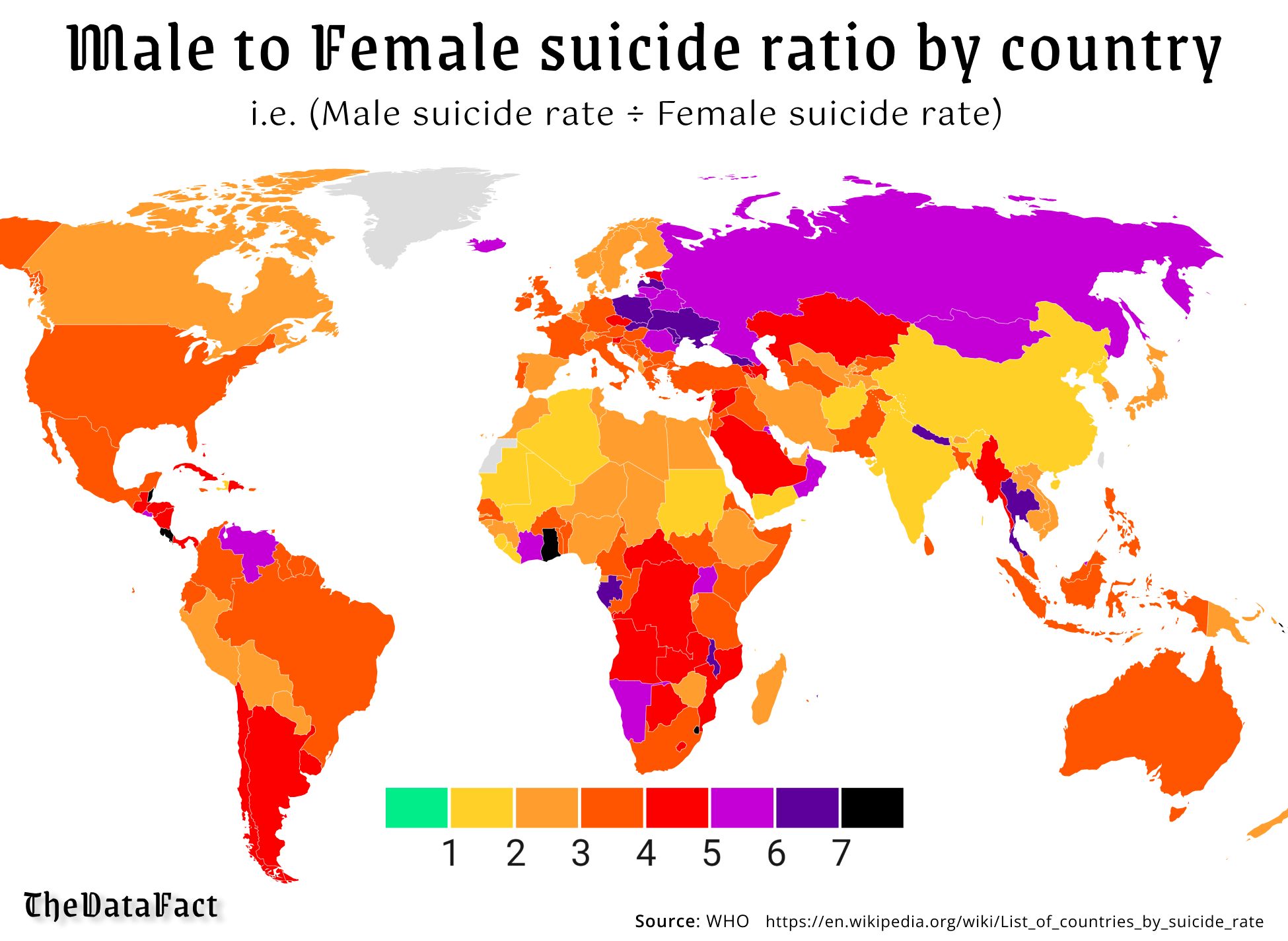
Pretty sure green would be male/female suicide parity (for every man to commit suicide, there would be a woman as well). I'm pretty sure the scale indicates more men than women commit suicide the further up you go. That being said, it is not a very good graph, and also doesn't show total numbers, which would be interesting to see.
Yeah the graph is pretty bad. I had to actually think about it and still got it wrong.
Yeah, maybe it's not the graph's fault.
I'm pretty sure that green goes from 0 to 1, i.e. from 0 male suicides to suicide parity.
That would be correct.
There are clearer ways that this data could have been displayed tbh. There are colors on the map that don’t fit into the scale - the map colors are continuous, but the scale would suggest that they are discrete.