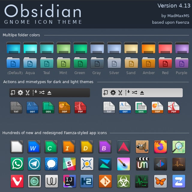
I use this icon pack. A very good GTK/Qt/Kvantum/whatever is Simplewaita. It goes together well with the icon pack.
Linux
From Wikipedia, the free encyclopedia
Linux is a family of open source Unix-like operating systems based on the Linux kernel, an operating system kernel first released on September 17, 1991 by Linus Torvalds. Linux is typically packaged in a Linux distribution (or distro for short).
Distributions include the Linux kernel and supporting system software and libraries, many of which are provided by the GNU Project. Many Linux distributions use the word "Linux" in their name, but the Free Software Foundation uses the name GNU/Linux to emphasize the importance of GNU software, causing some controversy.
Rules
- Posts must be relevant to operating systems running the Linux kernel. GNU/Linux or otherwise.
- No misinformation
- No NSFW content
- No hate speech, bigotry, etc
Related Communities
Community icon by Alpár-Etele Méder, licensed under CC BY 3.0
Skeuomorphic, IMHO, is the best thing that happened to the world of software. I don't ever understand why the whole industry shifted to the ugly flat shit design.
skeumorphism is fucking ugly and it's the main thing that made me dislike the appearance of os x back in the day. it honestly blew my mind people found apple to be the vanguard of graphical design
Colorful icons were amazing. That's literally why the iMac sold so well. Colorful. Prove me wrong.
It's nice and easy on the eyes. I conjecture that glossy and matte (as seen here) styles of skeuomorphism gave way to more abstract design since:
- Skeuomorphism is hard to get just right without being excessive and tacky
- Saturated, simple blocks of color pop out more, particularly on the increasingly prevalent mobile UI
- And thus also have better shelf appeal
If it were up to me, the red line would be when buttons and interactive elements are indistinguishable from text. The stock Android settings is probably among the worst offenders in this regard.
What I really miss is light mode that isn't hated for blinding users and dark mode that doesn't plunge the user into the void. Those "toolbars" look lovely, perfect for any lighting condition or time of day. I've yet to understand why, at present, designers insist on pure white everywhere when it comes to light mode. Maybe everyone is using the night light filter so it doesn't matter? At least pure black dark mode makes sense for power efficiency on OLEDs.
Skeuomorphism is hard to get just right without being excessive and tacky
that was always my impression of os x back in the day. it felt tacky as hell. i'm a linux guy, but windows's aero was so much more beautiful
Hey, that's the icon set I use in KDE! And yes i'd sell my kidneys to bring back skeumorphism and aero
I tried to do a couple of icon sets that went with that trend for KDE. At one point I was involved with the KDE VDG and was about to set the style of the icons they'd use.
But apparently some suit told them they needed to go completely flat as they needed to plaster Firefox/distros/whatever logos on it, so everything needed to look consistent.
So in the end I got bored about it and stepped away. I'm trying to redo a new square-shaped-skeumorphed icon set but it's so much work - like it'd need to be your daily job to pull it off.
However, if you take a look at it, it's already in this one - some of them are just the base shape with some logo plastered on it (like the whatsapp one, or the one with the butterfly) and voilá, there's your icon.
So icon sets are incredibly hard, and if you want a skeumorphism icon set its hard squared. That's another of the reasons flat icons thrive today.
I fucking love skeuomorphism !
Kinda, yeah! These kinda remind me of some of the icon packs I used on my jailbroken iPod Touch!
i don't, not at all, but still think elementaryOS looks beautiful! Like holy hell, even on their websites they manage to make their design look good!
Yeah, I don't understand flatness either. Neither I understand the dark themes either. My eyes and brain simply can't do the separation easily, I spend more time trying to process an image. Old style icons and UI colors are the best IMHO.
My primary icon theme and widget style are 20+ years old and not flat in the least. You can still have that look and feel on a real computer if you want it (but you may have to compromise elsewhere or do some extra work). On phones, all bets are off.
Dunno what your issue with that icon pack is, but I'd bet there's a good chance it can be solved with a few file renames or symlinks if you care enough to bother.
I don't know if you'd call that skeuomorphism, and we have icons that are similar.
I'm not sure what you would call the opposite of 'flat' in terms of these designs, but I think that's what you're referring to.
I miss the KDE 3.x crystal theme
I do miss them. But I'm happy with my custom Suru++ Aspromauros
icons too.
I miss UIs having lines and clear separations between elements. I loath this new flat style that everything has to have now, where you can't tell when one thing stops and another starts.
And you can't tell when something is active/focused or not because every goddamn app and web site wants to use its own "design language". Wish I had a dollar for every time I saw two options, one light-gray and one dark-gray, with no way to know whether dark or light was supposed to mean "active".
I miss old-school Mac OS when consistency was king. But even Mac OS abandoned consistency about 25 years ago. I'd say the introduction of "brushed metal" was the beginning of the end, and IIRC that was late 90s. I am old and grumpy.
And you can’t tell when something is active/focused or not because every goddamn app and web site wants to use its own “design language”.
The FireTV os is worse. The active focus indicator is different between pages of the OS ignoring apps. Oh and it changes constantly.
I've got these articles saved, about the history of brushed metal on Apple software: https://512pixels.net/2013/03/brushed-metal-intro/ https://512pixels.net/2016/11/the-brushed-metal-diaries-beyond-software/
To be honest I loved it ... though maybe it has to do with the fact that I have a soft spot for 10.4 Tiger, due to personal (?!) reasons. After Tiger they started progressively tearing down the brushed metal components.
I miss being able to use bitmapped fonts back in the Gnome 1.x days.
God, no!
Though these do look pretty, they don't look like the buttons in Windows 95/XP and maybe that's a good thing.
I liked the soft gradient XP icons, though maybe that's just the nostalgia talking
Yeah, I do miss that, but idk how much of it is nostalgia and how much is an absolute aesthetic preference. I think the main reason for the change though is Microsoft trying to make Windows work well on mobile devices though, meaning forgoing the aero and more expensive VFX.
Wish some DEs would make their default style more like a win7 era style. Would be nice to have the variety.
No reason they wouldn't work on a small phone, especially back then
I miss the time when not all icons were a rectangle or a circle.
Quick info, the link does not work.
You need to put it in the address part aswell (like this [https://github.com/madmaxms/iconpack-obsidian](https://github.com/madmaxms/iconpack-obsidian)
Here is a working one https://github.com/madmaxms/iconpack-obsidian
Okay thanks never made a post with a link
My plasma 6 desktop has absolutely stunning icons, and im like you - I like proper icons that look more interesting.
Try plasma 6, I'm sure those icon sets are also much more complete. :)
No. Old UI is terrible. The newest UI with extremely rounded corners is bad too but I'd much rather use it than old stuff.
How about flat, easy to recognise icons and straight, square windows and app designs?
Brutalism for your DE!
Another thing that's needed is icon labels or alternative text. Apps like LibreOffice suffer from icon-heavy UI which is hard to understand and remember for new users and even for me without any explanations.