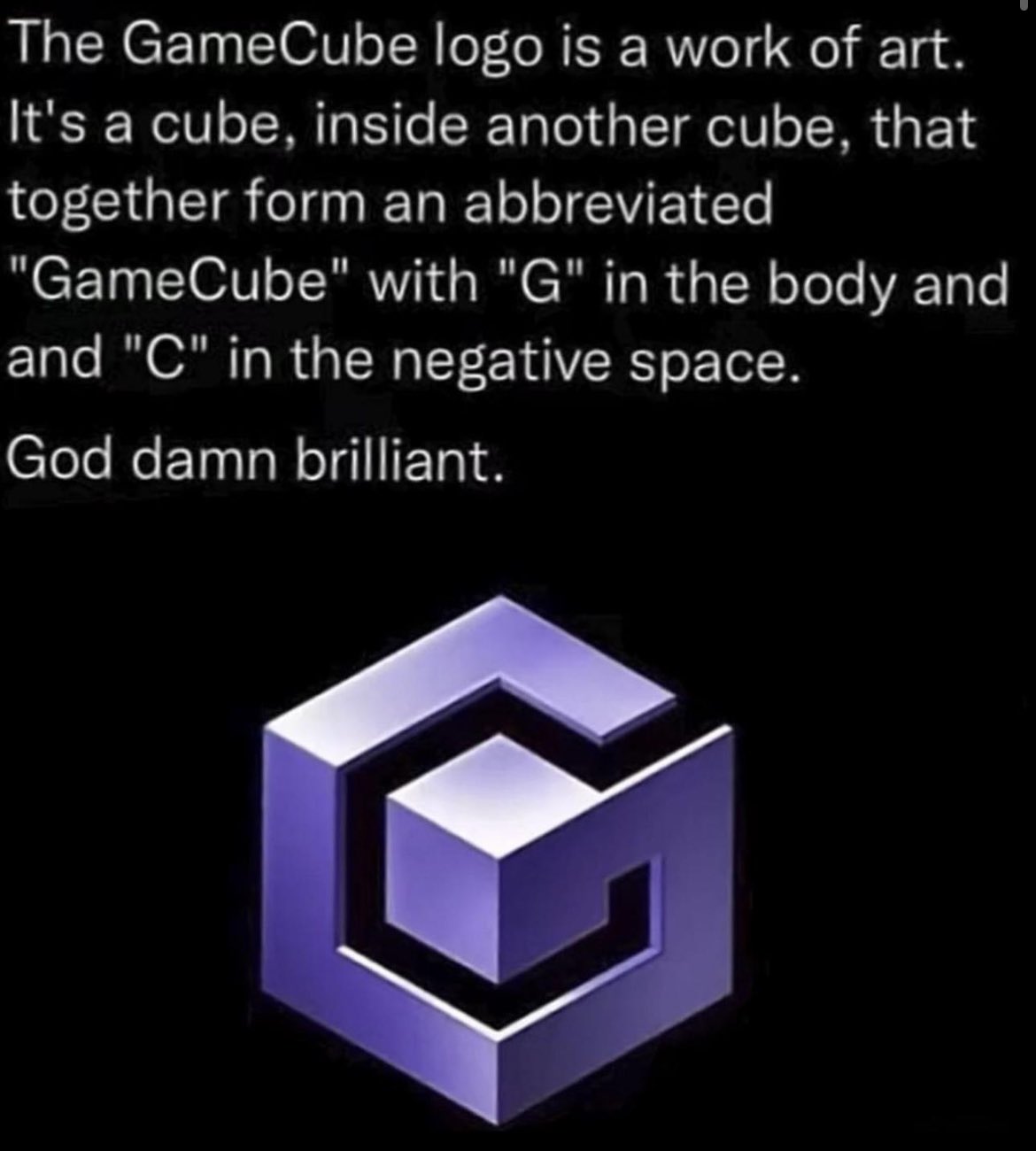
i'd like to have a graphic design community on here
Gaming
!gaming is a community for gaming noobs through gaming aficionados. Unlike !games, we don’t take ourselves quite as serious. Shitposts and memes are welcome.
Our Rules:
1. Keep it civil.
Attack the argument, not the person. No racism/sexism/bigotry. Good faith argumentation only.
2. No sexism, racism, homophobia, transphobia or any other flavor of bigotry.
I should not need to explain this one.
3. No bots, spam or self-promotion.
Only approved bots, which follow the guidelines for bots set by the instance, are allowed.
4. Try not to repost anything posted within the past month.
Beyond that, go for it. Not everyone is on every site all the time.
Logo uses joystick by liftarn
I second this.
ps1_bootup.nostalgia
Godel, Escher, Bach did it first, but even cooler.
Likely inspired the design.

Humans are so friggin creative I can't stands it.

Yeah you know me.
Now, for the ladies, OCP means something different.
Orange County Police! Get your hands up dirtbag!
This one or the N64 logo (with its 64 faces) is the greatest real logo
I don't see how the N64 logo can have 64 faces. I counted 24 faces.
I've just looked it up, and it seems to just come from a Reddit post where they explain how they've worked it out, but in their working out they've triple-counted the N-shaped faces.
Probably the actual 3d representation does
Didn't realize it had 64 faces that's cool af
Not to mention all the memes it spawned.
Kinda related -
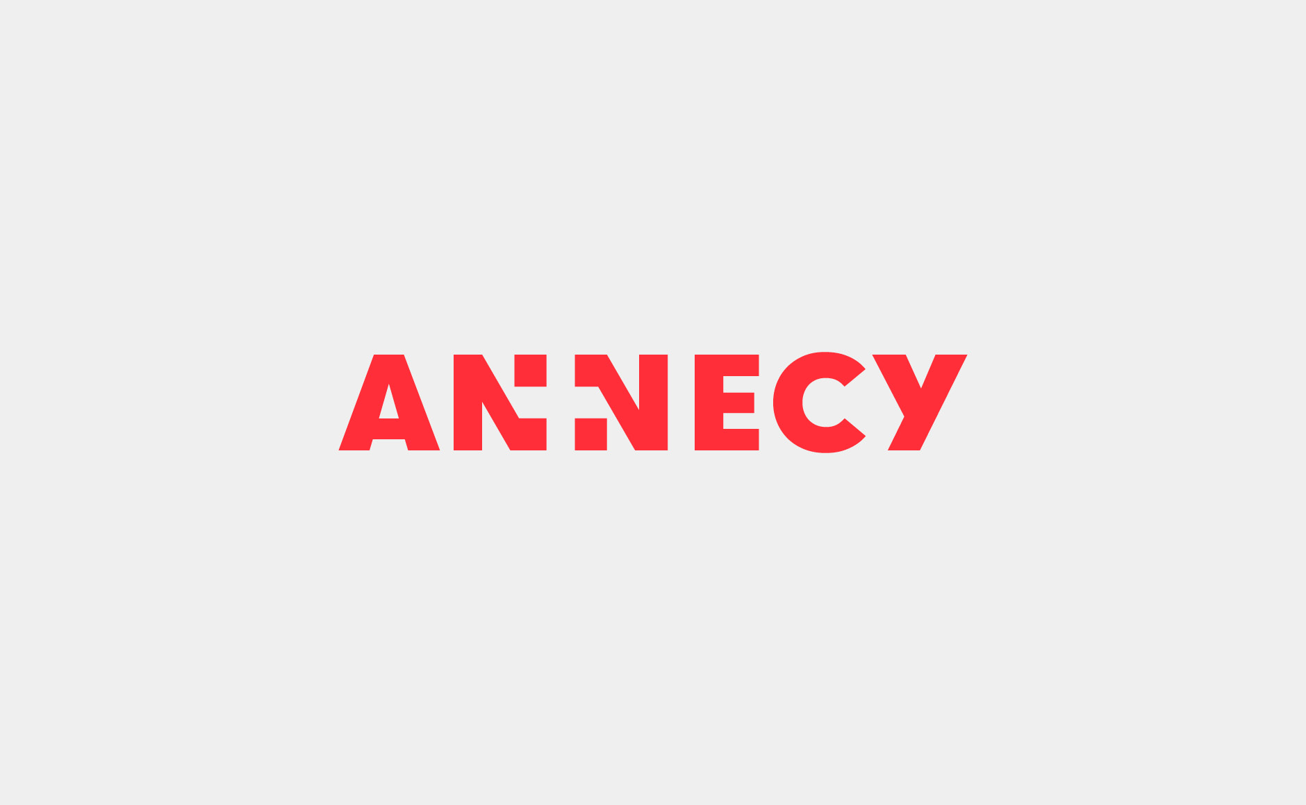
The logo of Annecy, capital of Haute Savoie -
Why it's so clever - the flag of Haute Savoie -
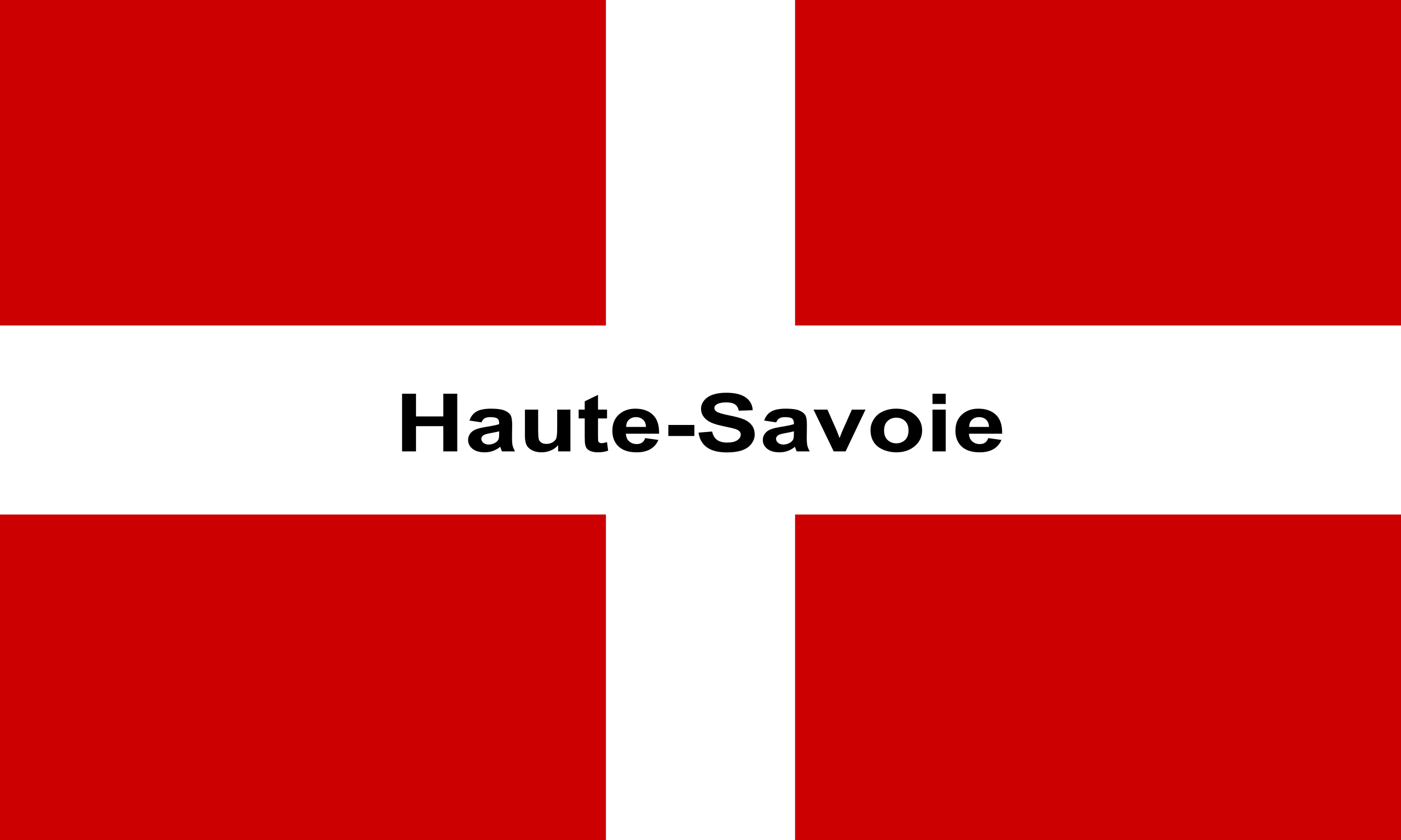
Edit, forgot to add, the Swiss flag has red gaps at the ends of the white cross, in case you were wondering
Damn that's actually clean af
Some random guy in a remote part of France is an amazing graphic designer
Also good to know that haute Savoie is the most Swiss part of France so the similarities are no coincidence (I assume).
It's literally right next to Geneva

"I can't wait to see their next brilliant logo design!"
ಠ_ಠ
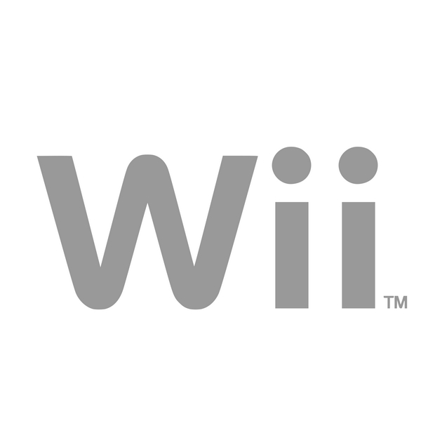
My brain just did some work. Now I can't unseen this as that manly handshake scene from Predator. The two 'i's are the guys, and the 'W' is a zoom-in of their handshake.
That whole era had really shitty design. “Sleek this, minimalist that. Only black/white/greys allowed”. Got old real fast.
Just wait until you see the sequel to this one.
(╯°□°)╯︵ ┻━┻
But the "ii" part bows to you! Its revolutionary!
Oh I thought that was like "we" cuz you play alone most of the time.
Random Nintendo execs show up to your house unannounced.
"We would like to play"
You stare at them blankly for a beat then shut the door in their faces. This is your time away from the world and its demands. No one will take that away from you.
