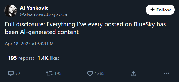
every posted
Microblog Memes
A place to share screenshots of Microblog posts, whether from Mastodon, tumblr, ~~Twitter~~ X, KBin, Threads or elsewhere.
Created as an evolution of White People Twitter and other tweet-capture subreddits.
Rules:
- Please put at least one word relevant to the post in the post title.
- Be nice.
- No advertising, brand promotion or guerilla marketing.
- Posters are encouraged to link to the toot or tweet etc in the description of posts.
Related communities:
I ran into this exact scenario with an acquaintance on Facebook back when I engaged in such silly endeavors.
Her name was Al and I couldn't figure out for the life of me if it was Al or AI. I think I finally did ask, but damn I could NOT figure it out on my own. I suppose there must've been some way to copy paste it into word and configure to all caps, but the thought never occurred to me.
It should be illegal to have a font where Il| are not all easily distinguishable.
lI|
Also, O and 0. And there's a special place in Hell for font designers that make 1 look like I
Oh Al, you little scamp!
Or : a lesson in typography, and why lower-case L ought to have a serif or curve.
Fʀᴀɴᴋʟʏ, I'ᴍ ɴᴏᴛ ᴇᴠᴇɴ ᴄᴏɴᴠɪɴᴄᴇᴅ ᴡᴇ ɴᴇᴇᴅ ʟᴏᴡᴇʀᴄᴀsᴇ ʟᴇᴛᴛᴇʀs ɪɴ ᴛʜᴇ ғɪʀsᴛ ᴘʟᴀᴄᴇ. Sᴇᴇᴍs ᴛᴏ ᴍᴇ ᴛʜᴀᴛ's ᴊᴜsᴛ ᴀsᴋɪɴɢ ғᴏʀ ᴛʀᴏᴜʙʟᴇ.
𐑯𐑴𐑐. 𐑿 𐑒𐑨𐑯 𐑛𐑵 𐑢𐑦𐑞𐑬𐑑 𐑤𐑴𐑼𐑒𐑱𐑕 𐑓 𐑖𐑫𐑼.
Minuscule letters were invented to write on paper and similar materials, because curved strokes had lower probability of tearing the material (as opposed to majuscule letters' angular features, adapted to carving in stone or similar materials). Now that we're not restricted by materials, might as well only use one case
I'm a big fan of Chinese seal script used for stone engravings just like the look
Make Writing (adapted for) Stone Again
lower probability of tearing the material
Is that well documented? I thought it was just because it makes writing more fluid, and people tend to evolve towards fluid movements when they repeat the same ones all the time as it requires less energy. Ex: high-level musicians or sport practicionners.
Hmm. Still harder to read and comes across as yelling, even when the capital letters are itty-bitty...
I read this in the voice of Death from Discworld. I didn't even realize I had an internal voice actor assigned to him.
Christopher Lee
After reading this comment, I too read the comment it was responding to in the voice of Discworld's Death. Something both warm and somewhat metallic.
Come to think of it, is there actually much of any point to capital vs lowercase letters? You know what the first word of a sentence is anyway because of the period before, and names can be identified by context. Why do we even have capitalization in the first place?
As I mentioned in another comment, the original reason we have majuscule and minuscule letters is the difference in materials they were written on. Having them persist in the typesetting is in fact more of a historical artifact
It's a plot by Big Typesetting to sell more letters. Wake up sheeple!
God dammit.
I'm not ready for AI AL.
Ready or not, Al be baming
If that's an official account, that's actually amazing. Also an amazing comment.
Seems to be official. He hasn't set up the domain but a bunch of prior posts and interactions make it seem real enough

"Is that an English letter in your pocket or are you just happy to see me?"
Generated by the state of Alabama?
Aluminum?
That would be straight indiscriminate racist ramblings.
