Unixporn
Unixporn
Submit screenshots of all your *NIX desktops, themes, and nifty configurations, or submit anything else that will make themers happy. Maybe a server running on an Amiga, or a Thinkpad signed by Bjarne Stroustrup? Show the world how pretty your computer can be!
Rules
- Post On-Topic
- No Defaults
- Busy Screenshots
- Use High-Quality Images
- Include a Details Comment
- No NSFW
- No Racism or use of racist terms
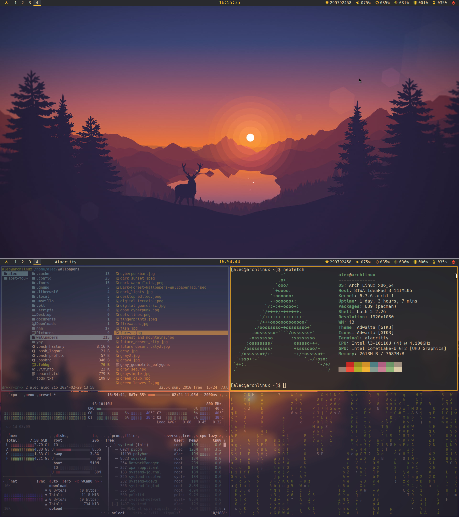
You made it so that only the currently focused window has 100% opacity, while making the others really transparent. Isn't that impractical when you are, let's say, writing some document while checking other windows for information related to what you're writing? Has there been any situations where something similar happened to you? Since this is your own "rice", there's no problem if you never used your computer for stuff like this, but I'm legit curious about it.
Great work :)
The vertical alignment of the panel is not great, the horizontal one probably can be improved too. The clock font size seems bigger than everything else which is questionable but not an issue. Love the transparent inactive windows and the very readable active one. Let's say 9/10
Thank you, I think the window alignment is fine but since i3 draws borders to "child containers" and I obviously messed up the config file it it looks weird sometimes. I made the clock bigger but now that you mention it it looks wrong to me too. And for the panel I think you mean the white line that I put in there to separate images? Any way thank to point it out I will do something about it. :)
You are welcome. And no I meant that all the widgets inside the panel look a pixel or two closer to the top then to the bottom of it. The windows are fine
Oh yeah, I can't fix that automatically its just the icons(I guess). Im going to dump them for text or a monospace icon set if I ever find one.
average wallpaper
Hey I have the same wallpaper in my slideshow, good choice!
(rice is a racist term and should be dropped)
Ricist
I did not know that, would you mind elaborating ?
My understanding is the term originated in the car-modding scene as a derogatory way to refer to the way east asian people modded their cars. While I'm sure it's not what the OP intended, it's a term with some baggage
from the 70's and 80's imported asian cars were called 'rice burners' ('rice rocket' for fast asian motorcycles) and tuning your car with visual improvements that didn't actually add horsepower was known as 'ricing'.
source: grew up knowing car people during that era and heard this casual racism along with 'beaner' for anything hispanic
@pacmondo and @cubbytustard thanks for your answers :)
How embarrassing... Arriving late to the hyperstitious slur cascade
https://www.astralcodexten.com/p/give-up-seventy-percent-of-the-way
this is too beautiful
Very Firewatch… love it!
