this post was submitted on 02 Mar 2024
0 points (NaN% liked)
Unixporn
15364 readers
1 users here now
Unixporn
Submit screenshots of all your *NIX desktops, themes, and nifty configurations, or submit anything else that will make themers happy. Maybe a server running on an Amiga, or a Thinkpad signed by Bjarne Stroustrup? Show the world how pretty your computer can be!
Rules
- Post On-Topic
- No Defaults
- Busy Screenshots
- Use High-Quality Images
- Include a Details Comment
- No NSFW
- No Racism or use of racist terms
founded 5 years ago
MODERATORS
you are viewing a single comment's thread
view the rest of the comments
view the rest of the comments

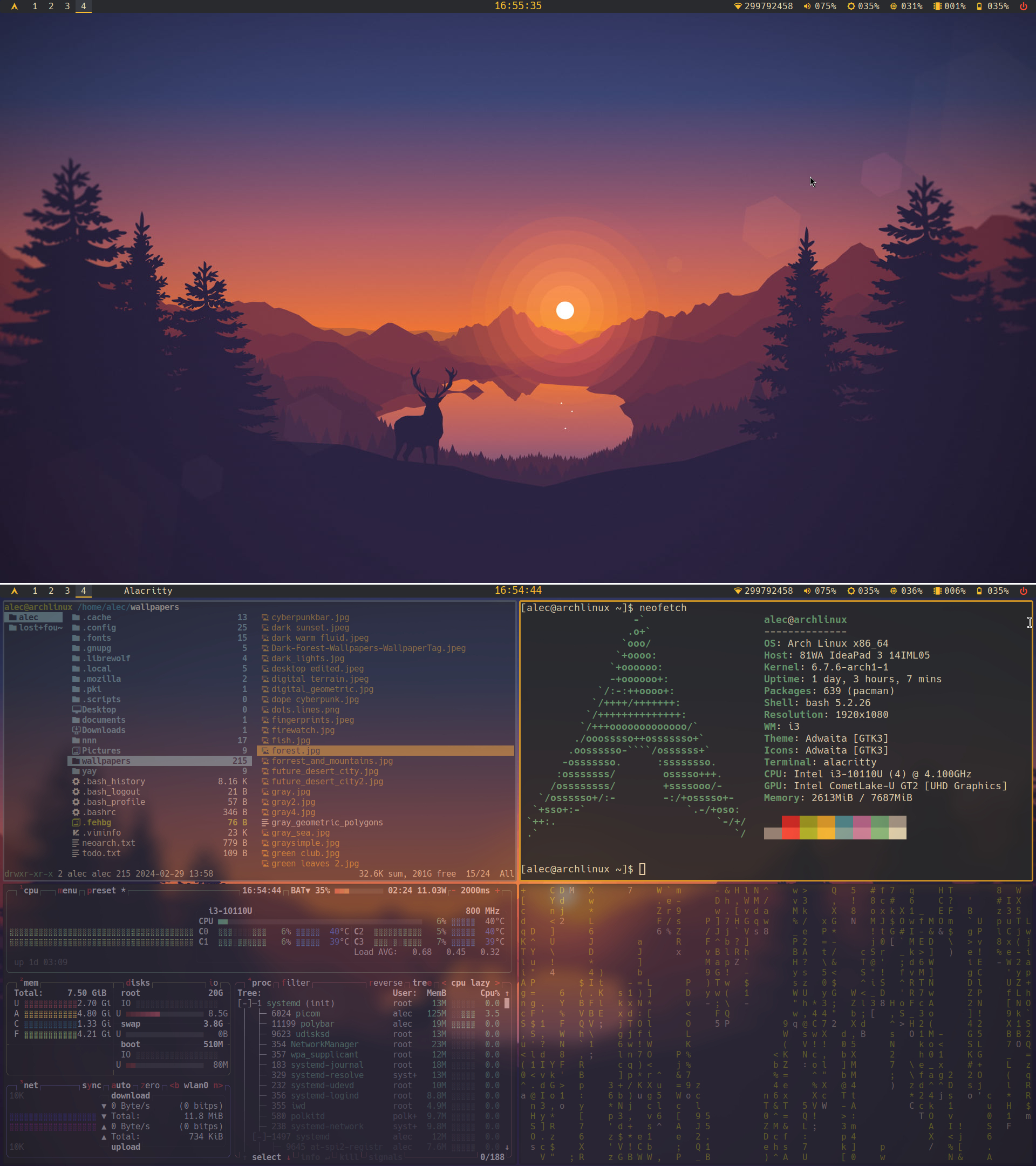
Thank you, I think the window alignment is fine but since i3 draws borders to "child containers" and I obviously messed up the config file it it looks weird sometimes. I made the clock bigger but now that you mention it it looks wrong to me too. And for the panel I think you mean the white line that I put in there to separate images? Any way thank to point it out I will do something about it. :)
You are welcome. And no I meant that all the widgets inside the panel look a pixel or two closer to the top then to the bottom of it. The windows are fine
Oh yeah, I can't fix that automatically its just the icons(I guess). Im going to dump them for text or a monospace icon set if I ever find one.