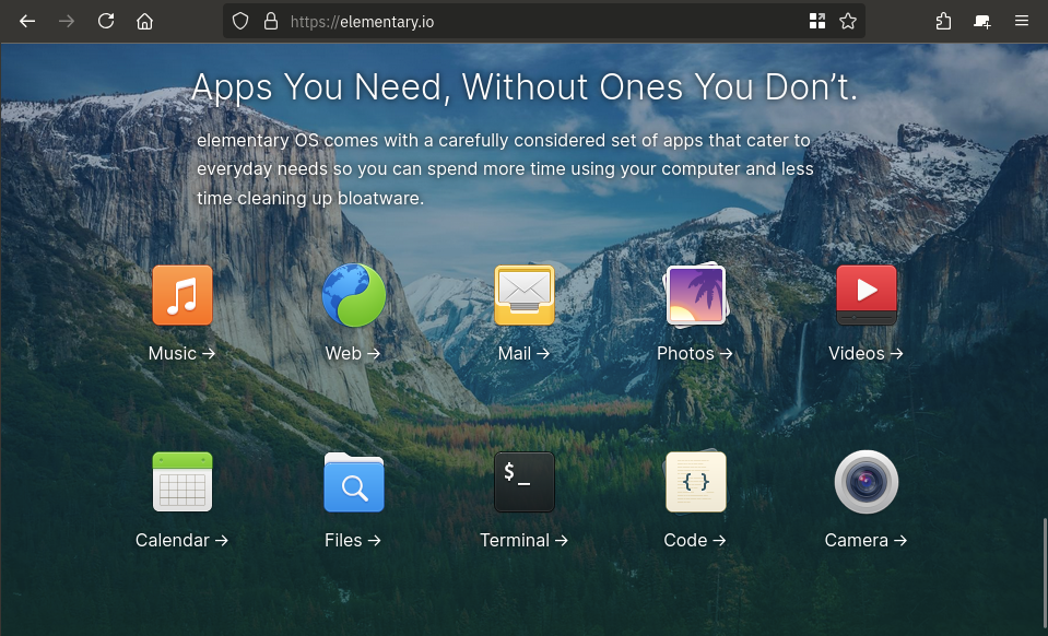
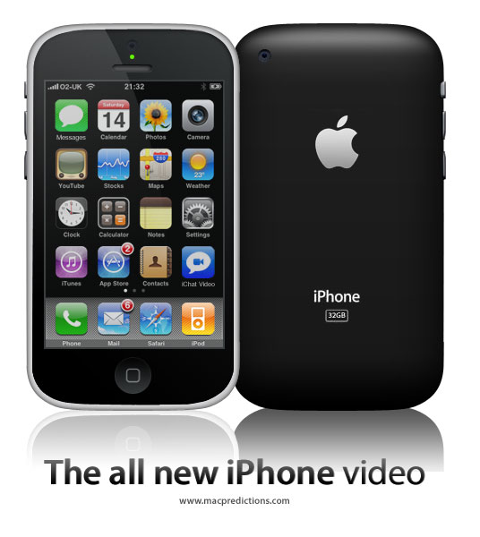
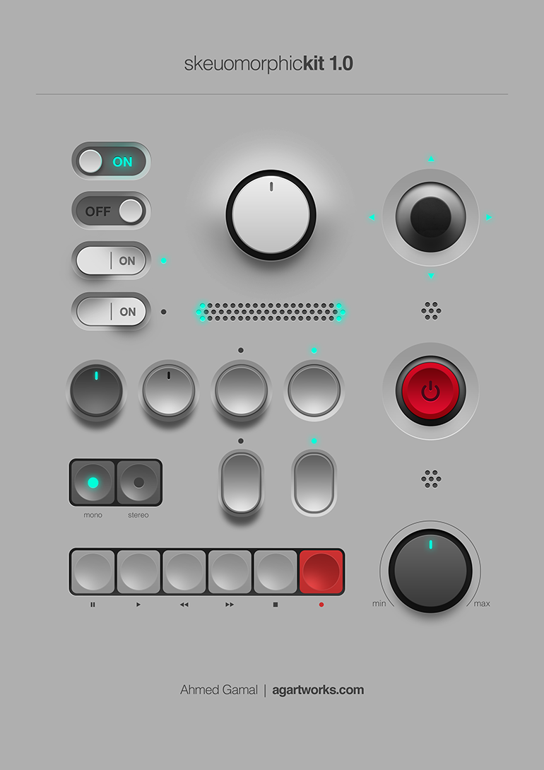
I tried to do a couple of icon sets that went with that trend for KDE. At one point I was involved with the KDE VDG and was about to set the style of the icons they'd use.
But apparently some suit told them they needed to go completely flat as they needed to plaster Firefox/distros/whatever logos on it, so everything needed to look consistent.
So in the end I got bored about it and stepped away. I'm trying to redo a new square-shaped-skeumorphed icon set but it's so much work - like it'd need to be your daily job to pull it off.
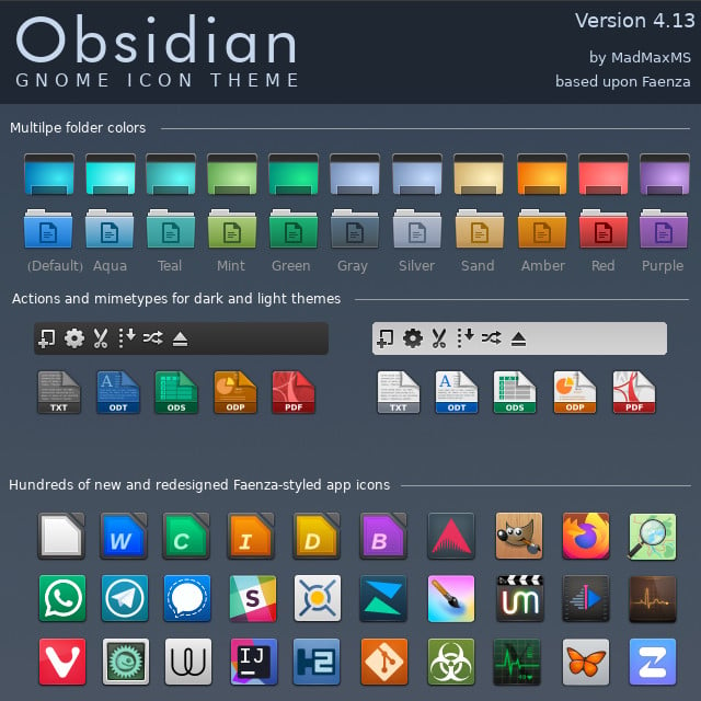
However, if you take a look at it, it's already in this one - some of them are just the base shape with some logo plastered on it (like the whatsapp one, or the one with the butterfly) and voilá, there's your icon.
So icon sets are incredibly hard, and if you want a skeumorphism icon set its hard squared. That's another of the reasons flat icons thrive today.
