this post was submitted on 15 Oct 2024
1 points (100.0% liked)

Gaming

3123 readers
14 users here now

!gaming is a community for gaming noobs through gaming aficionados. Unlike !games, we don’t take ourselves quite as serious. Shitposts and memes are welcome.

Our Rules:

1. Keep it civil.


Attack the argument, not the person. No racism/sexism/bigotry. Good faith argumentation only.


2. No sexism, racism, homophobia, transphobia or any other flavor of bigotry.


I should not need to explain this one.


3. No bots, spam or self-promotion.


Only approved bots, which follow the guidelines for bots set by the instance, are allowed.


4. Try not to repost anything posted within the past month.


Beyond that, go for it. Not everyone is on every site all the time.


Logo uses joystick by liftarn

founded 1 year ago
MODERATORS
 
top 50 comments
sorted by: hot top controversial new old
[–] [email protected] 0 points 4 weeks ago

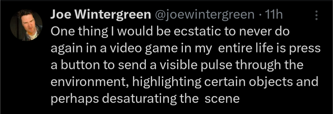
I see a lot of people saying that this is an accessibility thing, while also allowing you to not miss anything important

But a well designed, uncluttered environment can do both of these things while giving you a more immersive experience

But we can't do that, because we're in an endless chase to get the most realistic graphics, and how else are we going to show that off than overly detailing each pixel of stationary on a worker's desk?

I also see a lot of people saying "just don't use the feature if you don't like it"

There's a famous quote I like. "Given the opportunity, players will optimise the fun out of a game". And you can bet your ass I do that. In any game with this "scan" feature, I'll be tapping that like a relapsing porn addict, looking for any new quest npcs, missed collectables or just to see if I'm on the right path. I have a similar issue with minimaps, as they have a comparable effect on gameplay
[–] [email protected] 0 points 1 month ago

If it's like a fast fading wave but the highlight stays then thats fine.

If it's a toggleable mode that shows you only closeby items that you have to pick up and look at in a specific order, then fuck right off. Especially when it's so fucking obvious that theirs a suspicious bloody knife stuck in a tree but I need to follow footprints to it first.

[–] [email protected] 0 points 1 month ago (1 children)

The only game I'm aware of in my library that has a feature like this is Satisfactory, the "ping" feature to find nodes they tutorialize but you'll probably quickly stop using because you use an external map for planning/get to know the map.

[–] [email protected] 0 points 1 month ago

Witcher series.

[–] [email protected] 0 points 1 month ago (1 children)

Honestly if I could do this in real life for an object I'm looking for, and have the object ping and light up and flash and shit, I would love it.

[–] [email protected] 0 points 1 month ago

I use Tile trackers for this. They're pretty good.

[–] [email protected] 0 points 1 month ago (1 children)

It's because in older games, you could clearly differentiate between the background and the gameplay relevant sprites or models drawn over it. It was a technical necessity but it doubled as communicating to the player what's important. When technology advanced past that being technically necessary, something needed to take its place. The pulse is just one of many ways to do that and the easiest one to integrate into a realistic artstyle. When you get more stylized, your options open up considerably.

[–] [email protected] 0 points 1 month ago

Honestly I would prefer it to just be a highlight, like in CRPGs where either itll highlight the outline of the object or the object itself.

[–] [email protected] 0 points 1 month ago

If mandatory: meh
Accessability feature for players with impaired vision: great bloody UX

t, your local UI/UX guy

[–] [email protected] 0 points 1 month ago

If the game has a lot of stuff but only some of it is actually interactive, there should be a way to disambiguate.

[–] [email protected] 0 points 1 month ago

I’m thinking Splinter Cell had this kind of feature.

[–] [email protected] 0 points 1 month ago

Unpopular opinion maybe, but I LOVE that shit!

[–] [email protected] 0 points 1 month ago

I remember the first time I sent out a ping in the voxel-based action-adventure game Outcast (1999). I thought it was the coolest thing I'd ever seen.

There are good and bad implementations, but going to have to disagree with op on the whole.

[–] [email protected] 0 points 1 month ago
[–] [email protected] 0 points 1 month ago (1 children)

The Batman Arkham games kinda do that right? Except it was more of a toggle when you had it on or not?

[–] [email protected] 0 points 1 month ago

That's different. The detective mode is actually useful for when you have to clear a room. It's so good that some of the last and hardest enemies in the game are not visible while using it.

[–] [email protected] 0 points 1 month ago

The first game I remember doing this is The Witcher 2. Not sure if that's the first game to come up with the idea, but it's the earliest example I can remember.

[–] [email protected] 0 points 1 month ago

Just make it a toggle to highlight shit. On and off.

I used to play games that permanently highlighted interactive objects. I am playing a game, I don't need realism.

[–] [email protected] 0 points 1 month ago (4 children)

What I never wanna see again is a game having me hold a button instead of pressing it, for literally anything

Topical example would be apace marine 2

[–] [email protected] 0 points 1 month ago (1 children)

My god no man's sky before they finally added the option was a nightmare.

[–] [email protected] 0 points 1 month ago (1 children)

Omg I had no idea you could disable it thank you!

[–] [email protected] 0 points 1 month ago

Glad I could be of help lol.

[–] [email protected] 0 points 1 month ago

Toggle sprint, hold zoom, please and thank you

[–] [email protected] 0 points 1 month ago

God yes. It makes everything feel unresponsive and less snappy.

[–] [email protected] 0 points 1 month ago (1 children)

What about Satisfactory? It has that feature, but it also has alot more pros than cons?

[–] [email protected] 0 points 1 month ago

The big differences for me in Satisfactory is that you are not pinging resources all the time, it’s a small fractional of the gameplay loop. Also, it doesn’t have a super obnoxious screen effect, so it’s more palatable to me

[–] [email protected] 0 points 1 month ago (2 children)

What? And get stuck in places because you didn't see the not-so-obvious object you needed to interact with?

Yeah, fuck that.

[–] [email protected] 0 points 1 month ago (1 children)

Back in my day, the objects just glimmered every few seconds.

[–] [email protected] 0 points 1 month ago

Back in my day they hovered off the ground, bobbing and rotating in place.

[–] [email protected] 0 points 1 month ago

I don't mind it being an option but the game relying on it so much that it is a constant necessity that pains me.

[–] [email protected] 0 points 1 month ago (1 children)

I was trying to think on the history of this feature, since i wouldn’t necessarily count something like AvP's heatvision mode. That's meant to simulate a real thing, even if it works a bit gamey, by highlighting active objects.

Assassin's Creed is the game that, for me, codified the mechanic into it's current form. Hawk Vision or whatever they called it specifically highlighted game objects. I think they even mention that the animus machine is projecting that view to help Desmond see the world how his ancestors would have understood it.

But... I'm going to call the origin as being way farther back. In flight sims, your targeting hud can highlight enemies and targets by drawing little boxes around them. That is the very first instance I can think of where a game highlighted objects of interest for the player's benefit. Most flight sims (or adjacent genres like mech sims) would also label the box with the name of the thing, sometimes with health, ammo, weapon, or weakpoint indicators as well.

[–] [email protected] 0 points 1 month ago

It was big in Dragon Age.

load more comments
view more: next ›