242
This Dutch bike store uses a bike symbol and the Android share symbol to signify bikeshare bikes
(feddit.nl)

This is for strictly mildly interesting material. If it's too interesting, it doesn't belong. If it's not interesting, it doesn't belong.
This is obviously an objective criteria, so the mods are always right. Or maybe mildly right? Ahh.. what do we know?
Just post some stuff and don't spam.
I always thought it was a downward view of someone balancing two plates on poles.

That’s the national flag of Donkey Republic! How dare you desecrate it by letting it touch the floor!!!
donkey
It's strange that sharing hasn't really gotten a universal icon like most other things have.
But it has? 
Wait, it doesn't exist in Unicode. Why?
There should be a community for modern heiroglyphics
What's the inscription next to it? "Donkey Repub..." ? 😁
TIL this share symbol is android specific.
Edit: As other have mentioned, it's not Android specific (I was referring to the post title). From Wikipedia:
WordPress developer Alex King created the original Share Icon in 2006.
Thx @[email protected] for the Wikipedia Link
Well I didn't know that! Interesting,
The icon is two years older than Android.
It isn't
Almost as good as the car sharing sign in Germany
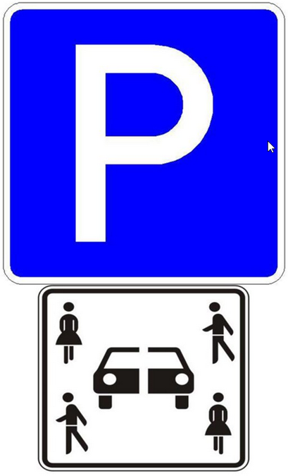
Explanation: "sharing" and "cutting in two pieces" can both be translated as "teilen"
That sign looks too much like the sign for the "verkehrsberuhigter Bereich" sign in in my opinion.
Nah, don't think so. The verkehrsberuhigte Bereich is blue and a lot bigger, and this here is always below the parking P since it's just an addendum. But it's really not intuitive to understand
Nobody? Nobody? Fine.
...
THAT'S A LOT OF DAMAGE!