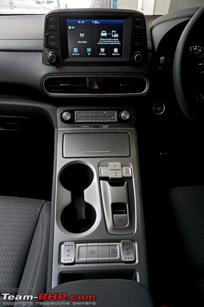
I understand why people want minimalist design. I too like this. This is why my 2000 Audi TT has a door flap to cover up the radio when you don't want to see the buttons.
People Twitter
People tweeting stuff. We allow tweets from anyone.
RULES:
- Mark NSFW content.
- No doxxing people.
- Must be a pic of the tweet or similar. No direct links to the tweet.
- No bullying or international politcs
- Be excellent to each other.
- Provide an archived link to the tweet (or similar) being shown if it's a major figure or a politician.
Why not have both

I've got a MK8 Golf and boy are the interior ergonomics of that thing annoying. Capacitive EVERYTHING. Steering wheel controls. Climate controls. Overhead lights!! It still has a normal blinker stalk though. But I knew what I was getting into when I bought it....I mainly wanted one of the last manual hatchbacks before they die out completely. Good thing it is super fun to drive so I don't really pay attention to the annoying lack of buttons.
Is this what the new subscribe-to-drive cars look like inside? Just a straight up tablet where the music and heat controls are supposed to be?
Old man screams at clouds. 👴✊️☁️
Bellows. Loudly and aggressively.
I just got a Corsa D from 2006 and am so happy the interior is still original. I think it looks great, actual buttons for anything I would need and a tiny 3.5mm jack to hook my bluetooth receiver up to for Spotify. It's perfect IMO.
And my axe.
And my Bumper Jack!
I recently bought a new car and I'm so glad that even though it's very modern it doesn't have a screen.
My 2015 Mazda 3 has both and I love it.
