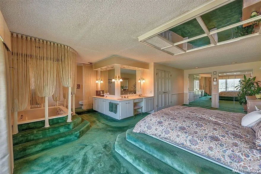
Mirror on the ceiling...
Terrible Estate Agent Photos
Terrible photos listed by estate agents/realtors that are so bad they’re funny.
Posting guidelines.
Posts in this community must be of property (inside or out) listed for sale which contains a terrible element. “Terrible” can refer to:
-
the photo itself (finger over the lens, too far away, people in the shot, bad Photoshop, etc.)
-
the property (weird layout, questionable plumbing, unsound structure, etc.)
-
the interior (carpeted bathrooms, awful taste interiors, weird mannequins/taxidermies/art, inflatable pools indoors, etc.)
-
the actual listing itself including unusual descriptions and unrealistic pricing. However, this isn’t a community to discuss the housing market in general. This is a comedic community - let’s keep it light.
-
Photos can be sourced from anywhere and be any age, but please check they haven’t already been posted.
-
Censor any names/contact details of private individuals.
-
Mark the post NSFW if it includes nudity or sensitive content
Rules.
This community follows the rules of the feddit.uk instance and the lemmy.org code of conduct. I’ve summarised them here:
- Be civil, remember the human.
- No insulting or harassing other members. That includes name-calling.
- Respect differences of opinion. Civil discussion/debate is fine, arguing is not. Criticise ideas, not people.
- Keep unrequested/unstructured critique to a minimum.
- Remember we have all chosen to be here voluntarily. Respect the spent time and effort people have spent creating posts in order to share something they find amusing with you.
- Swearing in general is fine, swearing to insult another commenter isn’t.
- No racism, sexism, homophobia, transphobia, xenophobia or any other type of bigotry.
- No incitement of violence or promotion of violent ideologies.
Is there anything more disgusting than carpeted areas around a tub or toilet?
Like what the fuck were they thinking?
All of the other 70s and '80s trends - like the really dark wood paneling, ugly orange colors, that's just aesthetics. Maybe we'll go back to liking wood paneling at some point.
Carpet in a bathroom is not aesthetics or fashion It is fucking disgusting and unsanitary.
Dark wood paneling and orange were popular because they hid the tar stains from everybody chain smoking indoors.
I just legitimately love it and I'm sorry about my awful taste
Honestly put a door in front of the shitter and pull the carpet away from the tub a bit, and I'd take it in a heartbeat.
Fringes curtain for the toilets help with ventilation I suppose.
Also I am a big fan of the mirrors above the bed. Kinky and I can't wait to catch movement at the corner of my eyes while falling asleep, I will spook myself with it.
Wait, are you telling me you would not rock this? I mean change the mattress first of course, maybe a good disinfection everywhere else.
Oh and rip out the carpet around the toilet, because that is a crime.
In addition to those changes, I’m adding an actual door the toilet rather than that fringing or whatever it is. I’m ditching the mirrors on the ceiling, getting rid of those steps up to the bed and replacing it with a normal bed frame. I genuinely don’t know what I’d do with the jacuzzi… I do love a hot bath but I don’t love the idea of that much humidity in my bedroom. Maybe partition it off with the toilet and make it a proper en suite?
I think all I really like is the size of the room and maybe the natural light - it’s a bit hard to tell from this angle.
"I hate everything about this" would have been quicker to type.
It’s weird, I do hate it but I also kinda like it? A hate like if you will.
Be careful, I think at least one of my friends got married on the same grounds.
