this post was submitted on 26 Mar 2024
182 points (95.0% liked)

Apple

18043 readers
68 users here now

Welcome

to the largest Apple community on Lemmy. This is the place where we talk about everything Apple, from iOS to the exciting upcoming Apple Vision Pro. Feel free to join the discussion!

Rules:
  1. No NSFW Content
  2. No Hate Speech or Personal Attacks
  3. No Ads / Spamming
    Self promotion is only allowed in the pinned monthly thread

Lemmy Code of Conduct

Communities of Interest:

Apple Hardware
Apple TV
Apple Watch
iPad
iPhone
Mac
Vintage Apple

Apple Software
iOS
iPadOS
macOS
tvOS
watchOS
Shortcuts
Xcode

Community banner courtesy of u/Antsomnia.

founded 2 years ago
MODERATORS
(page 4) 14 comments
sorted by: hot top controversial new old
[–] [email protected] 71 points 11 months ago* (last edited 11 months ago) (21 children)

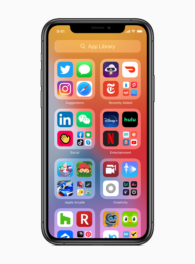
this is an unpopular opinion but i know the aesthetic reason for apple not implementing this for so long, and like eveything, it’s to make money.

android design is pretty good, but user created android phones home screens can often look pretty hateful, often with 4-6 screens of more empty space than icons, tons of widgets with an inconsistent design scheme, random half empty folders and a notification bar overcrowded with overshrunk icons. android phones often look like old Windows XP desktops—even on flagship distributions.

in contrast to google, apple cares what your phone looks like because they have a highly visual brand.

apple, by not allowing placement anywhere intentionally enforced a consistent top-left to bottom-right aesthetic which is now ubiquitous to the brand. among other design decisions, the result is that when you blur your eyes and look at a phone home screen you can tell whether it is apple or not.

  • but the functionality is worse, yes i know.
  • but it actually does look worse too, to you maybe, but not to apple. my belief is they did this for the same reason they put the magic mouse’s lighting port on the bottom (to keep users from always using it plugged in. which looks “ugly”).

the power of a strong and unmistakable brand is incomparable. in many cases, the value of a brand can even outperform raw product utility when it comes to customer satisfaction, a theory which i believe apple has been leveraging in this case very much intentionally despite the seeming paradox of utility.

edit: already getting downvoted to heck i should have known better than to be aware of basic marketing principles lol. i promise you im not defending apple im just explaining why they did this to make more money.
load more comments (21 replies)
[–] [email protected] 144 points 11 months ago (7 children)

Every modern release of iOS is more like Android, and every modern release of Android is more like iOS. Welcome to convergent evolution.

By 2030, the only major difference between Android and iOS will be that, when you hit the bottom of a scrolling page, one will be a little bouncy and the other will be a little stretchy.

People will still fight over which OS is the best.

load more comments (6 replies)
[–] [email protected] -1 points 11 months ago (12 children)

I can't imagine the thundering applause the mindless morons will erupt into when Tim Cook announces on stage that you'll be able to customize your home screen.

iPhones are super popular...? What a fucking joke

load more comments (12 replies)
[–] [email protected] 164 points 11 months ago (10 children)

What an amazing cutting edge breakthrough. Truly frontier technology. The mind boggles.

[–] [email protected] 40 points 11 months ago (7 children)

I thought we’d seen it all when they finally let people change the default notification sound in iOS 17!

load more comments (7 replies)
load more comments (9 replies)
[–] [email protected] 7 points 11 months ago

I'll believe it when i see it

[–] [email protected] 10 points 11 months ago

Oooh wow will they let you change your brightness and font too?

load more comments
view more: ‹ prev next ›