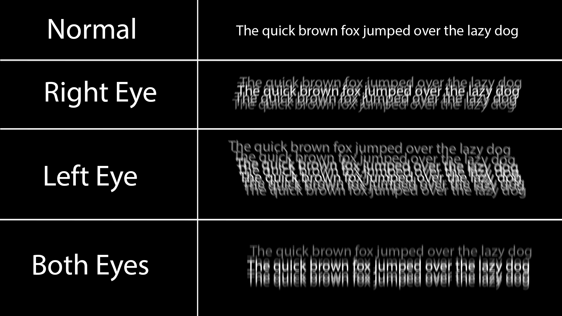
Just a friendly reminder that there's accessibility problems with dark themes.
For me dark themes look like this because I have astigmatism:

Black on white doesn't have this issue because all the white around it does is slightly blur into the black text and makes it a little grey at worst.
Any dark theme for a longer period of time also causes the white text to burn in my retina for a couple minutes, and I just see lines when I look away, and also makes reading a long article difficult and painful.
Dark themes look so much better, but keep in mind some people have very good reasons to prefer light themes. There's no need for dark theme elitism.
