Can't go away from Breeze Dark.
Linux
From Wikipedia, the free encyclopedia
Linux is a family of open source Unix-like operating systems based on the Linux kernel, an operating system kernel first released on September 17, 1991 by Linus Torvalds. Linux is typically packaged in a Linux distribution (or distro for short).
Distributions include the Linux kernel and supporting system software and libraries, many of which are provided by the GNU Project. Many Linux distributions use the word "Linux" in their name, but the Free Software Foundation uses the name GNU/Linux to emphasize the importance of GNU software, causing some controversy.
Rules
- Posts must be relevant to operating systems running the Linux kernel. GNU/Linux or otherwise.
- No misinformation
- No NSFW content
- No hate speech, bigotry, etc
Related Communities
Community icon by Alpár-Etele Méder, licensed under CC BY 3.0
I have astigmatism, so I can't work with dark themes. I can't read correctly when everything is black around. For me, the perfect theme is the one that has a black window manager, gray variations on specific widgets, and white windows (the background desktop image I prefer it to be blue-ish). Basically, to work properly, I need a mostly light, but mixed environment that provides contrast. Not all white, and definitely not all black. So far, I haven't found such a theme, because no GUI environment allows for such specificity in theming for the various widgets. Although the default Gnome theme ain't too bad.
Huh, I should look into that - I have astigmatism and with LCD & OLED monitors its much easier for me to read light text on dark background.
The font effects the clarity for me much more.
I use a Medium theme on my desktop. It's not dark or light. It really works for me.
I found it here, https://github.com/blue-mood/blue-mood-kde-color-scheme
I was actually looking for a Med-Dark charcoal theme and decided to try this first. I've used it for years now.
I tried making a KDE theme too and it either looks like that, or random parts are colored differently.
But everything blue... haha no thanks
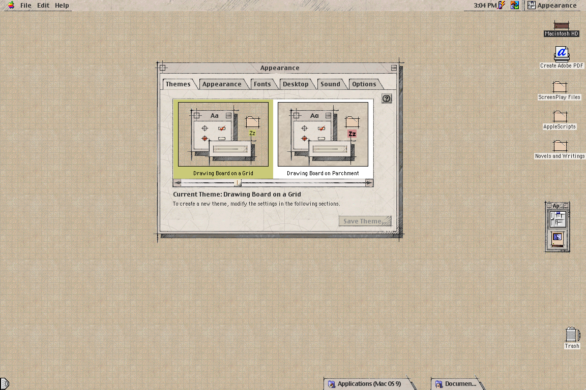
Not what you asked (Plasma theme), but my favorite UI theme since always has been MacOS Drawingboard:
https://www.appimagehub.com/p/1219916
Wishing it was possible on Linux for +20 years..
If you add an "!" Before the image link it is displayed in line!

To be honest, this seems to me like a pretty bad take with weird and kind of BS arguments. Why are professional designer, both those working for some of the biggest tech companies and those working in open source project, making these choices? It couldn't be for actual reasons or because they actually prefer it like that. No, they are "afraid of color". Or implying that dark theme exist because of these black on white themes, as a mean to escape it. It just weird backwards logic to justify his taste and shouldn't be necessary to just state that he prefer a different kind of themes.
To me, the Windows themes he showed as positive examples look way to cluttered and busy, even though they don't show this much information. I don't need the theme to be "exiting", I need them to display the information in an easily readable way. And dark theme aren't there just for people who dislike the modern light theme. Having a light and a dark theme (and ideally having the app follow your system preference) actually serves a purpose. You can actively switch between them depending on the context, the time of day, the brightness of the room or any other reason to make the screen easily readable and comfortable to look at.
Layan with a transparent Kvantum theme
layan looks so nice but it's so slow :(
dark themes are fine but they're horrible on TN/cheap IPS panels
Why is that?
the contrast of black on white isn't uniform because of bad viewing angles
Oh, that trick where you could make the screen unreadable by tilting it far back enough.
That's why I use light mode, looks miles better in my IPS