This is hilariously bad.
It doesn't take into account so many things, and it's extremely misleading.
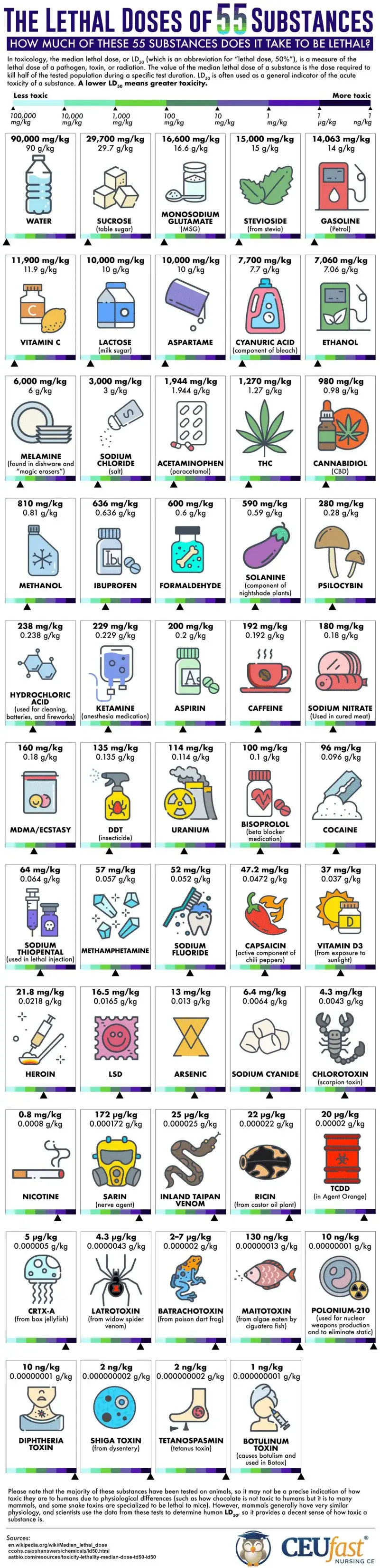
Most of these chemicals don't ever appear in products in their pure form, so there's so much here that simply isn't relevant.
There's also consideration here that everything is by weight, and it makes sense to create that as a standard, but many of the pure forms of these items are far more dense than you would expect. One that stands out is uranium. A gram of it would be incredibly small, approximately 0.05 cm cubed. 1 lb is around 1.45" cubed (for my American friends).
So it would be an insanely small amount. Meanwhile water is insanely light by comparison. While also safer per gram, so it's an insanely large amount of water before any damage can be done while a relatively small rock of uranium can tear your DNA apart.
The whole chart is wildly misleading. It might be accurate, though, I have no idea if it is, but the fact is that it makes it seem like normal every day compounds like vitamin B will kill you at lower doses than uranium. While technically true based on weight, it makes uranium seem relatively safe by comparison and bluntly it's not. Even the smallest amount of pure uranium, which this chart would regard as "safe", would cause you to become incredibly sick for a very long time.
I hope nobody gathers "new" information from this chart and decides to do something stupid; but honestly, there's a lot of idiots in the world, and if anyone is that dumb, I wonder if the average intelligence of the planet might increase a bit.