this post was submitted on 01 Mar 2024
940 points (94.3% liked)
memes
10190 readers
2320 users here now
Community rules
1. Be civil
No trolling, bigotry or other insulting / annoying behaviour
2. No politics
This is non-politics community. For political memes please go to [email protected]
3. No recent reposts
Check for reposts when posting a meme, you can only repost after 1 month
4. No bots
No bots without the express approval of the mods or the admins
5. No Spam/Ads
No advertisements or spam. This is an instance rule and the only way to live.
Sister communities
- [email protected] : Star Trek memes, chat and shitposts
- [email protected] : Lemmy Shitposts, anything and everything goes.
- [email protected] : Linux themed memes
- [email protected] : for those who love comic stories.
founded 1 year ago
MODERATORS
you are viewing a single comment's thread
view the rest of the comments
view the rest of the comments

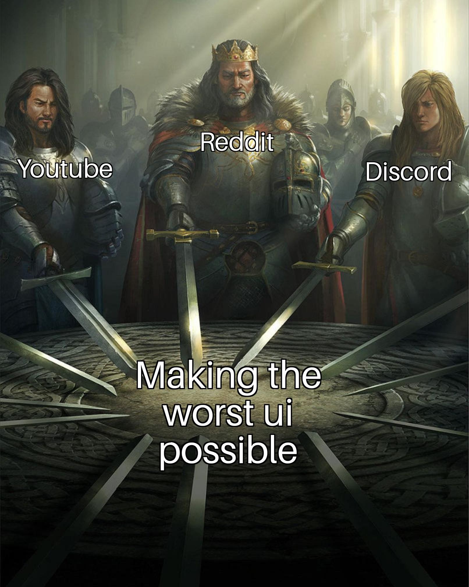
The UI of Youtube is actually not bad. What is bad is how the search function has gone to shit, constant promotion of youtube Shorts taking up half the screen, and the algorithm getting steadily worse at recommending videos.
The interface itself is pretty easy to navigate.
I really don't like how hitting the back button minimizes the currently playing video instead of going back to the previous played video, personally
Youtube 2012 loaded in 1 second on a 5MBit line. HTML, CSS and JS for a page was a few hundred kilobytes.
You can profile the current "responsive" version in your browser. It might not look horrible but it's a technical abomination. I doubt it'll even load anymore in a browser from 2012.
100% certain that if they kept their 2012 UI, we'd be complaining about how outdated their UI is.
No? That would be true if we were the Twitter community. But, for Lemmy, I am pretty sure most people that are on Lemmy fancy Reddit's outdated old.reddit.com UI as well because it's more simple. Things are much lighter, but still work.
Well luckily we don't use browsers from 2012. Thanks god for that. Modern browsers and web standards are so much better.
I do feel like the mobile app has been getting progressively buggier over the last year. Maybe it's just me but the mini-player has been glitching out for months and other weird stuff has been getting more prevalent like yesterday I had the YouTube play button icon stretched and distorted as an overly across the whole app until I restarted it and creating a queue didn't work until I started a new video manually.
I hate the app so much, it always starts to play random shit while I'm just browsing/searching.
I couldn't tell you. I ditched it for GrayJay since it was in alpha and couldn't be happier.
imo loading several video recommendations while im just scrolling through comments is very bad, especially because the API calls are seperate and load both sides seperately. huge waste of bandwith when im only interested in the text, which is barely any bandwidth
https://www.youtube.com/results?search_query=REPLACETHISQUERY&sp=CAI%253D
this string isn't too bad. there are some others but this is my default query string.