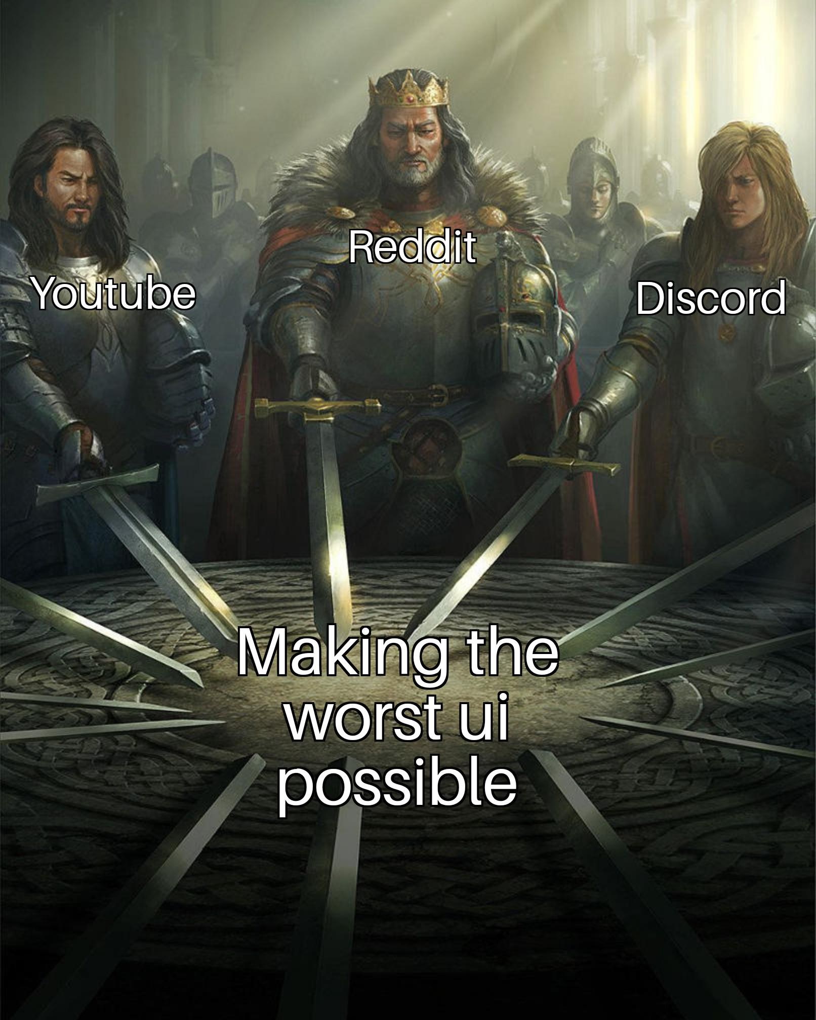
I just started TemTem and the UI there is just CLUNKY.
memes
Community rules
1. Be civil
No trolling, bigotry or other insulting / annoying behaviour
2. No politics
This is non-politics community. For political memes please go to [email protected]
3. No recent reposts
Check for reposts when posting a meme, you can only repost after 1 month
4. No bots
No bots without the express approval of the mods or the admins
5. No Spam/Ads
No advertisements or spam. This is an instance rule and the only way to live.
Sister communities
- [email protected] : Star Trek memes, chat and shitposts
- [email protected] : Lemmy Shitposts, anything and everything goes.
- [email protected] : Linux themed memes
- [email protected] : for those who love comic stories.
Steam, tho?
Reddit was by far the worst.
Github's ui can honestly be pretty goofy sometimes. I feel like I'm navigating the website for the first time every time I use it, which is multiple times a week. Where's that setting? Which settings panel is it in? Where do I find that repo that I contribute to but don't own?
They all want to give you just enough control to make you think you chose what their algorithm recommended for you.
Spotify tried making their UI look like Instagram or tick tock. It was a push update change with no way to revert to normal. What you'd normally see on the screen where there was multiple pieces of information was now a shitty video clip previewing the play list or title being suggested. Everything was moved around.
I used it once to go to work. I was receiving my subscription for free from a friend. I called my friend to tell him that I deleted my account because I couldn't change the UI back to normal. I pay for a tidal subscription now.
I remember the first day I got on Discord. My friend said, "it's like IRC." Yeah, the chat part. Once I figured out how the fuck I could get to the place to chat with my friend.
YouTube isn't even following material design 3...
i like the YouTube ui excluding the channel page
