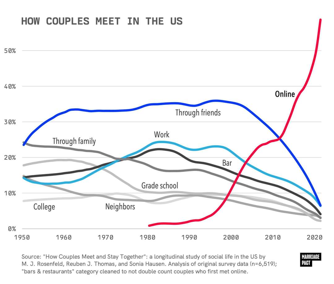
It's been trending this way for years, but seeing it graphed out like this is shocking.
What do you think are the effects of this drastic change?
A place to share and discuss visual representations of data: Graphs, charts, maps, etc.
DataIsBeautiful is for visualizations that effectively convey information. Aesthetics are an important part of information visualization, but pretty pictures are not the sole aim of this subreddit.
A place to share and discuss visual representations of data: Graphs, charts, maps, etc.
  A post must be (or contain) a qualifying data visualization.

  Directly link to the original source article of the visualization
    Original source article doesn't mean the original source image. Link to the full page of the source article as a link-type submission.
    If you made the visualization yourself, tag it as [OC]

  [OC] posts must state the data source(s) and tool(s) used in the first top-level comment on their submission.

  DO NOT claim "[OC]" for diagrams that are not yours.

  All diagrams must have at least one computer generated element.

  No reposts of popular posts within 1 month.

  Post titles must describe the data plainly without using sensationalized headlines. Clickbait posts will be removed.

  Posts involving American Politics, or contentious topics in American media, are permissible only on Thursdays (ET).

  Posts involving Personal Data are permissible only on Mondays (ET).
Please read through our FAQ if you are new to posting on DataIsBeautiful. Commenting Rules
Don't be intentionally rude, ever.

Comments should be constructive and related to the visual presented. Special attention is given to root-level comments.

Short comments and low effort replies are automatically removed.

Hate Speech and dogwhistling are not tolerated and will result in an immediate ban.

Personal attacks and rabble-rousing will be removed.

Moderators reserve discretion when issuing bans for inappropriate comments. Bans are also subject to you forfeiting all of your comments in this community.
Originally r/DataisBeautiful
It's been trending this way for years, but seeing it graphed out like this is shocking.
What do you think are the effects of this drastic change?
Right, I get that it doesn't strictly rule it out directly, but it's a surprising discrepancy. That 53% is just for under 30s too:
while the purported figure for people having met their partner through an app is for all demographics. The number of people who are partnered vs single is 70%. If 60% of those met via dating apps, that's 42% of the total. Which seems probably still more than the number of people who have ever tried them, and that would only check out with the absurdly generous assumption that those apps have a near perfect success rate and almost no one who uses them goes back to other methods.
You're still not slicing thin enough.
If 60% of the couples who got together in 2022 met on dating apps, and people who got together in 2022 constitute 5% of all couples, that's still possible (and probable), then those couples will still only be 3% of the total. Pretty easy to add up to 11% that way when you start including all the 10-year-old relationships, the 20-year-old relationships, etc.
If it were flat at 60% for all years then no, it wouldn't add up.
But if you look at the area under the curve, it's still pretty small comparatively speaking because it's such a recent phenomenon. (And not every year would actually count equally for the whole data set, but it's displayed in this chart as every year adding up to 100% for its own year.)