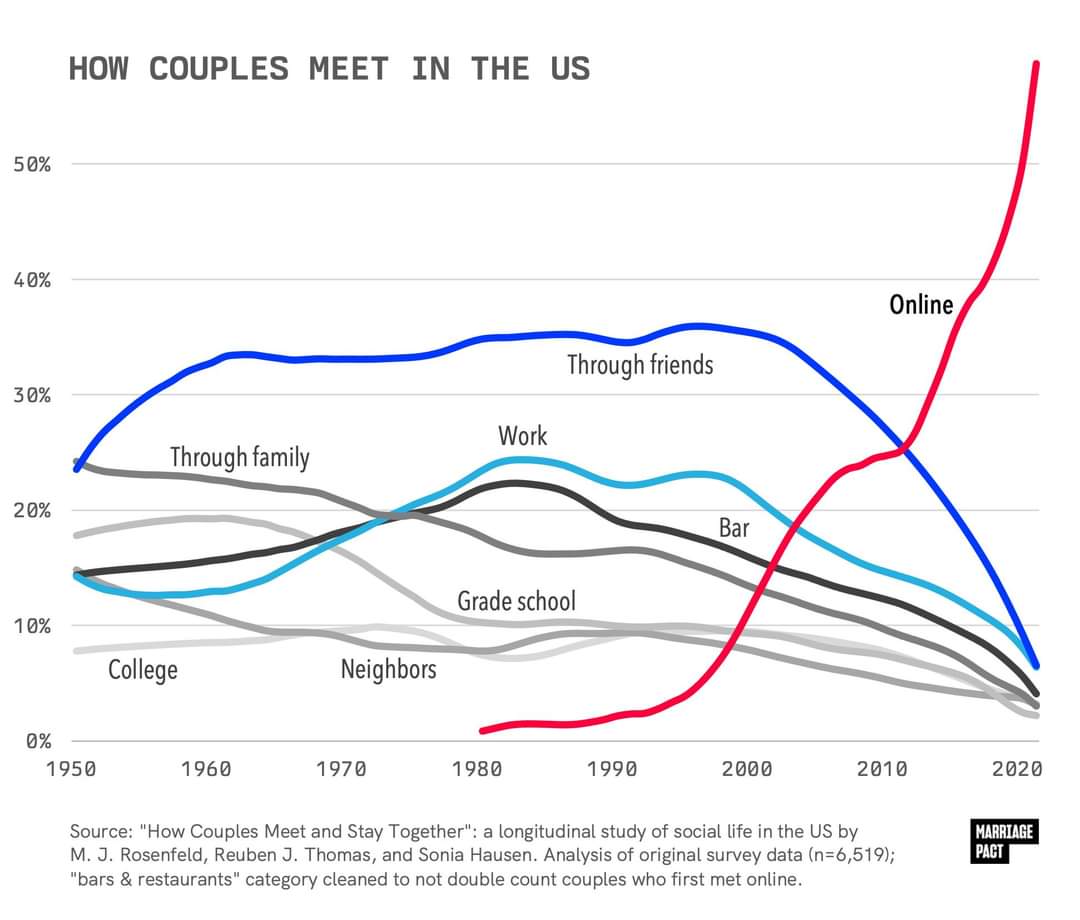
It's been trending this way for years, but seeing it graphed out like this is shocking.
What do you think are the effects of this drastic change?
A place to share and discuss visual representations of data: Graphs, charts, maps, etc.
DataIsBeautiful is for visualizations that effectively convey information. Aesthetics are an important part of information visualization, but pretty pictures are not the sole aim of this subreddit.
A place to share and discuss visual representations of data: Graphs, charts, maps, etc.
  A post must be (or contain) a qualifying data visualization.

  Directly link to the original source article of the visualization
    Original source article doesn't mean the original source image. Link to the full page of the source article as a link-type submission.
    If you made the visualization yourself, tag it as [OC]

  [OC] posts must state the data source(s) and tool(s) used in the first top-level comment on their submission.

  DO NOT claim "[OC]" for diagrams that are not yours.

  All diagrams must have at least one computer generated element.

  No reposts of popular posts within 1 month.

  Post titles must describe the data plainly without using sensationalized headlines. Clickbait posts will be removed.

  Posts involving American Politics, or contentious topics in American media, are permissible only on Thursdays (ET).

  Posts involving Personal Data are permissible only on Mondays (ET).
Please read through our FAQ if you are new to posting on DataIsBeautiful. Commenting Rules
Don't be intentionally rude, ever.

Comments should be constructive and related to the visual presented. Special attention is given to root-level comments.

Short comments and low effort replies are automatically removed.

Hate Speech and dogwhistling are not tolerated and will result in an immediate ban.

Personal attacks and rabble-rousing will be removed.

Moderators reserve discretion when issuing bans for inappropriate comments. Bans are also subject to you forfeiting all of your comments in this community.
Originally r/DataisBeautiful
It's been trending this way for years, but seeing it graphed out like this is shocking.
What do you think are the effects of this drastic change?
I think this graph is fake. The way the data is presented is confusing, but the study they are citing doesn't seem to confirm anywhere close to the 60% figure, it seems to be saying 11.5% instead: https://www.icpsr.umich.edu/web/ICPSR/studies/38873/datasets/0001/variables/W1_Q24_MET_ONLINE?archive=icpsr
This lower figure also seems to line up with other studies: https://www.pewresearch.org/short-reads/2023/02/02/key-findings-about-online-dating-in-the-u-s/
The graph is branded with the logo of "Marriage Pact", which seems to be a dating app/service targeting college students. Maybe they made it as a form of (deceptive, unethical) advertising? I don't know, reverse image search just shows similarly unsourced social media posts, I can't confirm anything about its origins.
I think you've linked the variable of all couples regardless of when they got together. If 11.5% of all couples met online, whether they met in 2023 or 1975, then that doesn't actually disprove the line graph (which could be what percentage of couples who met in that particular year met through each method).
The researcher who maintain the data set you've linked published an analysis of the 2017 data showing that it was approaching 40% towards the most recent relationships being formed, in 2017. I could believe that post-covid, the trends have approached 60%.
It could be that. I'm noticing now that the study I linked has a note about a sampling error they made:
So another possibility is that the data used for the graph is wrong because of a big correlation between sexual orientation and preference for online dating and it was made before this was corrected.
I don't think the figures are intuitively implausible, mostly I'm just bothered by the apparent lack of any way to confirm the authenticity of the graph and its relationship to the source material, or get an authoritative answer to the question of how prevalent online dating is.
One reason to doubt them though, the other article I linked says that as of 2022
Which is the demographic that uses them the most. So it doesn't make sense that more people would have met their current partner through a dating app than have ever used one.
The last part doesn't mean that. It's 53% of the whole population under 30. Could be a higher percentage of the ones having a partner/married. Since the total is smaller if you just take the ones having a partner. Removing the ones still single/didn't meet anyone.
Right, I get that it doesn't strictly rule it out directly, but it's a surprising discrepancy. That 53% is just for under 30s too:
while the purported figure for people having met their partner through an app is for all demographics. The number of people who are partnered vs single is 70%. If 60% of those met via dating apps, that's 42% of the total. Which seems probably still more than the number of people who have ever tried them, and that would only check out with the absurdly generous assumption that those apps have a near perfect success rate and almost no one who uses them goes back to other methods.
You're still not slicing thin enough.
If 60% of the couples who got together in 2022 met on dating apps, and people who got together in 2022 constitute 5% of all couples, that's still possible (and probable), then those couples will still only be 3% of the total. Pretty easy to add up to 11% that way when you start including all the 10-year-old relationships, the 20-year-old relationships, etc.
If it were flat at 60% for all years then no, it wouldn't add up.
But if you look at the area under the curve, it's still pretty small comparatively speaking because it's such a recent phenomenon. (And not every year would actually count equally for the whole data set, but it's displayed in this chart as every year adding up to 100% for its own year.)