this post was submitted on 28 Aug 2024
0 points (NaN% liked)
Data is Beautiful
5309 readers
9 users here now
A place to share and discuss visual representations of data: Graphs, charts, maps, etc.
DataIsBeautiful is for visualizations that effectively convey information. Aesthetics are an important part of information visualization, but pretty pictures are not the sole aim of this subreddit.
A place to share and discuss visual representations of data: Graphs, charts, maps, etc.
  A post must be (or contain) a qualifying data visualization.

  Directly link to the original source article of the visualization
    Original source article doesn't mean the original source image. Link to the full page of the source article as a link-type submission.
    If you made the visualization yourself, tag it as [OC]

  [OC] posts must state the data source(s) and tool(s) used in the first top-level comment on their submission.

  DO NOT claim "[OC]" for diagrams that are not yours.

  All diagrams must have at least one computer generated element.

  No reposts of popular posts within 1 month.

  Post titles must describe the data plainly without using sensationalized headlines. Clickbait posts will be removed.

  Posts involving American Politics, or contentious topics in American media, are permissible only on Thursdays (ET).

  Posts involving Personal Data are permissible only on Mondays (ET).
Please read through our FAQ if you are new to posting on DataIsBeautiful. Commenting Rules
Don't be intentionally rude, ever.

Comments should be constructive and related to the visual presented. Special attention is given to root-level comments.

Short comments and low effort replies are automatically removed.

Hate Speech and dogwhistling are not tolerated and will result in an immediate ban.

Personal attacks and rabble-rousing will be removed.

Moderators reserve discretion when issuing bans for inappropriate comments. Bans are also subject to you forfeiting all of your comments in this community.
Originally r/DataisBeautiful
founded 2 years ago
MODERATORS
you are viewing a single comment's thread
view the rest of the comments
view the rest of the comments

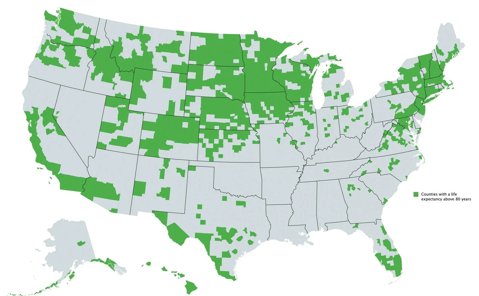
It's basically where people exercise more and/or have an outdoors-y culture.
States that exercise most:
If that map was more granular, I bet it would match very closely.
Lazy ass Rhode Islanders.
It's hysterical because the conservatives in the South are always saying how those pansy liberals wouldn't know a hard day's work if it hit them in the head. And here you have evidence that many of those states are among the worst and the rest are orange.
The hardest working states are the ones right down the middle, from North Dakota to Texas. The least hardworking are generally the northeast (excepting the redder states of NH and ME) and west coast. So.
Thanks for this info! I really appreciate learning more.
I think you have that backward. The red is showing the higher percentage of people who exercise. Which if the case, states around Mississippi exercises the most, while those in Washington and Oregon exercise least. This could suggest those those in warmer climates exercise more.
The first map shows life expectation over 80+, I believe to correlate more with affluence. Basically the more money you have, the higher the chance of living longer
No, it's a map of what percent say they don't exercise at all. I should have included the legend and title, but I've corrected the verbiage in the original post.
Are you of the opinion that north dakota, south dakota, Vermont, New Hampshire, etc are filled with wealthy people? I know you want to hate rich people, which is great, but that doesn't seem to be the whole story here.
Well, yeah ok. It's understandable now that you fixed the wording. Why would I hate rich people? Why are you making such an assumption? It's absolutely wrong anyway.