Typography & fonts

514 readers
31 users here now

A community to discuss and share information about typography and fonts

Sibling community:

[email protected]

Rules of conduct:

The usual ones on Lemmy and Mastodon. In short: be kind or at least respectful, no offensive language, no harassment, no spam.

(Icon: detail from the title of Bringhurst's Elements of Typographic Style. Banner: details from pages 6 and 12, ibid.)

founded 2 years ago
MODERATORS
1
5
www.theamdash.com (www.theamdash.com)
submitted 10 hours ago by [email protected] to c/[email protected]
2
3
4
13
Font activations (robhorning.substack.com)
submitted 4 days ago by [email protected] to c/[email protected]
5
6
7
8
9
10
11
12
13
14
15
16
14
Nebula Sans (nebulasans.com)
submitted 1 month ago by [email protected] to c/[email protected]
17
18


I quite like the new adaita font, though it has a bit less character than that new font open suse published a little while back.

But something more neutral isn't strictly a bad thing for an interface font I suppose

Hope y'all are having a good day :)

19
 
 
20


cross-posted from: https://lemmy.ml/post/27410537

Note that there still have been no studies on its efficacy. At worst, it is a great font to avoid ambiguity between characters.

21
22
23
12
The Scourge of Arial (www.marksimonson.com)
submitted 2 months ago by [email protected] to c/[email protected]
24


cross-posted from: https://feddit.org/post/8032101

From the author of the "Shift Happens" book that came out a little while ago.

spoilerIt's Gorton

This is now several crossposts deep but I wanted to share here :)

25


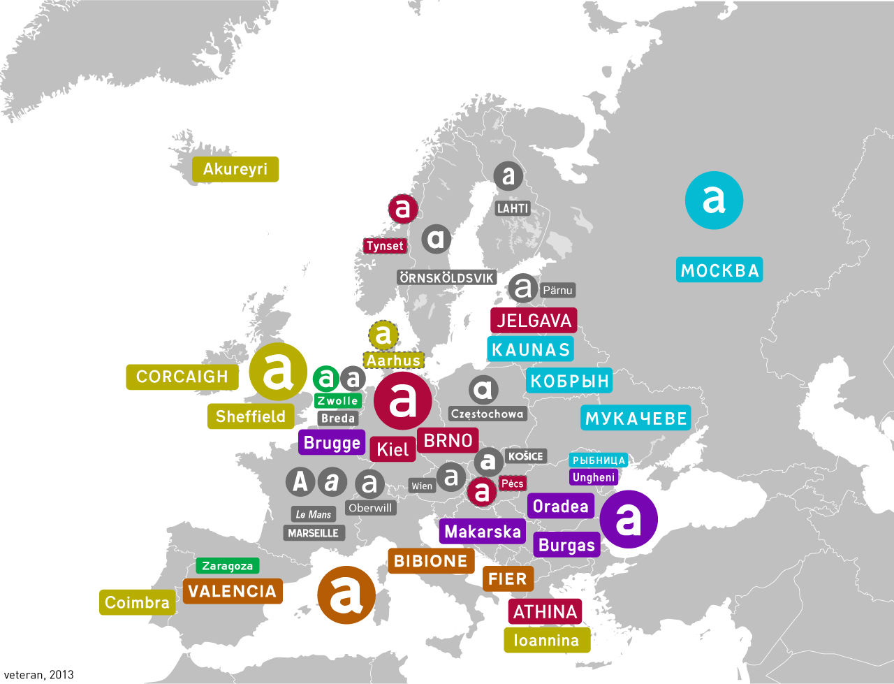
This is a cross-post from the map enthusiasts comm :)

view more: next ›