nimpnin
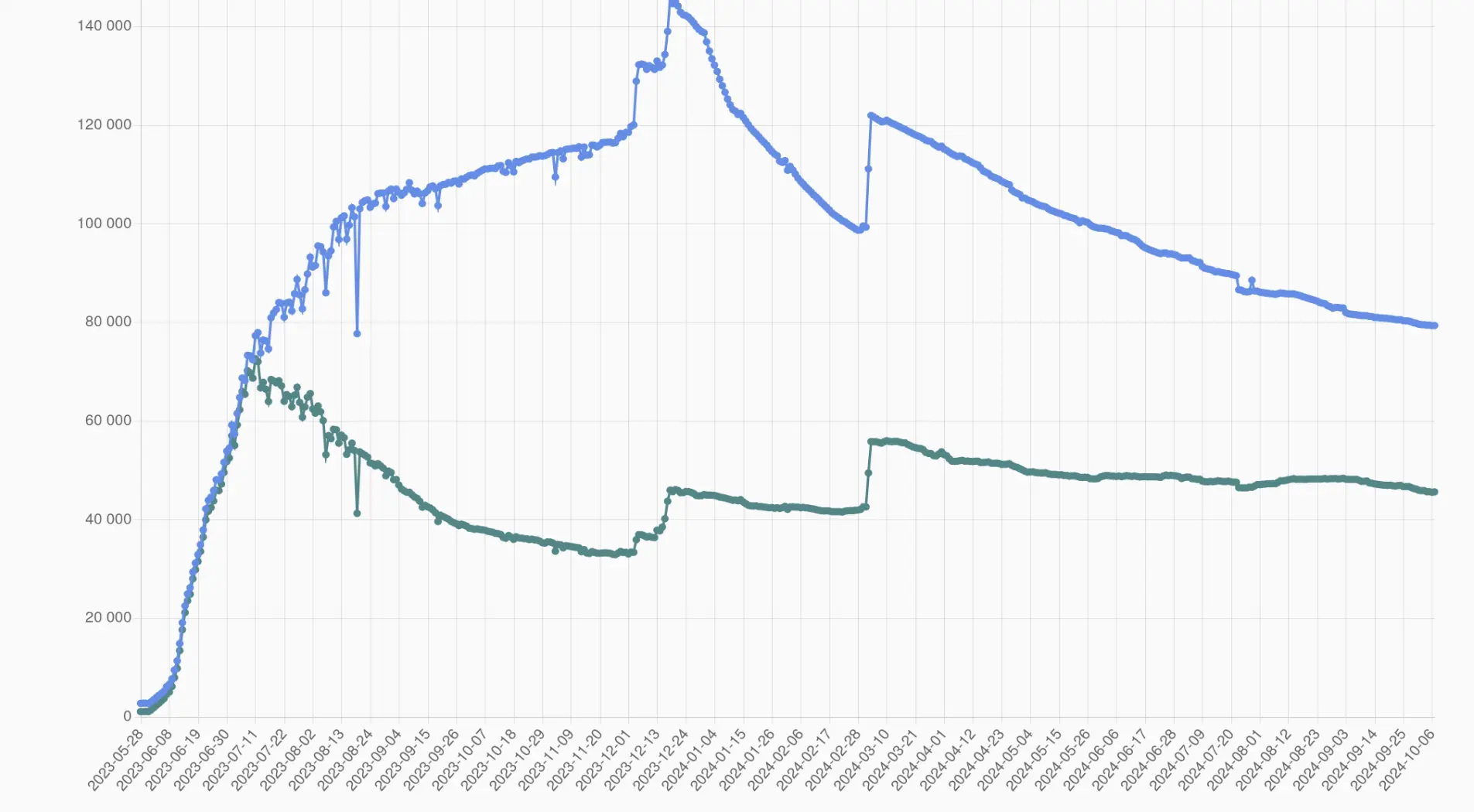
If you start at 0, you see exactly what you're supposed to: there is a rather negligible trend in the given timeframe.

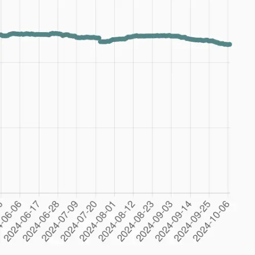
That's the point. The number of users has very slightly declined in the past few months. Under the original plot, you have a lot of people (rightly) misinterpreting the data, and saying that a lot of users are leaving the site.
That's why you start at 0. So that people interpret the data correctly.
Let's put that to a test

The same plot with a more reasonable y-axis:

Active users (monthly is what you should be looking at) is very slowly declining, however we are still above the level that we were before the most recent influx.
If you start the plot at 0, you can distinguish between a strong trend, a weak trend and a lack of a trend. This one is terrible for gauging that.
Insane to start the plot at 45k. The rate of decline is rather minimal
Both of these claims are kinda misguided. The brain is able to detect very short flashes of light (say, 1 thousandth of a second), and other major changes in light perception. Especially an increase in light will be registered near instantly. However, since it doesn't have a set frame rate, more minor changes in the light perception (say, 100 fps) are not going to be registered. And the brain does try to actively correct discontinuities, that's why even 12 fps animation feels like movement, although a bit choppy.
I am intrigued, how can a reply to that get 44 downvotes
I have never had that happen and I buy my bulbs from the grocery store
You talk as if you don’t understand how plots work. If the change looks like a 90% drop, that’s how it’s going to be perceived.
Moreover, if you do start from 0 you instinctively see the 5% drop, and can make the conclusion that it’s big or small yourself. If you don’t do that, you need to calculate numbers. People don’t do that. They see line go down, and get the impression from that.
Any drop would look the same on the initial plot. 5%, drop 50% drop, 0.005% drop. The ’start your y axis at 0’ rule has a lot of exeptions, but this is not one of them. In fact, it’s the quintessential example of lying with a plot.
If you want to see the actual values for each timestep, there are better tools for that. Such as a table.
Explaining all of this feels bizarre. You are de facto trolling by this weird contrarianism.