One of the 200 Japanese wood carvings Manet collected in his lifetime. The introduction of Japanese art to the west had a huge impact, it is said to be the influence of the impressionist movement in france.

If you're really interested...
Let's say you want to know how an ad has affected your sales since it was released 3 months ago.
You could put every single sale as a dot on a graph, but it probably wouldn't mean anything. Even if it showed the dots gradually getting higher on the chart. Was that caused by the ad or does it happen every year at the se time? What other factors could have caused this.
So I'll pause right there and say you will never know. You will never know all the forces that affect trends. You can get relatively close, but not. Does weather affect your sales? Delivery time? Internet sentiment?
So that's not very scientific, right? You need to know and control all variables to test an outcome.
Anyway, so you have a graph with dots and it may or may not mean anything. You think, ok what was last year's sales during these same 3 months?
So you get last year's data and plot the sales as dots in a different color. Now you have a graph with a ton of dots of two colors, and best case scenario: the dots for this year are higher than last year.
Is it responsible to stop there? If it were me, and my money, I'd want to make sure. So then you'd compare data from two years ago. Now you have a chart with three colors of dots.
Again, best case, this year is higher than that year too. However, as always is the case, the dots are getting difficult to understand, especially for people that don't know anything about data. You need to make things simple to digest.
So you say "I'll make an average of each month" and that will show how the averages are getting bigger, compared to previous years. Great!
So you average all the dots by month and plot them on a graph, and it looks great. But there are a few months that don't prove what you saw in the raw data. For instance, one month, two years ago, you landed a big contract and sold an astronomical number of units. So that month is the biggest one of all.
Ofuck.jpeg
Ok, no problem, you'll just remove those two data points, because they are skewing the day. Again, this is best case. Most of the time you will not be sure if these data points are errors in the data or Genuine sales. But anyway...
Luckily there is a method for removing "outliers" it's called standard deviation, and it's basically an equation that figures out what is an acceptable outlier and what isn't.
Again, I'll pause here to point out how unscientific this is. You are removing data because it doesn't follow the trend you want to show. And this is a perfectly acceptable practice in data analytics. And I'll point out something else, what was the affect of those contracts on your normal business sales? Did you make relatively less sales because of it? Is it responsible to completely remove those sales? Is it ethical?
And this is all very minor stuff in analytics. The more detailed the question, the more the data is "cleansed" by equations that get progressively more complicated - the more ethically vague the data is.
Data analyst here. It really do be like that. You can use stats to prove anything.
Yfw they say data doesn't lie. Looool
Right. Magically, everyone on the Internet has become infatuated with communism out of thin air over the last few years. Must just be my paranoia to surggest influence from a hostile government.
Lemmy is whatever we make it, except for the communism posts that love communism until they realize workers need representation. I half believe those are Chinese bots or high school kids who are stupid enough to believe the Chinese bots.
One of the 200 Japanese wood carvings Manet collected in his lifetime. The introduction of Japanese art to the west had a huge impact, it is said to be the influence of the impressionist movement in france.
Any mention of a server room reminds me of the fable of the guy, we'll call him Mike, who unplugged the Internet.
I can't remember where I read it, I think it was greentext on Reddit years ago.
So Mike is an intern, and due to some weird circumstances he becomes the only network admin in the building. Well, one day he doesn't esnt feel like working, so on his way in, he stops by the server room and unplugs the internet.
He then goes to his desk like a normal day. Then he starts getting phone calls. Everybody is freaking out because there is no Internet. So he begrudgingly descends into the server room and starts playing video games on his phone.
Close to the end of the day, he plugs the Internet back in and ascends a hero to the employees because they think he's been working hard all day to give them internet.
Well, back in 19 and dickaty-2 there was whisperings of a movie tie-in. The money spent, well I won't bore you with that, wouldn't mean much these days. But let's say it was epic - do people still say that? Boy, they used to.
Anyway, they rushed to production and built a million billion cartridges. Do you know what those are? These little black boxes that had the whole video game on these massive chips. Of course they were small in those days.
So they send it to market and it doesn't work. So then nobody bought it. And did you know, they buried all those cartridges way out in the desert some where, and that's where the aurora borealis comes from - the sky used all those chips to paint pretty pictures. And the video game industry began a bloodless vendetta that's still around today, to make up for that blunder by making as much money as possible, even if the game's not worth it.
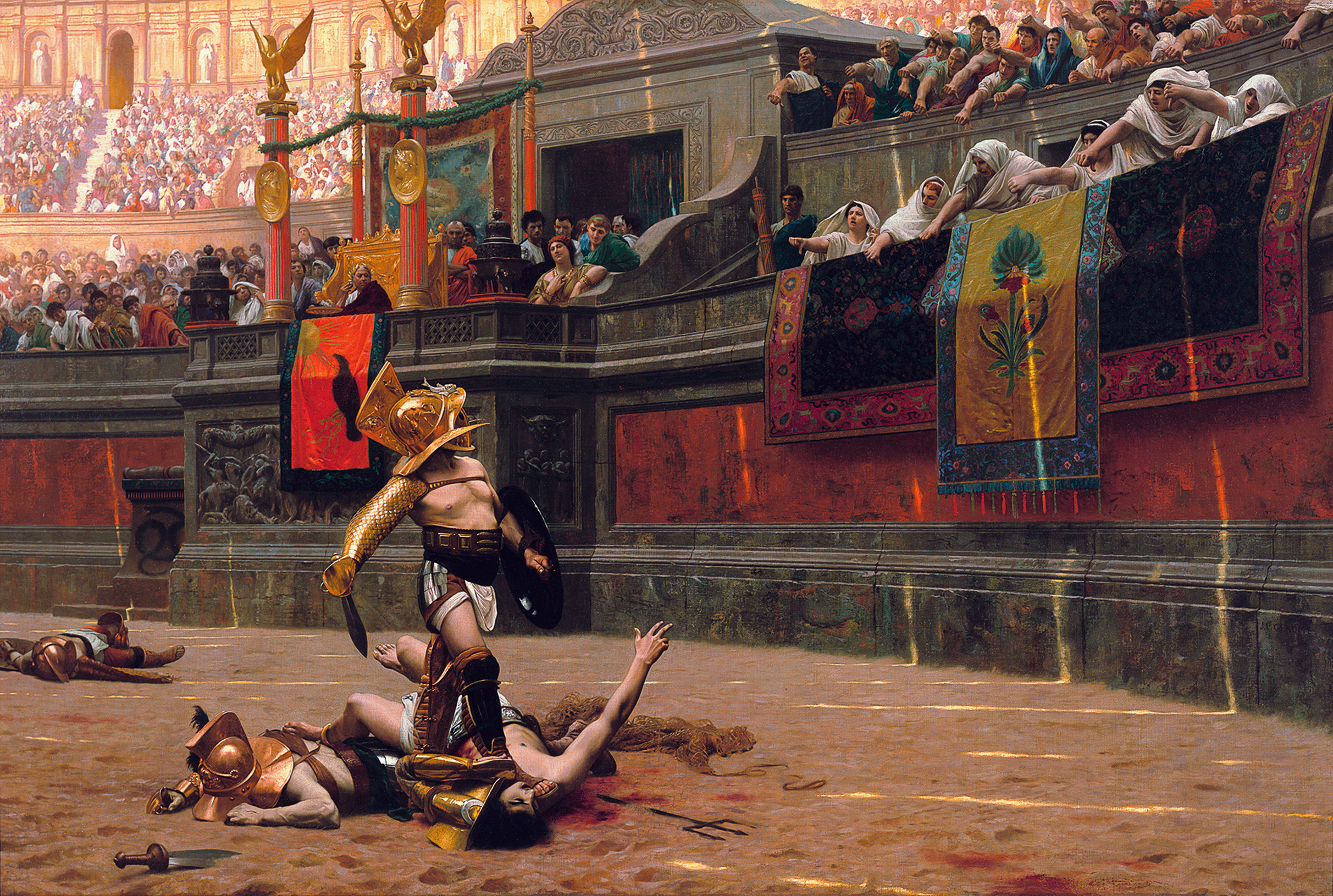
Pollice Verso is latin for "with a turned thumb".
I think he painted and sketched before that, but this was the first thing he painted on an easel - but there is speculation that it's not his.
Come gather round the stump young'ns, and I'll tell you a tale of when video games didn't need to be connected to the Internet.
Believed to be Michelangelo's first easel painting, completed when he was 12 or 13. Based largely on an engraving by Martin Schongauer, down to the demon's whiskered asshole:
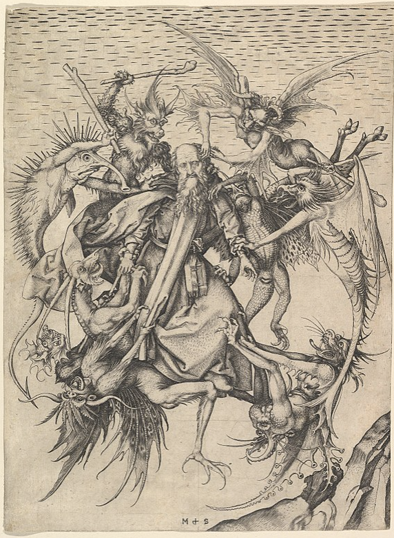
Michelangelo's Temptation is a mishmash of styles, particularly High Renaissance and Late Middle Ages. The foreground, ie St. Anthony being attacked by demons, is indicative of Late Middle Age art, whereas the intricate background is more on par with the Renaissance, which sought to improve on the classical art style (Ancient Greek and Roman) via realism. (https://en.wikipedia.org/wiki/High_Renaissance, https://en.wikipedia.org/wiki/Late_Middle_Ages)
From wikipedia:
The Torment of Saint Anthony (or The Temptation of Saint Anthony is attributed to Michelangelo, who painted a close copy of the famous engraving by Martin Schongauer when he was only 12 or 13 years old. Whether the painting is actually by Michelangelo is disputed. This painting is now in the Kimbell Art Museum in Fort Worth, Texas. It shows the common medieval subject, included in the Golden Legend (a big book of saints from mediaeval times) and other sources, of Saint Anthony (AD 251 – 356) being assailed in the desert by demons, whose temptations he resisted; the Temptation of St Anthony (or "Trial") is the more common name of the subject. But this composition apparently shows a later episode where St Anthony, normally flown about the desert supported by angels, was ambushed in mid-air by devils.
From the Kimbell:
The cleaning of Michelangelo’s Torment of Saint Anthony at the Metropolitan Museum of Art, New York, in 2009, revealed the quality of the small panel. Michael Gallagher, conservator in charge of paintings conservation, removed the layers of yellowed varnish and clumsy, discolored overpaint that obscured the artist’s distinctive palette and compromised the illusion of depth and sculptural form. The technical study accompanying the cleaning provided evidence of pentimenti, or artist’s changes, signifying that the painting is an original work of art and not a copy after another painting.
Comparison of Michelangelo’s work with Schongauer’s print reveals the many ways the novice artist distilled, edited, and expanded his northern source. Most obviously, unlike Schongauer, Michelangelo set the figures against a landscape, one that resembles the familiar Arno River Valley around Florence. In addition, following a trip to the fish market, Michelangelo heightened the naturalism of Schongauer’s demons by painting silvery scales onto the spiny, fishlike monster in the upper left. In translating Schongauer’s black-and-white print into color, Michelangelo also made the creatures more lifelike. (Keith Christiansen has noted that Michelangelo’s idiosyncratic use of shades of lavender, green, and orange invites comparison to his palette in the ceiling frescoes of the Sistine Chapel.)
The young artist introduced the element of fire, which does not appear in Schongauer’s print. A small fire appears in the crevice of the rocky outcrop, flames shoot from the mouth of the demon with squid-like wings at the lower right, and a wooden club wielded by the spiny, fishlike creature has been transformed into a firebrand.
Michelangelo increased the scale of the figures and made thoughtful, calibrated shifts in their placement and the ways they interconnect, which resulted in a complete rethinking of the negative spaces between them. He straightened the tilt of Saint Anthony’s head, altered his expression, added a halo, and simplified the saint’s drapery folds. The artist reframed the heads of the demons by refining the space around them, emphasizing their fantastic, bizarre features. He also intensified the drama by moving the horns of the long-necked demon in the lower left so that the demon below could bite one of them. Overall, these changes produce a more compelling and direct figural group.
While many of Michelangelo’s changes to Schongauer’s composition are obvious to the eye alone, technical analysis carried out during cleaning—which included X-radiography, pigment analysis, infrared reflectography, and close examination under the microscope—has shed light on many other aspects of the artist’s early working methods. Adopting the egg tempera technique still practiced in Ghirlandaio’s studio, Michelangelo covered the background with continuous, parallel, horizontal brushstrokes. He modeled the saint’s face with delicate hatched brushwork over a green underpaint. X-radiography confirmed that Michelangelo executed the painting on a poplar panel and that, in the process of laying in the background, he saved space for the figure of Saint Anthony and two of the demons. The work has survived in excellent condition with only minor flake losses and some wormholes.
The infrared reflectogram mosaic captured by Charlotte Hale at the Metropolitan Museum of Art reveals the character and extent of Michelangelo’s preparatory underdrawing. The artist used two types of underdrawing in The Torment of Saint Anthony: simple, broad, black-brush outlining for the figures and drapery and much finer, more detailed underdrawing in the landscape, perhaps in silverpoint. Since the artist invented the scenery, it likely required greater preparation than the figures, which were modeled after Schongauer. With its fine, curved, parallel hatching, Michelangelo’s underdrawing in the rocky outcrop of The Torment of Saint Anthony resembles the style of his early drawing after Giotto’s fresco The Ascension of Saint John, a copy he made as part of his artistic training.
The infrared reflectogram mosaic also recorded two areas of pentimenti where Michelangelo deviated from his initial underdrawing, confirming that he continued to make critical changes at the moment of painting. He shifted the wooden club held by the spiny, fishlike monster from the angle seen in Schongauer to a more vertical position and pulled in the arc of his long tail to encircle the head of the biting monster.
Examination of the paint surface of The Torment of Saint Anthony under the microscope shows an extraordinary assurance of execution and variety of paint application as well as the effort made by the young Michelangelo to perfect his composition. The heavy layering of paint in some of the demons suggests that the artist’s choice of color evolved as he transformed the black-and-white figures into colored beasts. Michelangelo applied pigment with brushes but then frequently attacked the surface with a sculptor’s tool. He scraped away paint along the back of the spiny, fishlike monster, exposing the underlying gesso and enhancing the sculptural form of the thick scales, which are painted in relief. The artist also sharpened the outlines of the demon with incisions. In a final stage of painting, Michelangelo made numerous adjustments to edges throughout the composition using the light background color. The exacting nature of these corrections suggests his obsession with the refinement of these contours.
The combined techniques of painting in relief, scraping, and incising have been previously noted in The Manchester Madonna and The Entombment, two unfinished works by the artist in the National Gallery, London. When considered together with the documentary evidence of Condivi and Vasari’s biographies as well as stylistic analysis, the technical examination of The Torment of Saint Anthony adds powerful evidence that the Kimbell panel is Michelangelo’s first easel painting.
https://kimbellart.org/content/michelangelo-torment-saint-anthony

Do you have any videos? Can you record tracks and musical production type stuff?
Unlike his Impressionist friends, Degas was an essentially urban painter, who liked to paint the enclosed spaces of stage shows, leisure activities and pleasure spots.
In a cafe, a fashionable meeting place, a man and a woman, although sitting side-by-side, are locked in silent isolation, their eyes empty and sad, with drooping features and a general air of desolation. The painting can be seen as a denunciation of the dangers of absinthe, a violent, harmful liquor which was later prohibited. Parallels have been drawn with Zola's novel L'Assommoir written a few years later and indeed the novelist told the painter: "I quite plainly described some of your pictures in more than one place in my pages." The realistic dimension is flagrant: the cafe has been identified - it is "La Nouvelle Athènes", in place Pigalle, a meeting place for modern artists and a hotbed of intellectual bohemians. The framing gives the impression of a snapshot taken by an onlooker at a nearby table. But this impression is deceptive because, in fact, the real life effect is carefully contrived. The picture was painted in the studio and not in the cafe.
Degas asked people he knew to pose for the figures: Ellen André was an actress, and an artist's model; Marcellin Desboutin was an engraver and artist. The painting cast a slur on their reputations and Degas had to state publicly that they were not alcoholics.
The off-centre framing, introducing empty spaces and slicing off the man's pipe and hand, was inspired by Japanese prints, but Degas uses it here to produce a drunken slewing. The presence of the shadow of the two figures painted as a silhouette reflected in the long mirror behind them is also expressive and significant.

Does anyone have any good advice on variable naming? Here's some of my rules I try to live by:
utils_FooBarisnot in bool names.
_g_VARIABLENAMEcalc_ImportantValueThatWillDecideTheUsersView is better than calc_SumYears if the variable is more important than the others.Edit: I realize I was speaking about function-naming with the prefix stuff.
For variables, I still use prefixes, but for variable type. Even if you define the variables as types, it's still incredibly useful. For instance,
a string is s_MyName,
enumerable is e_MyType,
A number is int or double or whatever i_MyAge or d_MyWeight
This might be obvious for custom objects, but I'd still do it like this p_Person or per_Person.
Seriously it does make a huge difference
For an extra boost to your enjoyment, consider listening to (Rimsky-Korsakov 2nd Symphony, Antar, movement 1: Vengeance)[https://youtu.be/Qd80g7wJWuQ?si=aZoRQ8PcU3_9OR_c]. This was the music that the artist listened to as he created the piece.
A very sad piece indeed. Ivan the terrible's mental illness came to a horrible climax one night when he saw his son's pregnant wife walk by in a nightgown that exposed her under garments. Blind with rage, he struck his son in the head fataly.
The painting depicts Ivan the Terrible, stricken with grief and anguish as his son dies. The son, in tears, forgiving his father in some cosmic understanding as he lay dying.
On the surface, an example of how mental illness, left to take more and more control, can result in horrible consequences.
However, looking at the dates; the event occurred about 300 years before the painting was created. Why?
The painting is an allegory of the assassination of Alexander II. Or rather the atrocity of the action itself and the consequences.
A group of far-left terrorists, bent on removing the autocratic tsarist government, killed A2 with a bomb in 1881; influenced by "Propaganda by the Deed," hoping it would spark a revolution.
The painter not only witnessed the assassination, but also the hanging a few months later of the men who committed the act. He was horrified by the violence, he called them horrors of the contemporary world.
The act of terrorism failed and it would not be for another nearly 40 years, when things had gotten so bad and the tsars so weak that the Bolsheviks were able to succeed and establish a Soviet Republic, but only after killing basically everyone that knew how to do anything: Doctors, Lawyers, Farmers, etc. Leaving the country in tatters and the government free to be run by one person, who would go on to commit awful such atrocities that it made the whole history of the tsars look like childs play in comparison.

Nikola Petrov was a Bulgarian landscape painter and graphic artist; also known for his portrait sketches and watercolors.
He displayed a talent for drawing while still in elementary school. When he was old enough, he went to Sofia and, in 1899, became part of the second group of students accepted for the newly organized State Drawing School (now the National Academy of Arts). He studied with the sculptor Marin Vasilev and Jaroslav Věšín, a Czech battle painter. Despite these influences, he chose to concentrate on landscape painting.
In 1903, he joined the Society of Modern Art, a group devoted to promoting currents trends such as Impressionism, Symbolism and Art Nouveau. That same year, he was able to spend some time studying in Rome, thanks to a state scholarship.
He continued to pursue his own styles, however, and spent much of his time painting en plein air; a habit to which he had been introduced by Věšín. He was also one of the first Bulgarian painters to do cityscapes and is often referred to as the "Xудожника на София" (Painter of Sofia)“. Following his first showing in 1904, he participated in numerous exhibitions at home and abroad, including London (1907), Munich and Venice (1910), Belgrade (1912) and Berlin (1916).
In addition to his paintings, he helped decorate Alexander Nevsky Cathedral, provided drawings for children's magazines and illustrated a book of poems by Pencho Slaveykov.
He died of tuberculosis, aged only thirty-five. In 1961, the Nikola Petrov Gallery was opened in his hometown of Vidin. It contains over 1,300 works by Petrov and other notable Bulgarian artists. Several postage stamps featuring his works were issued in his honor on the centenary of his birth.

It was at the age of 25 when Joseph’s love for the craft blossomed. As a creative and struggling actor in Los Angeles, he found art as a way to express himself freely. Painting became his way of being creative in a buzzing city and being grounded and mentally refreshed. After a year of trial and error and honing his technical skills, Joseph began developing his own style of painting and has since then become a successful artist in his own right.
https://www.minus37.com/2019/01/28/joseph-lee-artist-abstract-portraits/

Incuneandosi nell'abitato is one of the most famous Futurist aeropaintings. It portrays some buildings seen from above, from the point of view of a pilot who is dangerously 'nosediving' on the city. The point of view is set just behind the pilot, so we can see his head and shoulders and the inside of a cockpit from which one can see outside, not only through the front glass, but also through the side walls and even the ceiling.
Main Principles A New Theorization of the Relationship Between Subjectivity and Objectivity
The Rationalization of Aesthetics: the Straight Line
Analysis This work is emblematic of the strand of aeropainting concerned with depicting reality from an aerial perspective, thus conveying the physical and sensorial experience of flying. This strand emerged in works by Futurist artists, such as Tullio Crali, Tato, Benedetta and Gerardo Dottori, as opposed to that of 'cosmic idealism' developed by Prampolini, Fillia, Mino Rosso, and others. In these works, the artist's subjectivity sees and depicts reality from a new perspective which can be achieved thanks to the human conquest of the skies, accomplished by means of technological progress. This theme holds an immense power of suggestion, because it encapsulates modernity, speed and dynamism, and the idea of overcoming human limits—all themes privileged by Futurist artists. Aeropainting was indeed a new aesthetics developed by the artists of Second Futurism, and theorised by Filippo T. Marinetti, in an attempt to align themselves closely to the values championed by Fascism in their effort towards modernization, of which the celebration of aviation and of the national air force was an important part. In the late 1920s and early 1930s, Italo Balbo and his team had successfully carried out a series of transatlantic flights, thereby uniting Italy with rest of the world to affirm its ascendency and technological power. The regime and Marinetti celebrated him and his enterprises as a symbol of Fascist modernity and triumph. Aeropaintings also often evoke the theme of warfare, constituting another nexus between Fascism and Futurism.
The city we see through the eyes of the artist-pilot is a modern city, made of tall buildings and skyscrapers: the perspective is reversed and so is the relationship between subjectivity and objectivity. The urban environment is depicted through a rationalization of forms: the buildings are cubes; some of them have lines of square holes on their facades, which are the windows. The city thus becomes a set of geometric shapes. The perspective is emphasized to create an extreme sense of dynamism and the impression that the aircraft is extremely close to the buildings, and that a crash is imminent. The audacity and disregard for danger thus conveyed are again emblematic of Fascist as well as Futurist rhetoric.

Here we can see van Gogh's style point at something to come later - cubism. Typically his style is longer strokes, ie Starry Night, to convey motion or movement of light. Here however his strokes are short - almost to pointillism, but this predates cubism by nearly 20 years.

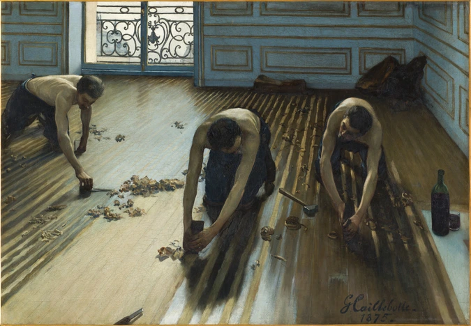
This painting is one of the first representations of urban proletariat. Whereas peasants (Gleaners by Millet) or country workers (Stone Breakers by Courbet) had often been shown, city workers had seldom been painted. Unlike Courbet or Millet, Caillebotte does not incorporate any social, moralising or political message in his work. His thorough documentary study (gestures, tools, accessories) justifies his position among the most accomplished realists.
Caillebotte had undergone a completely academic training, studying with Bonnat. The perspective, accentuated by the high angle shot and the alignment of floorboards complies with tradition. The artist drew one by one all the parts of his painting, according to the academic method, before reporting them using the square method on the canvas. The nude torsos of the planers are those of heroes of Antiquity, it would be unimaginable for Parisian workers of those times. But far from closeting himself in academic exercises, Caillebotte exploited their rigour in order to explore the contemporary universe in a completely new way.
Caillebotte presented his painting at the 1875 Salon. The Jury, no doubt shocked by its crude realism, rejected it (some critics talked of "vulgar subject matter"). The young painter then decided to join the impressionists and presented his painting at the second exhibition of the group in 1876, where Degas exhibited his first Ironers. Critics were struck by this great modern tableau, Zola, in particular, although he condemned this "painting that is so accurate that it makes it bourgeois".
https://www.musee-orsay.fr/en/artworks/raboteurs-de-parquet-105
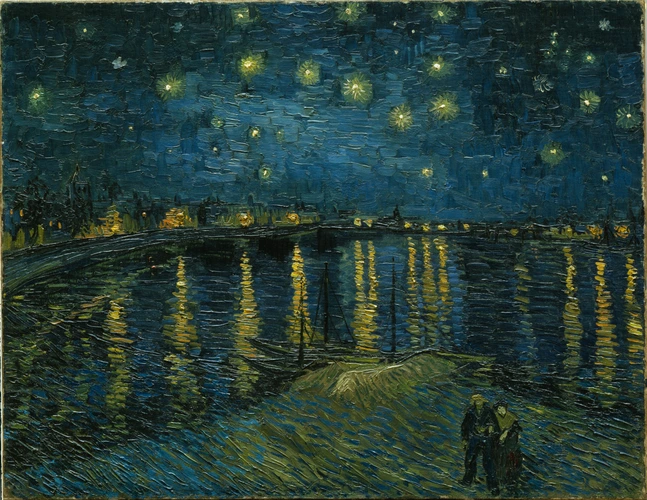
From the moment of his arrival in Arles, on 8 February 1888, Van Gogh was constantly preoccupied with the representation of "night effects". In April 1888, he wrote to his brother Theo: "I need a starry night with cypresses or maybe above a field of ripe wheat." In June, he confided to the painter Emile Bernard: "But when shall I ever paint the Starry Sky, this painting that keeps haunting me" and, in September, in a letter to his sister, he evoked the same subject: "Often it seems to me night is even more richly coloured than day". During the same month of September, he finally realised his obsessive project.
He first painted a corner of nocturnal sky in Cafe Terrace on the Place du Forum, Arles (Otterlo, Rijksmuseum Kröller-Muller). Next came this view of the Rhône in which he marvellously transcribed the colours he perceived in the dark. Blues prevail: Prussian blue, ultramarine and cobalt. The city gas lights glimmer an intense orange and are reflected in the water. The stars sparkle like gemstones.
A few months later, just after being confined to a mental institution, Van Gogh painted another version of the same subject: Starry Night (New York, MoMA), in which the violence of his troubled psyche is fully expressed. Trees are shaped like flames while the sky and stars whirl in a cosmic vision. The Musée d'Orsay’s Starry Night is more serene, an atmosphere reinforced by the presence of a couple of lovers at the bottom of the canvas.
https://www.musee-orsay.fr/en/artworks/la-nuit-etoilee-78696
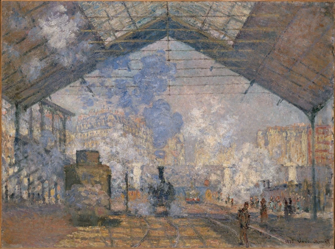
When he painted The Saint-Lazare Station, Monet had just left Argenteuil to settle in Paris. After several years of painting in the countryside, he turned to urban landscapes. At a time when the critics Duranty and Zola exhorted artists to paint their own times, Monet tried to diversify his sources of inspiration and longed to be considered, like Manet, Degas and Caillebotte, a painter of modern life.
In 1877, settling in the Nouvelle Athènes area, Claude Monet asked for permission to work in the Gare Saint-Lazare that marked its boundary on one side. Indeed, this was an ideal setting for someone who sought the changing effects of light, movement, clouds of steam and a radically modern motif. From there followed a series of paintings with different viewpoints including views of the vast hall. In spite of the apparent geometry of the metallic frame, what prevails here is really the effects of colour and light rather than a concern for describing machines or travellers in detail. Certain zones, true pieces of pure painting, achieve an almost abstract vision. This painting was praised by another painter of modern life, Gustave Caillebotte, whose painting was often the opposite of Monet's.
https://www.musee-orsay.fr/en/artworks/la-gare-saint-lazare-10897
To be fair, this is not just ADHD, but a curse of the digital age. Learning how to talk to people not in a digital capacity is like a muscle that will atrophy without practice.
Reminds me of the o-ring on the challenger