this post was submitted on 12 Dec 2024
289 points (80.8% liked)

Fediverse

28731 readers
70 users here now

A community to talk about the Fediverse and all it's related services using ActivityPub (Mastodon, Lemmy, KBin, etc).

If you wanted to get help with moderating your own community then head over to [email protected]!

Rules

Learn more at these websites: Join The Fediverse Wiki, Fediverse.info, Wikipedia Page, The Federation Info (Stats), FediDB (Stats), Sub Rehab (Reddit Migration), Search Lemmy

founded 2 years ago
MODERATORS
 

As a strong supporter of open-source and community-funded projects like Lemmy, which prioritize serving users over investors, I believe Lemmy has significant potential, and that's why I am here. However, it is clear that its growth is nearing a plateau in its current form. Despite the surge in users following Reddit's API changes, Lemmy continues to primarily attract tech-savvy individuals, politically left-aligned users, and those accustomed to old Reddit. For Lemmy to reach the broader average general audience, meaningful changes are necessary.

The rise of Bluesky demonstrates the importance of ease of use and a user-friendly design. Its polished and familiar interface is a key reason for its growth and appeal as an alternative to platforms like X/Twitter. This same ease of use is what Mastodon lacked, leading to its initial hype fading quickly. The average user is unlikely to adapt to something that feels complicated or unfamiliar, and this challenge also applies to Lemmy.

As someone who started as an average Reddit user and became more tech-savvy over time, I can confidently say that first impressions matter. When users first visit lemmy.world, the default UI is often enough to discourage them from staying. Most will not explore the homepage sidebar to explore, figure out and switch to one of the alternative UIs available, which is unfortunate because a better UI could make a huge difference.

This is why I propose that large servers like lemmy.world adopt Photon UI as the default web interface. Photon is currently the best and most mature alternative UI, offering a visually appealing, modular design that feels familiar to users of new Reddit. It makes excellent use of screen space and provides customization options like compact and cozy views. Unlike some other alternative UIs, Photon is actively maintained and ready for widespread use, although in no way is it perfect, this can also help bring in more contributors to the project development.

While it is important to continue offering other UIs as options, I believe adopting Photon as the default UI could make Lemmy far more appealing to the average Reddit user. First impressions are crucial, and the current default UI has turned off many potential users. If we want Lemmy to succeed as a true Reddit alternative, we need to prioritize user experience and accessibility. Thankfully today, Lemmy still continues to be THE biggest Reddit alternative, while our userbase is still considerably smaller than Reddit, it's the biggest of any alternatives, and Lemmy continues to somewhat be in the spotlight for those seeking alternatives, we can't let growth stagnate, it's high time we make the platform more welcoming and appealing for the average joe.

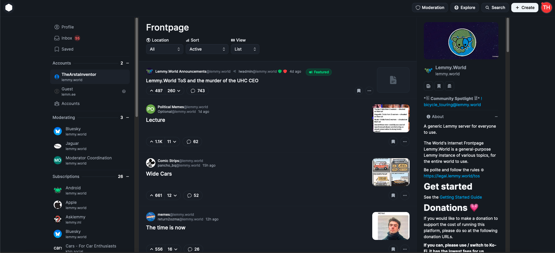
EDIT: The image I attached is from photon.lemmy.world, which I just realized is using the outdated version of Photon, I have updated the image to the updated current photon version from phtn.app. There are a lot of improvements made.

(page 4) 50 comments
sorted by: hot top controversial new old
[–] [email protected] 29 points 1 week ago

I don't think Reddit's redesign is a good thing to aim for. Personally I really like mbin's interface in compact mode.

[–] [email protected] 14 points 1 week ago* (last edited 1 week ago) (2 children)

Nah that looks like convoluted shit. Simple is better. Like old Reddit. Your screenshot looks like new Reddit dogshit.

load more comments (2 replies)
[–] [email protected] 9 points 1 week ago
  1. With what I think are near enough default settings, Voyager shows me about 9 stories. It doesn't feel cramped and the layout is regular, everything lines up.
  2. With what I think are near enough default settings, my browser here shows me 14 stories, with a good accessible font size by default and me easily zooming out to 80%. It doesn't feel cramped and the layout is regular, everything lines up.
  3. I can see 2 stories in that screenshot. Why would I want to have something that's at least 5 times worse, it feels cramped and parts of it line up I guess?
[–] [email protected] 3 points 1 week ago

Huh...?

But the Instances themselves can customize all they like...?

[–] [email protected] 21 points 1 week ago (4 children)

That UI is dogshit. Lemmy is a link aggregator and you're saying it should show 2 links on the screen at a time? New Reddit is shit for the same reason.

load more comments (4 replies)
[–] [email protected] 8 points 1 week ago

/me pines for the days of protocol over interface. NNTP + killfiles were the bees knees. Then we could just all pick our own interface to connect to any lemmy host.

[–] [email protected] 9 points 1 week ago

I literally hate the new reddit UI, as do most peeps I've spoken with...

The new reddit UI is designed to push ads, and push premium subs.

[–] [email protected] 43 points 1 week ago

Nah, the current UI is fine. We don’t need fancy shit on a link aggregator. Reddit went to shit after “updating” the UI.

Your opinions of “good” or “best” aren’t the same for everyone.

[–] [email protected] -2 points 1 week ago (2 children)

Bluesky looks like old Twitter and was even "created" by the former head of Twitter.

It's not surprising such a guy knows how to succeed.

Lemmy could use a face-lift, sure, but since Lemmy is largely centralized now with Lemmy.world, I'm not sure I care so much about it. It was more fun when Lemmy was started and we had a dream of an distributed network of interesting instances. That didn't happen and like-minded instances shut off federation with the others.

It's like children in a sandbox. "That guy said this, I will tell on the teacher".

[–] [email protected] 3 points 1 week ago

Isn't the ability to defederate a key point of having federation in the first place?

I personally do want to see word salad from supporters of russian genocidal imperialism and or the CCP.

[–] [email protected] 3 points 1 week ago (1 children)

The fediverse really is best viewed as a local-first space. Everything just works better if your primary focus is on the people or communities on your local instance. But people keep trying to think of it as primarily about the space in between, because that's what's novel.

But most people do not give a shit about that novelty, and we "market" it terribly.

"Lemmy" doesn't exist like Reddit does. It's not a place people can go to talk about shit. It's a website engine. It exists like WordPress does. One of its features just happens to be "can pull content from other websites".

If we want this space to grow, we need to focus on building community websites that stand on their own. Then we can market it as "hey, you love it here on MyInterest.social, but did you know you can also talk to people from SomethingElse.social? Pretty cool, huh??!?" Nobody seems to want to do that, though. That means we're totally at the mercy of places like Twitter and Reddit, waiting for them to fuck up badly again and hoping more people just kind of land here, in some cheap and uncanny knockoff of where they really wanted to be.

[–] [email protected] 1 points 1 week ago

community websites that stand on their own.

Nobody seems to want to do that, though.

Languages-focused instances like feddit.org or jlai.lu are quite good at this. Aussie.zone is also good, their daily threads are very active.

[–] [email protected] 15 points 1 week ago (1 children)

That’s too much padding. It needs to be more like Hacker News.

[–] [email protected] 19 points 1 week ago (1 children)

Lemmy will be getting a new, more modern UI sometime soon.

It is being actively developed and you can even try it out today: https://github.com/LemmyNet/lemmy-ui-leptos

[–] [email protected] 5 points 1 week ago (3 children)

Has anyone deployed it yet? Curious to see what it looks like, but too lazy to deploy it myself

load more comments (3 replies)
[–] [email protected] 69 points 1 week ago (5 children)

You really trying to convince us with a screenshot of the ugliest ui i ever seen huh

[–] [email protected] 52 points 1 week ago (2 children)

Yeah I used old Reddit. I don't want something that looks like new Reddit

[–] [email protected] 24 points 1 week ago (1 children)

You both aren't wrong... But this isn't about you.

load more comments (1 replies)
load more comments (4 replies)
[–] [email protected] 15 points 1 week ago* (last edited 1 week ago) (8 children)

The Lemmy UI is easy enough to use IMO. Where the problems show up are:

  • Unreliable linking to other comments and posts. It is annoying to no end to receive a link to someone's comment and be unceremoniously ripped out of your home server and put onto the federated one no longer logged in etc... This behaviour should somehow be prevented

  • a quick reference to the text commands easily found somewhere (ie: sidebar)

  • I'd prefer more theme and colour options

  • Fix the text interface so it respects carriage return entries properly. If I want to start a new line directly under the current one (edit: AFI knew after 4+ months of use) there is

no way

to do

it.

Make it so a single carriage return is acknowledged and correctly starts a new line right underneath, or automatically forces a blank line between. This needing double entry is unintuitive and wrecks many new user's first hundred post's appearance.

Finally, the premise: Lemmy.world should be more welcoming is itself undesirable. That instance is already taking up an inordinate number of users so IMO every other instance (except the awful ones, we all know who they are) should be using a better UI, not L.W

[–] [email protected] 15 points 1 week ago* (last edited 1 week ago)

no way

to do

it.

your can use
two space at the end of the line
to achieve this

For the links, it's being worked on, should be part of 0.20: https://lemmy.ml/post/23245384

load more comments (7 replies)
[–] [email protected] 3 points 1 week ago (1 children)
load more comments (1 replies)
[–] [email protected] 2 points 1 week ago* (last edited 1 week ago)

I'm new to Lemmy and quite tech savvy.

I'd like to get more people I know to join, but the standard UI really wasn't nice. Thanks for showing me Photon, I like it so much more!!

I'm using Sync on mobile, I miss the Upvote & Downvote bar, any idea how to get it back?

load more comments
view more: ‹ prev next ›