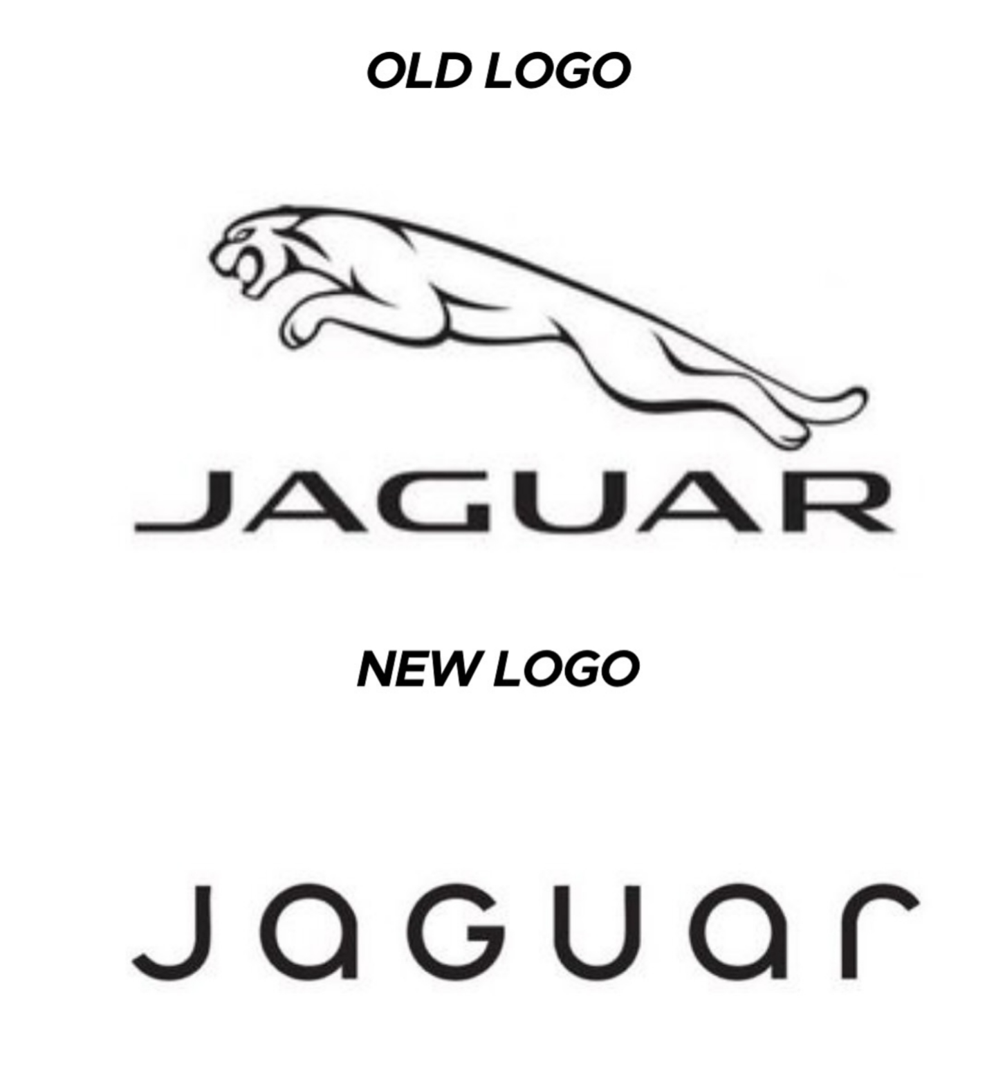
I hate these new logos these corporations make, the old jaguar logo looked like power the new one looks like some weird startup.
Welcome to Lemmy Shitpost. Here you can shitpost to your hearts content.
Anything and everything goes. Memes, Jokes, Vents and Banter. Though we still have to comply with lemmy.world instance rules. So behave!
1. Be Respectful
Refrain from using harmful language pertaining to a protected characteristic: e.g. race, gender, sexuality, disability or religion.
Refrain from being argumentative when responding or commenting to posts/replies. Personal attacks are not welcome here.
...
2. No Illegal Content
Content that violates the law. Any post/comment found to be in breach of common law will be removed and given to the authorities if required.
That means:
-No promoting violence/threats against any individuals
-No CSA content or Revenge Porn
-No sharing private/personal information (Doxxing)
...
3. No Spam
Posting the same post, no matter the intent is against the rules.
-If you have posted content, please refrain from re-posting said content within this community.
-Do not spam posts with intent to harass, annoy, bully, advertise, scam or harm this community.
-No posting Scams/Advertisements/Phishing Links/IP Grabbers
-No Bots, Bots will be banned from the community.
...
4. No Porn/Explicit
Content
-Do not post explicit content. Lemmy.World is not the instance for NSFW content.
-Do not post Gore or Shock Content.
...
5. No Enciting Harassment,
Brigading, Doxxing or Witch Hunts
-Do not Brigade other Communities
-No calls to action against other communities/users within Lemmy or outside of Lemmy.
-No Witch Hunts against users/communities.
-No content that harasses members within or outside of the community.
...
6. NSFW should be behind NSFW tags.
-Content that is NSFW should be behind NSFW tags.
-Content that might be distressing should be kept behind NSFW tags.
...
If you see content that is a breach of the rules, please flag and report the comment and a moderator will take action where they can.
Also check out:
Partnered Communities:
1.Memes
10.LinuxMemes (Linux themed memes)
Reach out to
All communities included on the sidebar are to be made in compliance with the instance rules. Striker
I hate these new logos these corporations make, the old jaguar logo looked like power the new one looks like some weird startup.
/uj Technically this is their new logo:
J a G U a r is just their new typeface (I think that’s the name?); and apparently/allegedly is to make the pronunciation closer to UK English, rather than American.
Either way, though - it’s still..
/j
..pReTtY fArKiN’ sToOoPiD.
Their logo doesn't have a jaguar and their car commercial doesn't have any cars. Fuck it, whatever
They went from luxury car company to mediocre smartphone brand
You're all making fun of it but this new style did exactly what it intended to do. Everyone is talking about them now.
If only they sold stuff that the people talking about it could afford in the first place, maybe that'd boost their sales.
Yeah, for a whole 2 hours, until everyone moves on to bitch about the next thing and then Jaguar are stuck with the shitty new logo no-one recognises for long after that.
JaGUar

Wow, they really took their logo from sexy, fast and expensive looking, to looking like an over priced soft drink?
That's impressive, haha.
It looks like an off brand sportswear shirt you'd find on an African market.
GUys I'm from ~~2040~~ 2035, here's Microsoft's logo

MS corporate comms army did a sik job getting across those inscrutable monolith vibes, I bet when it launched they all clapped (even though clapping is in performance reviews)
BONUS: heres Amazon, Faceberg and Nvideo too (yay diversity)
spoiler


I would have failed every design class I took in college if I submitted that. Why such wide kerning? Why lower case but upper G? Why so round? Why so completely unreadable at a distance because of micro serifs? There isn't one good design element in this.
I think they want people to focus on the "agua" and the j and r are just little accents on it like its word art rather than a logo. Like, I literally picture the marketing weirdos at the meeting going off like this.
The "a" is the worst part for me. You can't see those little stubbs at a distance. So it reads JoGuor at a distance. They didn't just fail to create a good logo, they failed to preserve the name. One bit of advice I always give is "imagine this logo on the back of a golf card or a Pride brochure. If the logo isn't crisp and readable in black and white in a 1/2 inch square then it sucks." This design fails that test. Not just because of the messed up "a" but the wide spacing makes those unreadable "a"s even smaller than if the letters weren't so widely spaced.
It doesn't say "car" at all either; no elegance or prestige. The old logo was sexy. New one looks like a logo for bottled water or something.
Edit: it's like going from James Bond to ~~Austin Powers~~ Inspector Gadget
Austin Powers has style. Crazy 60s style but style.
Ya, I wanted to use a bland spy but there aren't any-- I was going to use the Spy vs Spy guys because they are the most generic-looking, but ultimately I kept Powers because while he is stylish and fun, he is also really immature and the logo looks immature to me.
Tata cat.
Insiders might get it.
rimshot
JOGUOR
Could JOGUOR become the new KN?
I fucking hate this minimalist design trend more than it is probably reasonable to hate an aesthetic. It's got the personality of unfinished drywall.
Honestly I think unfinished drywall has more personality. It’s utilitarian and rough around the edges, without the shiny surface veneer.
That new Jaguar logo is like somebody took a beautiful old house full of exposed brick and wood work and put a coating of white paint over everything.
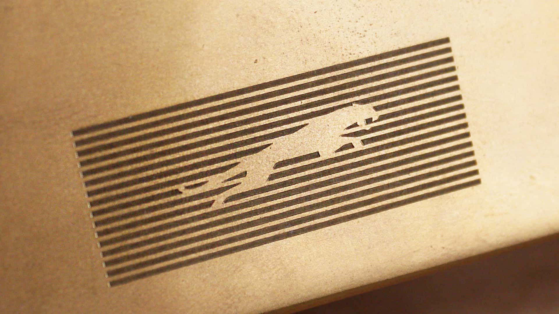
The pouncing jaguar is so visually powerful
It should be those puprple and yellows of Corporate Memphis
You were supposed to remove the text...
JaGUar
Changing things for sake of changing things. Like Microsoft with every moronic "update".