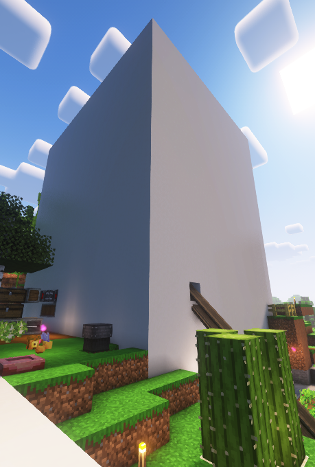
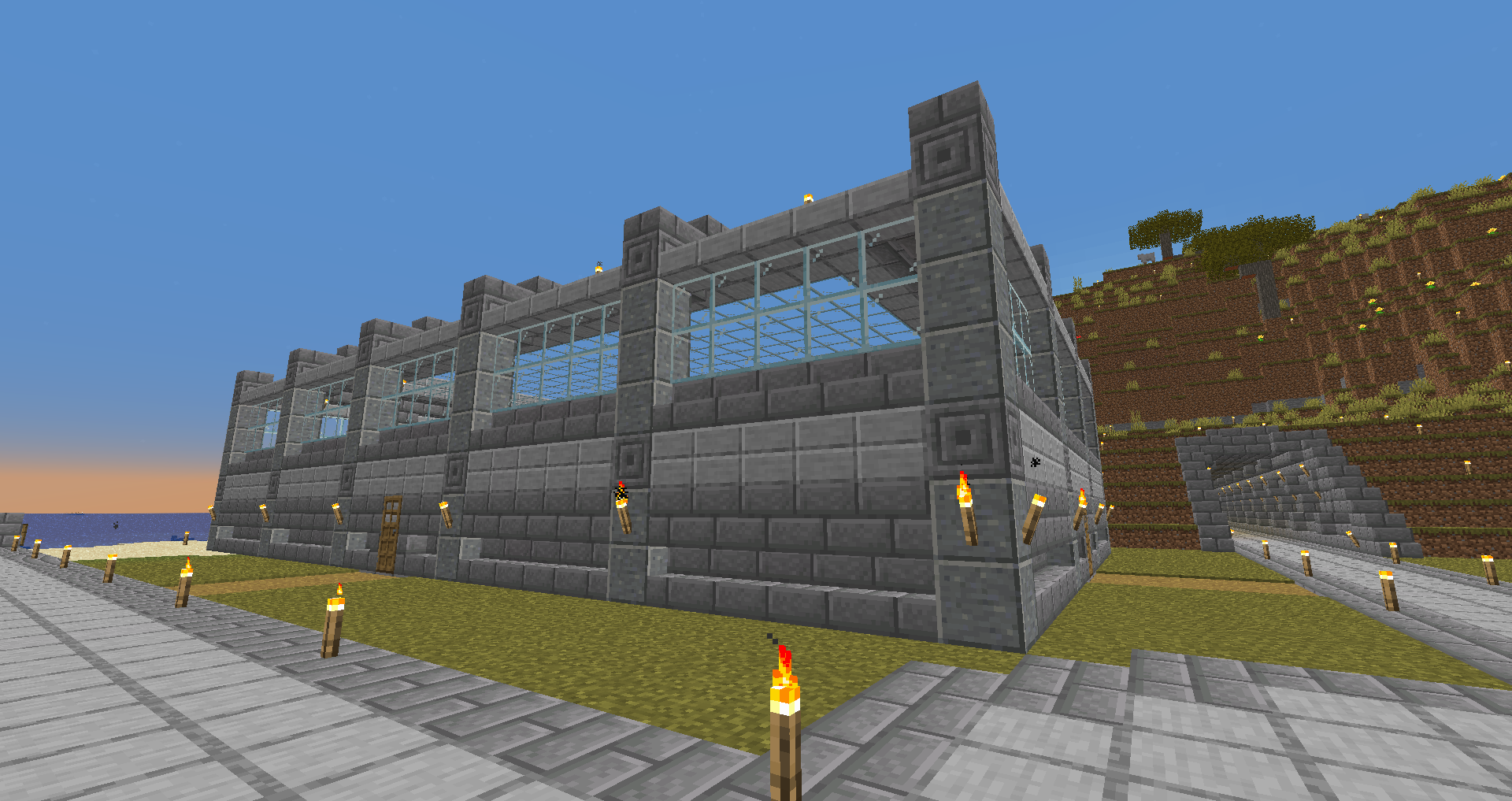
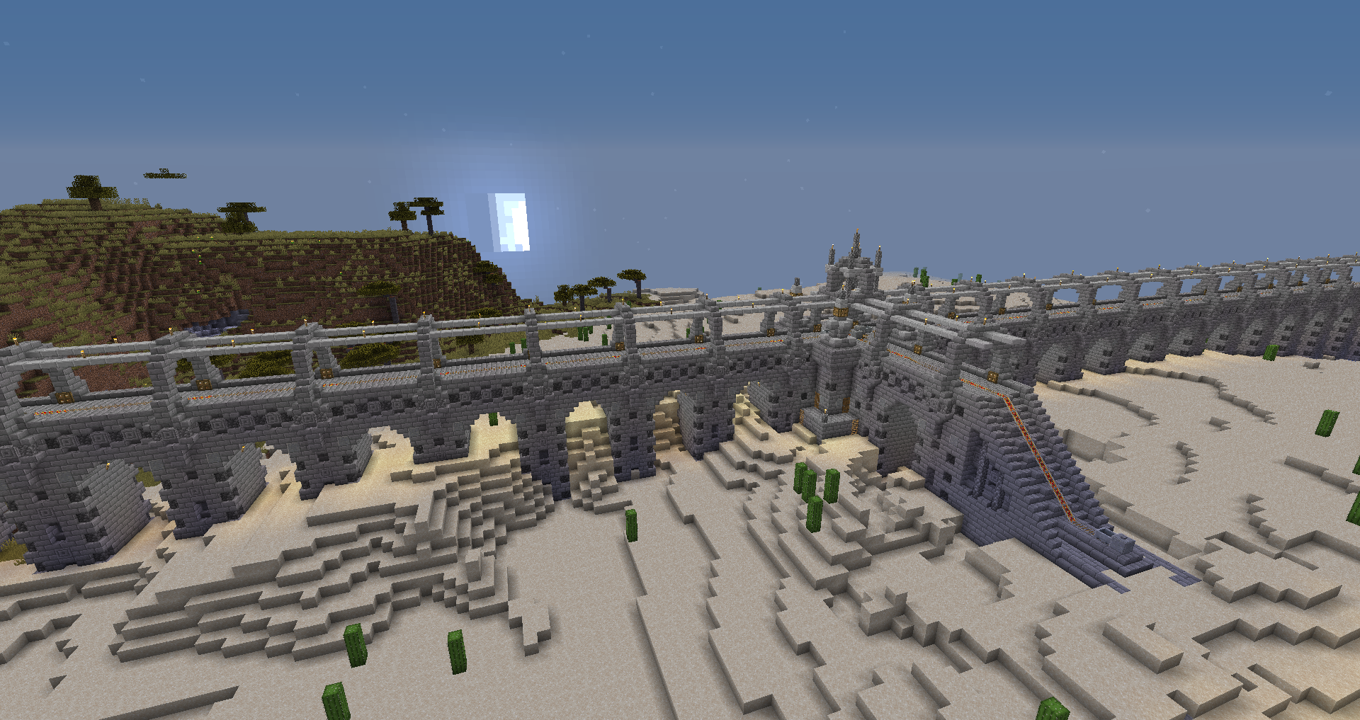
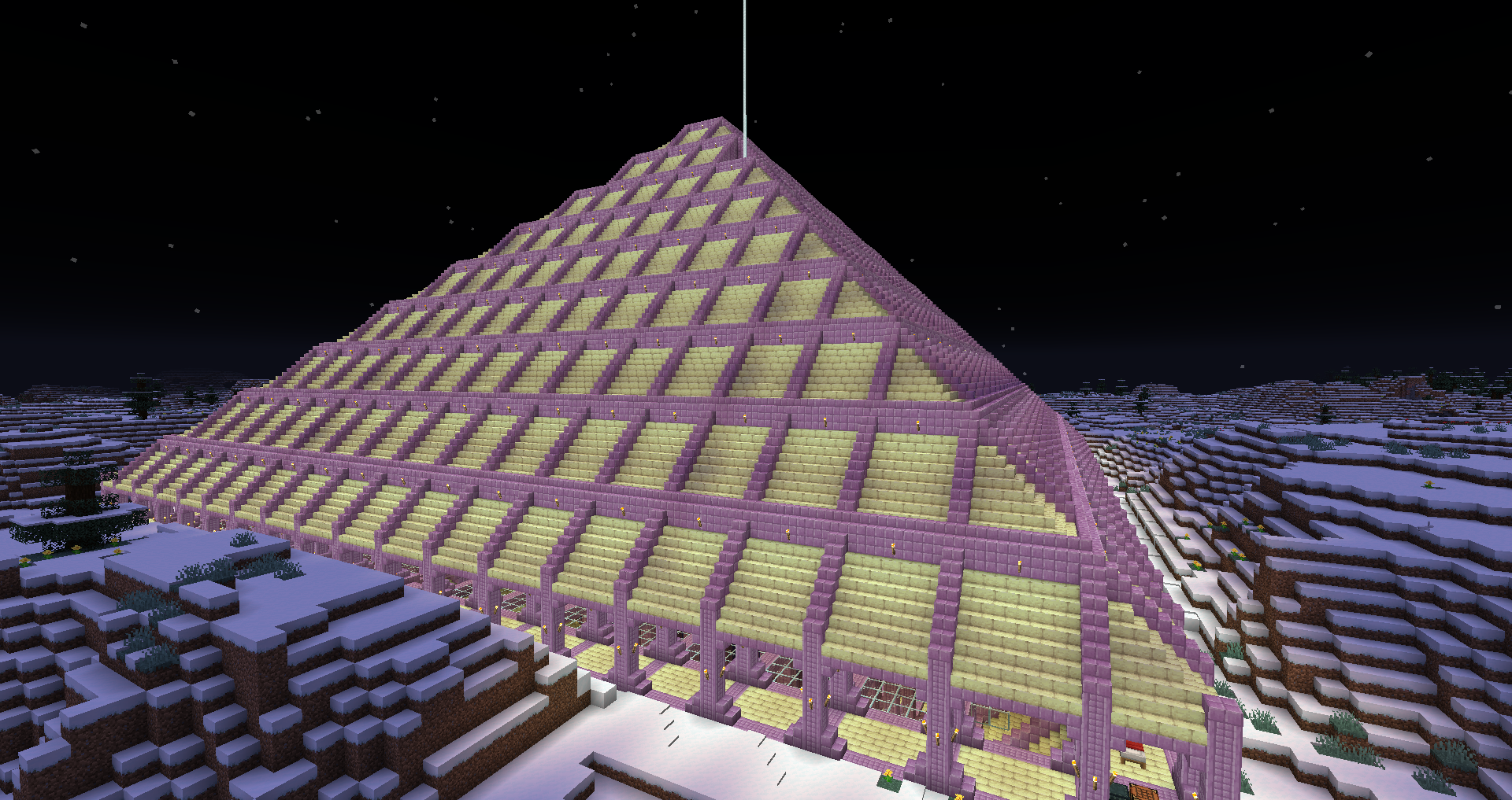
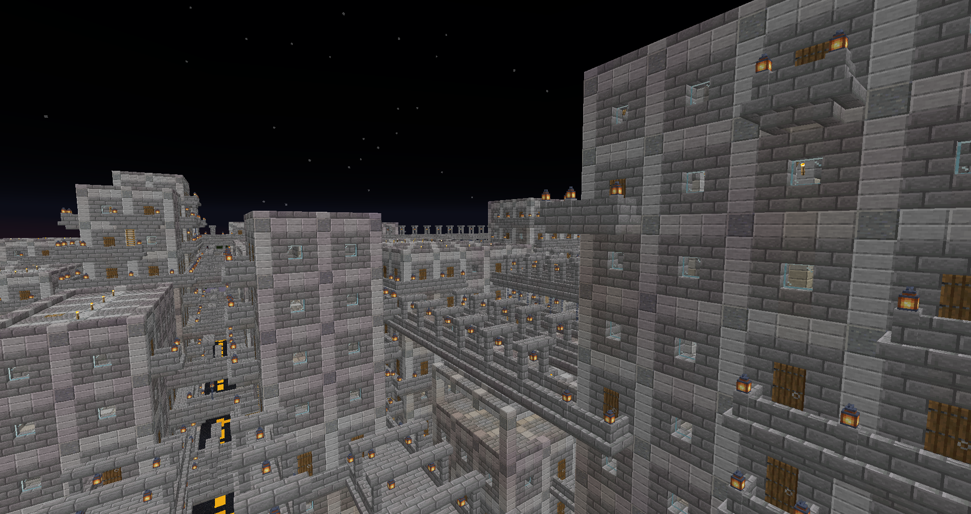
Grian's early videos on his channel were all about how to make better looking buildings. The fundamental strategy is to start with a more interesting asymmetric shape as the base and vary the height in various places as well to produce a more interesting shape. For example the entrance could be a short corridor with well defined doorways and its only as high as the corridor needs to be breaking up the cube both on the bottom layer and vertically.
The second part of his steps I recall were depth. So take the corners and put structure and framing on the outside, do this across the entire build to give it that sense of being held up with columns.
The next is all about colour and details where small extra little pieces are added such as frames around the windows and stair cases used to fill corners of framing to make them gradient in.
I highly recommend those early Grian tutorial videos on youtube because they teach some fundamentals that can make any build look a lot better even when you start out with a grey cube,
