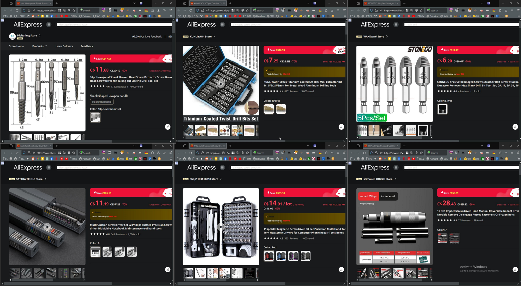
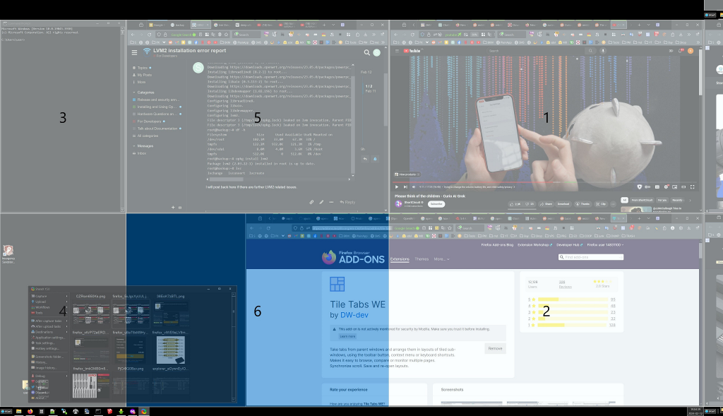
I want to view multiple tabs at once, in a split-page view where I can scroll on one tab, then mouse-over to another and start independently scrolling on that one. It's probably the key feature I miss from Vivaldi. Is there some insurmountable obstacle in the engine that prevents implementation, or is it stubborn devs?
Linux
From Wikipedia, the free encyclopedia
Linux is a family of open source Unix-like operating systems based on the Linux kernel, an operating system kernel first released on September 17, 1991 by Linus Torvalds. Linux is typically packaged in a Linux distribution (or distro for short).
Distributions include the Linux kernel and supporting system software and libraries, many of which are provided by the GNU Project. Many Linux distributions use the word "Linux" in their name, but the Free Software Foundation uses the name GNU/Linux to emphasize the importance of GNU software, causing some controversy.
Rules
- Posts must be relevant to operating systems running the Linux kernel. GNU/Linux or otherwise.
- No misinformation
- No NSFW content
- No hate speech, bigotry, etc
Related Communities
Community icon by Alpár-Etele Méder, licensed under CC BY 3.0
You can do this easily with Tile Tabs WE https://addons.mozilla.org/en-CA/firefox/addon/tile-tabs-we/ Works great, I've been using it for years
Example

You can also use FancyZone part of the opensource microsoft power toys
example

What I want is a better version of Tab Manager Plus in Own tab mode that can handle more than 1500 tabs and 30 windows without glitching as much
This is not even close to the worst thing they have ever done, but stuff like this is a waste of resources. People mostly want official vertical tabs and more than anything engine performance improvements. (and the ability to pretend to be Chrome in Youtube)
engine performance improvements
Absolutely. Firefox is so slow compared to Chrome. Switching tabs, scrolling, video calls, ... sure. Sure, Chrome/Chromium is a memory hog, but come on Mozilla, just invest in Servo already and stop adding useless features.
I miss the days with Opera. Not only could it group tabs, but it had previews too. Mouse gestures. Keyword searches. Page link filters and batch operations. RSS-reader. Chrome didn't even exist back then, and IE and Firefox are still playing catch up. Kinda amazing to think about it.
Vivaldi is the spiritual successor, but having to use chromium rendering engine, it's so many concessions and steps back. Has the mouse gestures, tho.
The gestures were amazing. Some are ingrained in my muscle memory after all these years.
Same here. And the single-key shortcuts for switching tabs. Modern browsers don't even come close.
Brave has configurable keybinds, you can set any key you want to do anything.
However I still need to use the vimium extension to have proper keyboard only web navigation, because with the exception of qutebrowser none of the "popular" web browsers have the select link mode with the f key.
I never got used to the f-key navigation, if i can't use shift+arrows i fall back to mouse.
I don't know, maybe Brave has this, unfortunately some time before Opera 9 and now I became one of these annoying people who only use FOSS.
I think many people in the comments suffer from some version of curse of knowledge.
Sure, this feature us quite irrelevant for a power user who is quick to navigate the browser and needs a split second to remember what tab it is simply by reading the header and seeing the icon.
However, many less proficient people can benefit from this feature. Not once I saw how someone who has 10 tabs open and needs to go to a different webpage, starts meticulously clicking through every single one of them because they have no idea how the page they are looking for is called, they are too overwhelmed by using web as a whole to take notice.
How is hovering over a tab and waiting for a preview faster than clicking it?
Again, in my opinion you approach the problem like a power user. Using a browser is not a speedrun where every millisecond matters. Here is why I think it provides more comfort to an average user:
- No need to divert attention and look around the monitor. When you're not well versed with a mouse, it's easier to click and look at the same place
- Nothing distracts you unlike when you click through pages. Imagine going from dark theme page to a light theme page, the entire screen suddenly lights up
- Depending on the way it is implemented (perhaps by keeping compressed page screenshots?), it might be faster to show a preview than to render the page again on a weak machine
Power users love to bash accessibility features like this. Its a classic case of "I don't need a wheelchair ramp so i dont know why the library added one!"
Accessibility is way more than screen readers. It's more than specific disability-minded modes. The web needs to be friendly to everyone, including people who may not know they could benefit from accessibility features. Everyone benefits from this type of work.
There are definitely some legit feature concerns and priorities being called out here. Mozilla has left a lot to be desired of late on that front. But a power user is more than capable of jumping into settings or about:config to turn things like this off, or finding an extension to get by for now.
Also the firefox dev team isn't tiny. This isn't blocking other work or anything in a substantial way, it's a fairly isolated piece of UI, and there's no guarantee that skipping this would change the timeline on anything else.
I don't understand how someone can have 10 or more tabs open. The times when I have "many" tabs open is when I'm looking for references while doing art, and that still hardly ever surpasses 5 tabs! XD
I think it's much easier to have more than to have less. Most people I encounter have such a mess of pages in their browser, makes my hair stand on end. If we continue to approach this as an accessibility feature, it starts to make even more sense since tons of users have so many tabs they only see icons, not page names
Currently have 23 tabs open, 7 are youtube, 3 lemmies, and i guess the rest are docs I cant tell I'd greatly benefit from the tab previewer
Have they ever said if vertical-tabs is a feature they will add? Vivaldi and Edge both support it by default and it's awesome.
I find that Firefox manages tabs better. So eveb though i use side tabs on vivaldi, I prefer them on top in Firefox, and it's just a keystroke away to see the list vertically, but not stay that way.
By vertical tabs do you mean tabs on the side instead of the top? If so, check out the tree-style tabs extension, it's great.
The extension is awkward to use imo. The way Vivaldi has it integrated for example is miles better and I really want to see Firefox do same.
I don't see the point personally but I enabled it just because and while it does work it's currently very slow for me. It takes around 1 sec for the preview to appear so finding something by moving the cursor quickly across the tabs is impossible unless you slow way down.
From the article:
To control how fast/slow tooltips appear modify
browser.tabs.cardPreview.delayMs. This is set to 1000 (milliseconds) by default, meaning tooltips only appear once you’ve hovered over a tab for at least a second.
I saw that later, I guess I forgot to save the edit.
150 ms feels alright.