this post was submitted on 09 Nov 2023
2 points (100.0% liked)

Programming

17686 readers
107 users here now

Welcome to the main community in programming.dev! Feel free to post anything relating to programming here!

Cross posting is strongly encouraged in the instance. If you feel your post or another person's post makes sense in another community cross post into it.

Hope you enjoy the instance!

Rules

Rules

  • Follow the programming.dev instance rules
  • Keep content related to programming in some way
  • If you're posting long videos try to add in some form of tldr for those who don't want to watch videos

Wormhole

Follow the wormhole through a path of communities [email protected]


founded 2 years ago
MODERATORS
top 11 comments
sorted by: hot top controversial new old
[–] [email protected] 0 points 1 year ago (1 children)

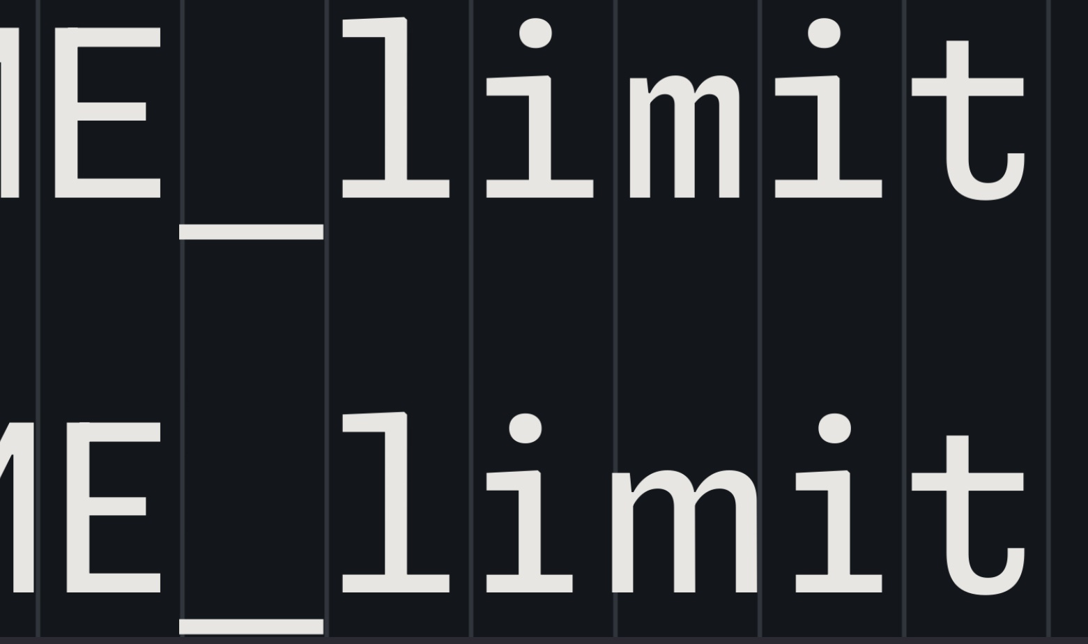
Technically, font healing is a neat idea. It fails for text that does not meat its requirements, i.e. two 'm' next to each other. Depending on the characters around them, this might create two different 'm'.

This is unavoidable, of course. The only solution are proportional fonts. So font healing is a nice idea. It creates a more consistent spacing at the price of less consistent glyphs. Whether one likes this compromise, is a matter of taste. I personally lean towards consistent glyphs, but I did not try it for an extended period.

[–] [email protected] 1 points 2 weeks ago

Ideally, texture healing would distribute the resizing over the whole word, so it would look better and be used in more cases. But that is not possible with OpenType fonts as far as I know.

Commit Mono has smart kerning, which is similar, but it only shifts, not morphs, the shapes. So it avoids that the same letter looks differently in different places. It also works on triplets, not just pairs, so it is more widely applicable. See this comparison.

[–] [email protected] 1 points 1 year ago* (last edited 1 year ago)

And sadly one more font I will never be able to use due to missing support of non-latin characters.

Sadly some features are nice.

[–] [email protected] 2 points 1 year ago (2 children)

Why the fuck is a page about fonts using 50% CPU?! Is it mining crypto or something?

[–] [email protected] 1 points 1 year ago

Average website experience in 2023

[–] [email protected] 0 points 1 year ago (1 children)

That's just modern web dev

[–] [email protected] 1 points 1 year ago

I really hope Chrome gets its shit together and stabilizes the chrome.processes API during my lifetime so I or someone can make an extension that autokills or at least warns you about these shitty pages.

[–] [email protected] 0 points 1 year ago* (last edited 1 year ago) (1 children)

I like all of it, except for that awful "texture healing". Imagine having words above & below like

i=mins
w=maxs

But the m's just slightly don't line up because the top one is wider than the bottom one. I'd feel like my editor was gaslighting me 🤢

[–] [email protected] 0 points 1 year ago (2 children)

They would still line up, wouldn't they? Or am I misunderstanding how the texture healing would work... Would they not take the same total amount of space?

[–] [email protected] 1 points 1 year ago* (last edited 1 year ago)

Each line is the same total length but the "m" in "mi" would be wider than the m in "ma"