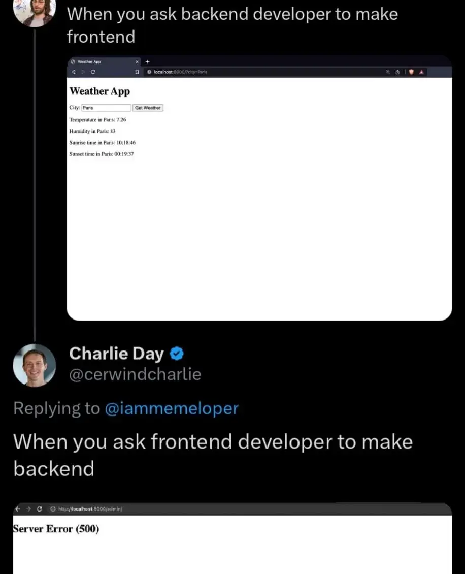
The frontend developer made the backend so inefficient that it runs out of memory
Programmer Humor
Post funny things about programming here! (Or just rant about your favourite programming language.)
Rules:
- Posts must be relevant to programming, programmers, or computer science.
- No NSFW content.
- Jokes must be in good taste. No hate speech, bigotry, etc.
what is wrong with this frontend? not enough ads? loads too quickly?
Honestly, no units
No designated time zone.
I would hire you as my lawyer.
The page at the top looks perfectly fine. It's useful, it gets the job done and it's lightweight.
A highly compatible design with no ads, unnecessary images, videos, animations, scripts that goes straight to point delivering you exactly the information you need and nothing else? Something that's easily accessible even with old feature phones allowing older people to get information easily?
Simply something that loads instantly and just works?
Who would want that?
Found the backend dev. "CUT THIS AESTHETICS NONSENSE! GIMME THE VARIABLE CONTENTS ALREADY! WE'RE 3.54 NANOSECONDS BEHIND!"
Frontend: "Come on, this needs at least some flair. This isn't the 90s."
Throws React at it
yeah, just css is enough.
you don't need js unless you need to fetch data dynamically.
you can do all of your animations, dropdowns and transitions in css.
like this menu i made. no js in sight.
also fully accessible and you can tab right into it without clicking enter or whatever
(and respects prefers-reduced-motion)
React ugh, everybody is using NextJs these da- ....oh, what's that? We've moved on already?
From my experience, devs be like:
Backend, yay! Frontend, nay! ... and I the end, not even the backend works properly.
So in the end, it doesn't even matter?
I TRIED. SO. HARD.
