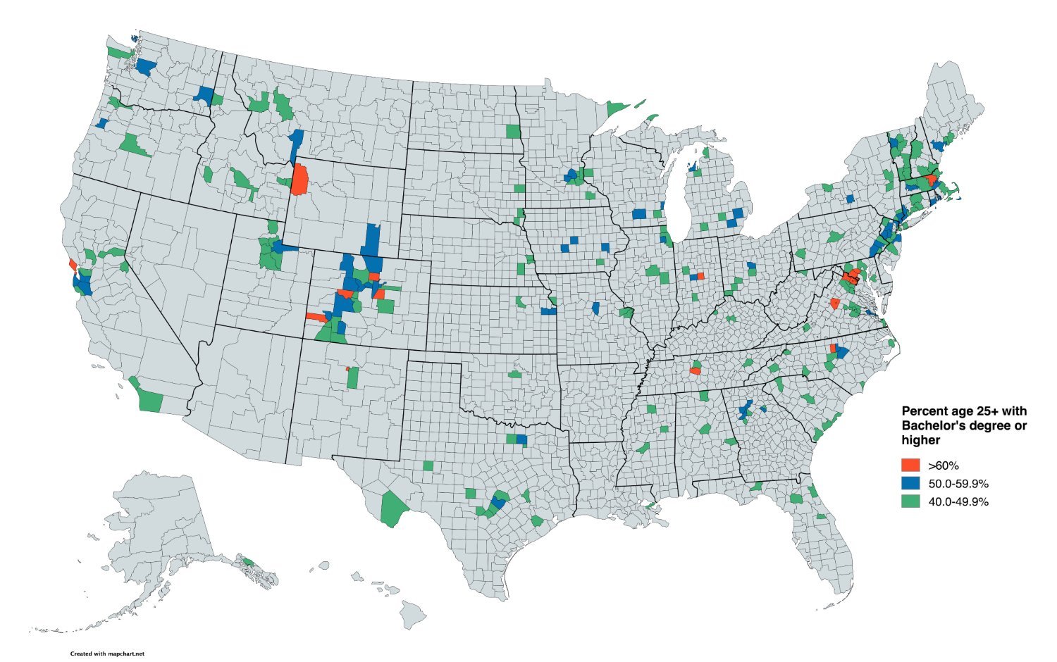
If you are wondering what that red spot in Wyoming ans adjacent green in Idaho is, they are the Teton counties (one on each state).
For the map enthused!
Rules:
post relevant content: interesting, informative, and/or pretty maps
be nice
If you are wondering what that red spot in Wyoming ans adjacent green in Idaho is, they are the Teton counties (one on each state).
Nah, Teton County is easy to understand although I do question how they have a higher percentage than Albany County. What I'm really wondering about though is that orange county in South Western Colorado. WTF is that about?
This is somewhat a "people live in cities" graph, but not as stark of one I expected. Not all big cities are so educated, plus there are a lot of rural places that draw in a surprising number of people with advanced degrees.
Still, I'm amused that Interstate 29 in specific lights up like a string of Christmas lights.
Based on the states I know, some of the surprising rural areas are where state universities are.
Counties with colleges have a higher amount of college degrees, neat
Why only count people older than 25?
Below 25 it depends on how fast you finish your studies whether you own a bachelor's degree yet or not.
Whycome the south doesn't has orange boxes? Is we stupid?
Yes you does
No I ain’t
Neat data, but it seems like starting the coloring at 40% is really high.
I'm curious what this would look like if they counted counties with 25% and above degree requirements.
not really, that's roughly the percentage for the entire population of the country.
Exactly. The less educated population matters just as much as the more educated. Those people are not represented in this map.
I live near Indianapolis.
You wouldn't now it.
Edit: Ironically, I made a spelling typo. Sigh.
It appears that the red county is Hamilton County, not Marion County.
Could be. Hard to tell when it's that small. Still doubtful.
In 1911, the Hoosier State House came within one vote of rounding 'k' off to backspace.
One can see the impact of the Yellowstone national park quite clearly.
Same with Los Alamos Labs in NM. That orange spot has more PhDs per Capita than anywhere else in the states.