this post was submitted on 02 Dec 2024
184 points (95.5% liked)
Fediverse
28576 readers
341 users here now
A community to talk about the Fediverse and all it's related services using ActivityPub (Mastodon, Lemmy, KBin, etc).
If you wanted to get help with moderating your own community then head over to [email protected]!
Rules
- Posts must be on topic.
- Be respectful of others.
- Cite the sources used for graphs and other statistics.
- Follow the general Lemmy.world rules.
Learn more at these websites: Join The Fediverse Wiki, Fediverse.info, Wikipedia Page, The Federation Info (Stats), FediDB (Stats), Sub Rehab (Reddit Migration), Search Lemmy
founded 2 years ago
MODERATORS
you are viewing a single comment's thread
view the rest of the comments
view the rest of the comments

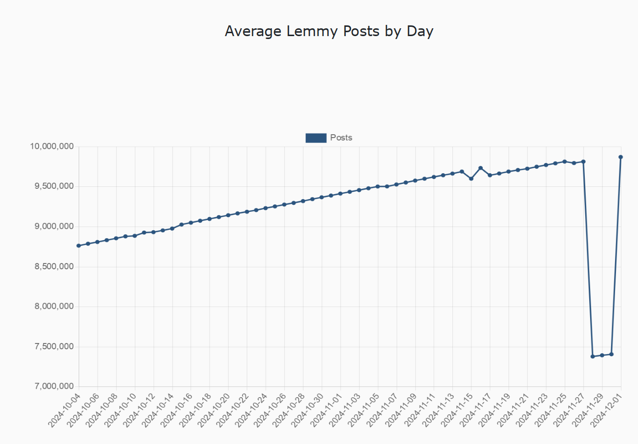
I hate the fact that the vertical axis starts at 7 million, making the drop seem deceptively large
Seems fine to me, the axes are easy to understand and there would be a lot of unnecessary whitespace otherwise. Though, it does require some reading comprehension, and that one actually looks at it and not just skims over.
Using compressed axes to display data was literally "How to identify misleading statistics 101" in middle school for us....
It seems fine to you but for the majority of people it's misleading most people look at the lines and the relative distance between them to make judgment calls. Not literally the entire point of graphs, to visually display information.
This is a well-known effect and is taught in pretty much every major curriculum.
And the above was literally how I was thought to represent data in university. Maximize the areas of interest, make sure to properly label your axes (lest they become misleading), and remember to trim empty space where relevant.
But it appears that proper graphs for science and engineering reports may not be used for representing data to the common man, as it must be assumed that, even for the most simple of graphs, the common man will only look at the funny line, but not the graph itself.
This reading comprehension joke it overused and it doesn't even make sense here. It's well-known that you need at least one of those little zigzag indicators when the graph doesn't start at 0 in most cases to avoid people misinterpreting the graph and to make it much more visually clear.
I was of the impression that reading a graph also required understanding of regular writing/reading, but I'm no native speaker, so I'll gladly stand corrected.
I'm not sure what you mean by "one of those little zigzag indicators", do you perhaps mean leap/break in data denoted by the "Squiggle"? I don't think any data below 7m is included in this graph, so, if I understand you correctly, then that wouldn't be a proper use of said squiggle.
Yes, I mean an axis break to denote that part of the axis has been omitted. Using it to show a gap between 0 and the lowest included data in the dataset is very common and is a proper use even according to your own source:
Beginning the Y axis at 0 and using an axis break to go from there to 7 million allows you to see the same amount of detail as you can in the OP, while visually signalling to the reader that the scale on that axis does not show a full 0 to 10 million range. This increases the chance that they'll read the graph correctly. You can justifiably blame someone for reading it wrong, but the point of a graph is to communicate, so minimizing the chance for misinterpretation is a good idea.
I agree that this way of displaying the data is appropriate, but it would be nice to have a very visible indicator of this. Some kind of highlighted "fold" line or something at the very bottom of the chart, maybe. If I can deduce the units from context, and the trend is more interesting than absolute numbers, then I'm not going to look at the axes most of the time