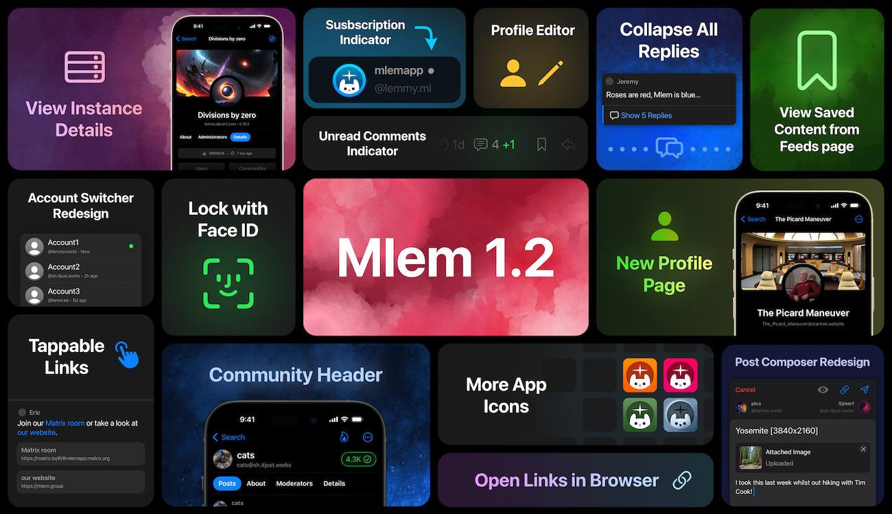
Mlem 1.2 is out of beta and live on the App Store! We’ve got loads of new features big and small for you to enjoy.
Major Features
- Profile editor: you can now change your display name, biography, avatar and banner image, and matrix ID. Check it out in Settings -> Account.
- Easy-tap links: links detected in posts and comments now get a nice big tappable button at the bottom of the post. You can copy and share these links via long-press on the link button, and customize their behavior in Settings -> General.
- Tab bar navigation: tapping the currently selected tab while at the top of the feed will navigate back. Reselecting the search tab from the top of the feed will focus the search bar.
- Upgraded post composer: we’ve made the post composer prettier, added the ability to upload images from files and clipboard, and made it show the account you're posting from. It also now displays a warning if your post runs afoul of your instance’s slur filter.
- Instance page: you can now view detailed instance information, accessible from a community or profile via the ellipsis menu in the navigation bar.
- Saved content feed: saved content has moved! It’s now listed under Feeds along with all the other feeds, and you can also open it from the app shortcuts.
Minor Features
- Voting icons are now colorized in compact mode
- “Report” and “Block” items in context menus are now colored red and ask for confirmation
- Fixed some inconsistent wording and incorrect capitalization
- Improved performance of markdown rendering
- Redesigned the account switcher and tweaked the behavior of long press/swipe up: long press on profile now swaps accounts immediately if you have two accounts and opens the switcher if you have more, while swipe up always opens the switcher. Both of these gestures can be enabled and disabled in Settings -> Accounts -> Quick Switcher
- Added an indicator to posts from subscribed communities in All and Local feeds
- Added headers to feed pages
- Redesigned app icon selector
- Added more app icons
- Added a new comments indicator to posts you’ve already viewed
- Added the option to open links in the system browser, rather than in-app
- Added support for image links and shields.io badges
- Added options for how your accounts are sorted in the account view and quick switcher
- Tidied the settings page
- Added the option to disable tap-to-collapse on comments
- Refined the swipe action activation angle, so it should be harder to accidentally trigger it while scrolling
- Added the option to require biometric unlocking when opening the app
- Added the option to automatically collapse child comments
- Redesigned the profile page
Bug Fixes
- Disabled swipe actions on items embedded within the post/comment composer
- Fixed a bug where favoriting a community from the ellipsis menu would cause the subscription status to display incorrectly
- Fixed a bug where adding an account while already logged in would fail on instances running 0.19
- Fixed a bug where account details were not being loaded in the user view
- Fixed “failed to determine site version” error
- Saved content now loads dynamically on scroll, rather than all at once
- Fixed /u/user@instance and /c/community@instance links not behaving properly
As always, a huge thanks to our TestFlight for all their bug reports and feedback.
Cheers,
Mlem is a free and open source project. 100% of our funding, which pays for things like server time, comes from our generous donors; we do not, and will never, run ads or sell data. If you'd like to help support Mlem, you can donate here.

Saved posts have moved to Feeds—you can find them alongside All/Local/Subscribed.
That's a bit strange-- is there a technical reason for that? Intuitively I wouldn't consider a relatively static collection of posts to be the same as a feed.
There are both technical and design reasons for the change.
Technically, it lets us rip out a lot of logic that handled the differences involved in loading and displaying your own profile vs someone else's; from a design perspective, this makes your profile page a much more logical grouping: "content you created" instead of "content you created and also content you saved." Feeds is already the root category for "content other users created," with each item (All/Local/Subscribed/Community) displaying a filtered subset of that content, a grouping into which Saved fits much more naturally.
Fair enough. Thanks for all your work on this site!