this post was submitted on 09 May 2024
458 points (92.4% liked)
Programmer Humor
32415 readers
370 users here now
Post funny things about programming here! (Or just rant about your favourite programming language.)
Rules:
- Posts must be relevant to programming, programmers, or computer science.
- No NSFW content.
- Jokes must be in good taste. No hate speech, bigotry, etc.
founded 5 years ago
MODERATORS
you are viewing a single comment's thread
view the rest of the comments
view the rest of the comments

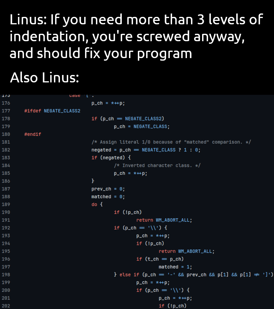
One nit: whatever IDE is displaying single-character surrogates for
==and!=needs to stop. In a world where one could literally type those Unicode symbols in, and break a build, I think everyone is better off seeing the actual syntax.In a world where your IDE and maybe also compiler should warn you about using unicode literals in source code, that's not much of a concern.
VSCode (and I'm sure other modern IDEs, but haven't tested) will call out if you're using a Unicode char that could be confused with a source code symbol (e.g. i and ℹ️, which renders in some fonts as a styled lowercase i without color). I'm sure it does the same on the long equals sign.
Any compiler will complain (usually these days with a decent error message) if someone somehow accidentally inserts an invalid Unicode character instead of typing
==.If your build fails because you can't track down the literal
≠in the code I would recommend just looking at the compiler error. I understand the concerns about==vs=more but the vast majority of LSPs (and some compilers) will catch that too.I have also yet to see any IDE enable ligatures by default, at least VS Code and the JetBrains suite both require opting into them even though their default fonts support them.
I think it's a lineature. FiraCide does that for example, and I like it very much. My compiler and lsp will tell me if there is a bad char there. Besides, the linea tires take the same space as two regular characters, so you can tell the difference.
It's not the 90s anymore. My editor can look nice.
Ligature, not lineature.
Oops, good to know.
I love ligatures but much prefer the ones that preserve the proper width of all the characters for this exact reason
are there ligatures for monospace fonts that don't preserve the width of the characters?