this post was submitted on 31 Mar 2024
1 points (100.0% liked)
tumblr
3414 readers
11 users here now
Welcome to /c/tumblr, a place for all your tumblr screenshots and news.
Our Rules:
-
Keep it civil. We're all people here. Be respectful to one another.
-
No sexism, racism, homophobia, transphobia or any other flavor of bigotry. I should not need to explain this one.
-
Must be tumblr related. This one is kind of a given.
-
Try not to repost anything posted within the past month. Beyond that, go for it. Not everyone is on every site all the time.
-
No unnecessary negativity. Just because you don't like a thing doesn't mean that you need to spend the entire comment section complaining about said thing. Just downvote and move on.
Sister Communities:
-
/c/[email protected] - Star Trek chat, memes and shitposts
-
/c/[email protected] - General memes
founded 1 year ago
MODERATORS
you are viewing a single comment's thread
view the rest of the comments
view the rest of the comments

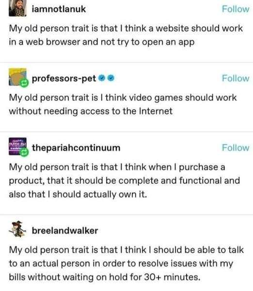
My old person trait is that UI shouldn't change unexpectedly when you are trying to click or touch something.
it should not change unexpectedly, period.
I don't want to install an update and have the ui completely change on me because some dev wanted to pad out his resume by starting a new project on the fresh-framework-of-the-day.
Of course it shouldn't, that's one of the core principles of UI design, but these days it does anyway so it is an old person trait now
TIL 'old person' means 'having literally any god damn standards and not getting on your knees for corpodaddy at the drop of a hat.
Yes.
Pointless UI changes are a fucking atrocity, cause they are always more complicated and more informational overload than the previous design, while being more resource intensive and slower.
KISS is a motto for a reason. Unfortunately its the stupid people that seem to make the decisions and don't register that they are the ones KISS is directed at.
Right? I wait for everything to load and snap into place and then I touch my screen. SIKE! it's got one more button to put under my finger that instant.
I feel like this is a product of a lack of UX team or outsourcing it. When engineers are left to make a UI... they make what works (barely), not what is easy to use...
As a developer I need to be reigned in when it comes to design. I don’t know shit and have learnt that there are conventions for a reason.
Especially when you're given a deadline where you know that you can't afford to spend 10-20% of the time designing the interface lol