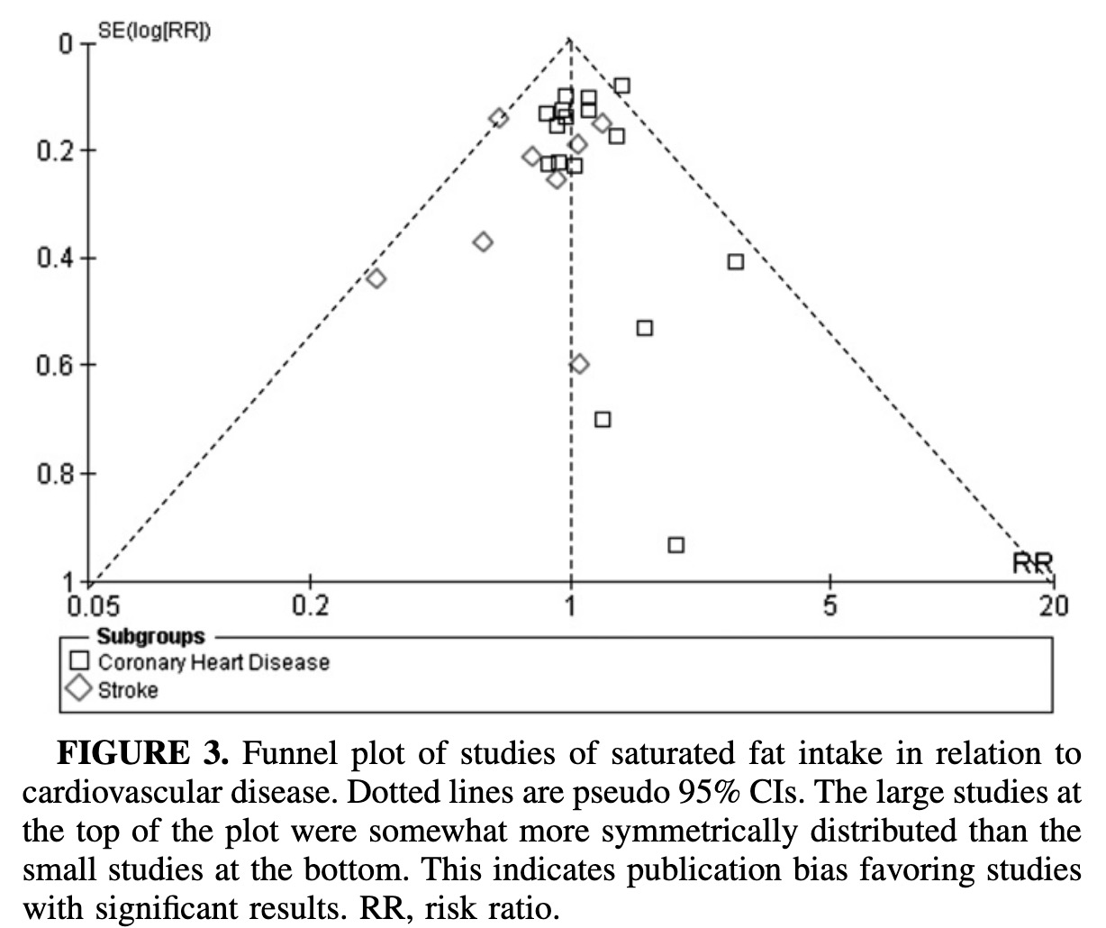
Y Axis is log plot of Relative Risk, closer to zero is less risk (top)

I love the footnote on figure 3:
This indicates publication bias favoring studies with significant results.
A place to discuss metabolic health research, papers, talks, etc.
This topic can touch upon many people's personal triggers, so please be civil.
Rules
The banner poster in high resolution can be found here
Y Axis is log plot of Relative Risk, closer to zero is less risk (top)

I love the footnote on figure 3:
This indicates publication bias favoring studies with significant results.
Although the Strong Heart Study reported a positive association between saturated fat and CVD in younger than in older individuals (ie, RR = 5.17; 95% CI: 1.6, 16.4), the fully adjusted model that included adjustment for polyunsaturated fatty acids, trans fats, and monounsaturated fatty acids was not statistically significant (RR = 2.98; 95% CI: 0.66, 13.6).
This touches upon the theme of yesterday's paper https://hackertalks.com/post/5676721 , that with large data sets the variables and the groupings of correlation are nearly as important as the data itself.