this post was submitted on 26 Nov 2024
71 points (82.6% liked)

Fediverse

28519 readers
426 users here now

A community to talk about the Fediverse and all it's related services using ActivityPub (Mastodon, Lemmy, KBin, etc).

If you wanted to get help with moderating your own community then head over to [email protected]!

Rules

Learn more at these websites: Join The Fediverse Wiki, Fediverse.info, Wikipedia Page, The Federation Info (Stats), FediDB (Stats), Sub Rehab (Reddit Migration), Search Lemmy

founded 2 years ago
MODERATORS
top 50 comments
sorted by: hot top controversial new old
[–] [email protected] 4 points 13 hours ago

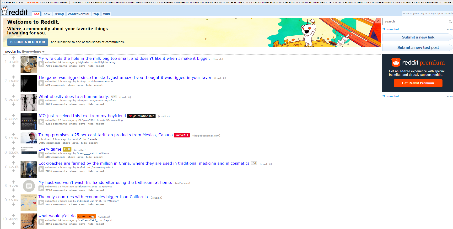
I switched Lemmy instances in part because lemmy.ml doesn't have the old.lemmy (mlmym) interface available. For a while, mlmym had an official standalone site that could be used to access any Lemmy instance in the mlmym interface, but once they shut that down I was disappointed in going back to the standard Lemmy web UI that doesn't stretch to use your entire screen width. I used some userscripts to make it better but finally ended up moving to lemmy.today because they run mlmym on old.lemmy.today.

It's basically the old Reddit interface and that's how I viewed Reddit for 12+ years, on desktop and on phone. Also, the mlmym/old Lemmy interface actually fits better on portrait phone screens than old Reddit as it hides the sidebar.

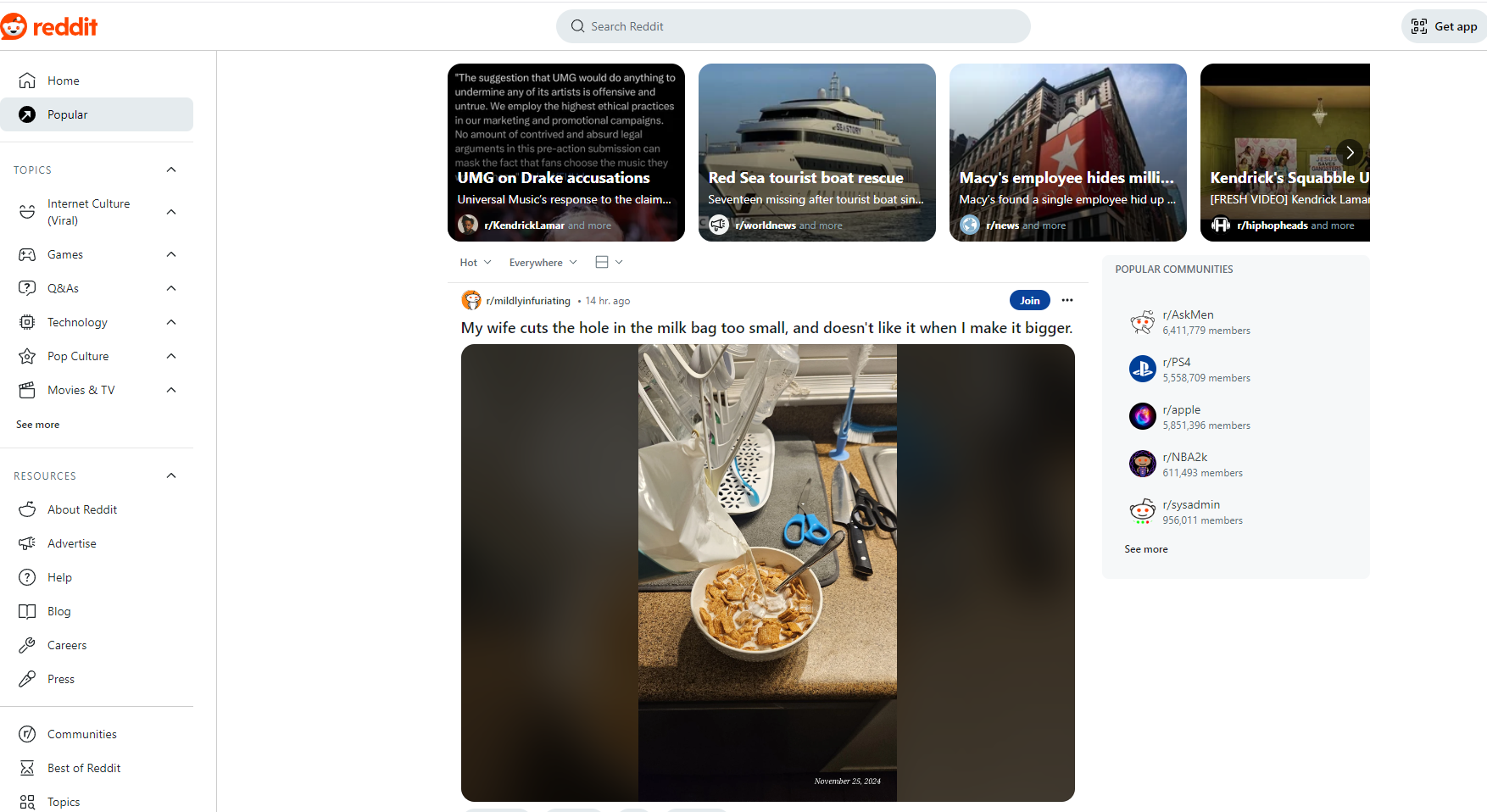
I hate Reddit's awful card UI. I don't want giant pictures everywhere. Let me read the headlines and then click to expand if I want. The overly media heavy Times Square looking overstimulation of modern web design is atrocious.
[–] [email protected] 10 points 21 hours ago (1 children)

Something I hadn’t considered to possibly be generational. When I was on Reddit, it was always old Reddit. I can’t imagine anyone using card view, I thought maybe that existed for iPads or devices with large screens.

I also don’t see appeal in instagram or TikTok like the author though as well.

I don’t necessarily get the consideration of “decision fatigue”. If you chose not to decide you still have made a choice. The choice then of allowing the app to just show you whatever can’t really be put on decision fatigue in my opinion.

[–] [email protected] 2 points 11 hours ago

Card view is great for porn. Otherwise, yeah, old Reddit is the better layout.

[–] [email protected] 15 points 22 hours ago

Millennial here. I’ve been consuming Reddit, and now Lemmy, almost exclusively on my phone and for me it’s card view all the way. Often the graphic content is more important than the title and opening posts only to find out it’s not funny or interesting feels like a waste of time. Only when I find a post interesting enough that I want to comment or see the comments, I open it. Instances or communities that I don’t like go on the blocklist.

If I really need to use Reddit, I open old Reddit in the browser with an extension that turns it into a mobile friendly site with card view. The new design has always felt sluggish and bloated to me, but not because of the card view.

[–] [email protected] 12 points 23 hours ago

This seems very anecdotal. It would be interesting to see some numbers on how different age groups interact with different UI types.

In my experience, most people prefer "card" view type interfaces. Most popular sites I can think of at the top of my head are like this. Instagram shows you a picture. Facebook you default see a post until it is truncated. New Reddit is like this as well. Twitter shows just a small post, and you can view threads that way too.

Even old sites that had list views tended to get more popular when you get a card view, like Reddit.

I'm not sure if it's generational.

[–] [email protected] 9 points 1 day ago

this is dumb, you still have to parse info either method of interacting with the site, its just slightly diffrent, some people can just filter out info they care less about a little better. if anything has to do with the so called divide between generations (i always call bullshit on this, people are far to complex to be put in these boxes) it may have to do with how people first started interacting with the internet. people who have been interacting with the internet for longer may be more accustomed to the fourm style of website, where as people who started using the internet on their phone may be more accustomed to the app style layout. it mostly boils down to learned ways of interacting in online spaces, not how old you are in my opinion.

[–] [email protected] 10 points 1 day ago (1 children)

When Lemmy came around, I didn't stop using Reddit.

steps aside to dodge rotten tomato

I saw a new place to go visit and explore, and I haven't been given a reason to leave. I actually post more here than Reddit because the conversations feel more genuine, but I still browse both. No reason not to.

[–] [email protected] 5 points 23 hours ago

I haven't been using reddit, but no shade from me for using it. I know it's difficult finding communities on Lemmy that are similar for some topics. Episode discussions have been hard to find for most shows. I still prefer Lemmy because like you said it feels more genuine.

[–] [email protected] 25 points 1 day ago* (last edited 1 day ago) (3 children)

Maybe it's just because I had taken classes on web design in the late 90's, early 2000's, but I hate the current Reddit design because they absolutely ignore all of the basic design rules. The most egregious is wasted space.

Like, I get it; modern shit is more commonly viewed on a phone, being held vertically. That doesn't prevent you from having a widescreen format for regular fucking screens or phones held horizontally. I can not stand having all the content squeezed into the center, leaving big open spaces with absolutely nothing in them on the margins of the page.

[–] [email protected] 1 points 1 day ago

Naah I like the wide spaces on the left and right. It looks too cluttered otherwise with unnecessary information

[–] [email protected] 14 points 1 day ago

We went from fixed-length elements that don't scale with the browser, to the golden era, and then back to fixed-length elements that don't scale with the browser.

[–] [email protected] 6 points 1 day ago

Yea, I used old.reddit.com even on my phone and it was fine. Their new design was fucking awful the last time I saw it. On top of that it was slow as shit. You spend more time looking at that fucking stupid spinning logo than you do seeing content.

[–] [email protected] 6 points 1 day ago (2 children)

I haven’t spoken to very many people about this

Obviously not. I, a millennial prefer the "new" design. I can subscribe to communities and subreddits with already is a good way to filter content. I don't have to look at everything that gets thrown at me. Also I do not have to be scared there is a hidden ad somewhere inbetween like when using Instagram or whatever.

I also really liked the forums from the bronze age, but those were text-based at the post level, while Lemmy also supports images and links (including thumbnails).

[–] [email protected] 2 points 21 hours ago (1 children)

Without seeing actual statistics, both accounts are anecdotal. But it’s my experience that I have had a lot less interaction of people who prefer new Reddit and a lot more with people who prefer old Reddit. Many Lemmy instances host old Reddit inspired front ends. I’m not aware of a single front end for Lemmy that strives to emulate new Reddit

[–] [email protected] 3 points 21 hours ago (2 children)

I think Voyager is one of the most popular Lemmy web frontends. I haven't used reddit for a long time but it seems to be more similar to the new than old design.. I honestly don't talk about reddit designs with people in the real world

[–] [email protected] 2 points 17 hours ago* (last edited 17 hours ago)

I use Voyager, but I have it set to compact view.

In My opinion, the best design is usually one that gives users a choice in the design.

[–] [email protected] 2 points 21 hours ago

To be fair I don’t talk about Reddit/Lemmy front ends with anyone except in meta discussions as well.

I used Apollo/use Voyager as well, my experience in the early days after the API migration on the voyager community was that most people used the compact view and card view was more for iPad usage

[–] [email protected] 5 points 1 day ago (2 children)

How can you prefer this:

over this:

[–] [email protected] 5 points 23 hours ago

I definitely think the newer design looks better, although it is less functional and has more unnecessary crap. I definitely prefer the compact view over the the card view. Back when I still used Reddit I used the old design with custom css though.

[–] [email protected] 4 points 1 day ago (1 children)

I'm mobile so I am much faster scrolling. I guess that's an important point, most people probably use their smartphones browsing Instagram etc. Also I use Voyager for browsing Lemmy on PC, no reddit for me

[–] [email protected] 3 points 23 hours ago (1 children)

New Reddit is only marginally better on mobile than on desktop. Old Reddit still blows it out of the water. 2 posts per page vs. 8 when I just checked. Not to mention new Reddit is just a lot slower in general and mixes links to other posts into the comments of the one you're looking at.

[–] [email protected] 3 points 23 hours ago (1 children)

It seems people have different preferences and there are some millenials that want to watch just funny cat images and don't mind looking at the less funny cats from time to time. The article we are talking about (do we?) draws shitty conclusions based in shitty data ("people within my bubble").

[–] [email protected] 1 points 22 hours ago

I don't care about the article. I'm asking you because you've stated your opinion that new reddit and I literally cannot understand it even when I try looking from other perspectives. There is nothing I can see that is better about new reddit. I don't mean that to be confrontational towards you or to say you are wrong in it. I just would like to understand because it seems more and more things are going towards similar designs and I hate it.

[–] [email protected] 2 points 1 day ago

honestly i'm not even sure how the author of this managed to boil down feed UI preferences into "questions" or "options" or whatever. all of the same content is there, it's just a matter of if it's expanded or collapsed by default- merely information density. what it really comes down to is older sites collapsed things by default, newer sites expand things by default, and most people like whatever they grew up with. i'm gen z and much prefer the older style just because i was on forums and old reddit right around when my peers opened their twitter and instagram accounts. there is definitely a discussion to be had there about which format is healthier and why companies prefer the latter format these days, but to skim right past that into the bit about third parties makes me think that was the real point the author wanted to make and contorted their UI argument to get there

load more comments
view more: next ›