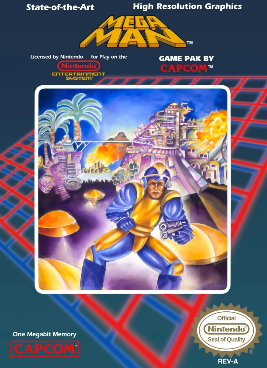
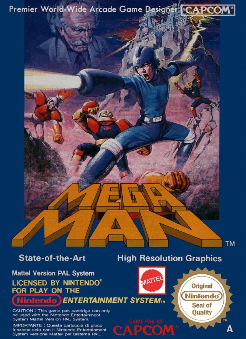
They paid Soriyama $100,000,000 to paint this.
Video Game Art
Video games are not mere time killers. They are albums of sound, aesthetics, animation and narrative.
This community is in appreciation of that. Screenshots, fanart, animations, gameplay clips. It is all welcome here.
The one common thread should be an eye for the aesthetic. This is not a place to discuss mechanics or stats, but to show off simply the artistic, expressed through the video game medium.
- All rules of the parent instance apply. That is, sopuli.xyz
- Include the name of the game your post is associated with in the post title.
- If your post is fanart, include a link to the artist in post body, if you can. You may also ping @[email protected] to have it attempt to find the source for you, and provide it in a comment.
- MARK ANY TEXT SPOILERS, as for art, do not post content that outright spoils key moments of a games narrative. Content that can only be understood with the context of having played the game, is ok.
- No generative AI art.
Also check out:
So were the artists of those first 2 games just not aware of the game? Were they just given a vague direction of what to draw?
It's not exclusive to megaman. Box art in the US (maybe Europe) went through a weird phase in the NES era.
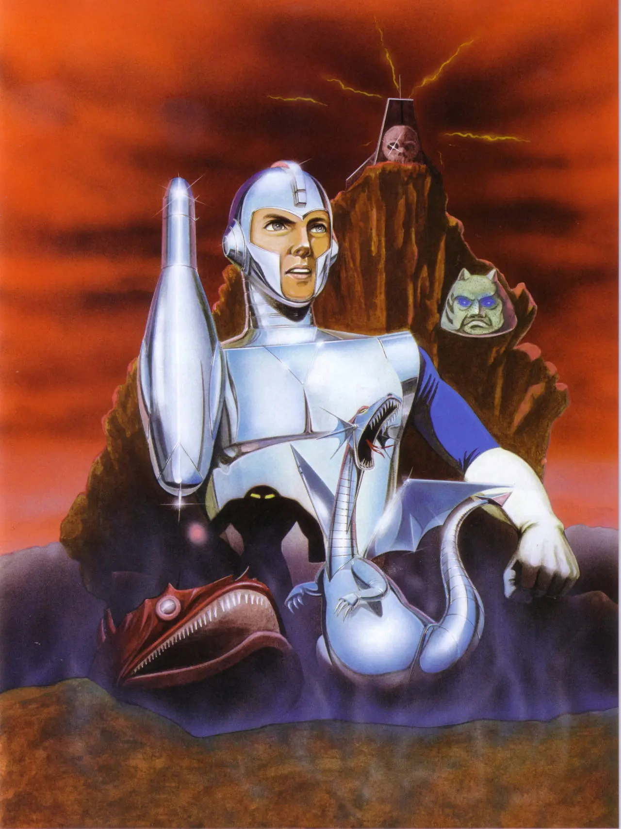
Bowling pin arm man
So, the Dragon is from one of the Wily stages. The fish is from Bubble Man’s stage. The castle on top of the hill is Wily’s base.
But what the hell is that face to the right of Mega Man’s shoulder?
I'm guessing the big heads from Air Man's level.
Believe it or not, that artwork was an improvement

I still remember my older brother renting mega man back when I was 9 or 10 years old and I looked at the box art and said “this looks like a terrible game”. And then the game itself was epic for its time.
That was the American cover for Mega Man 1. This is the European cover.
The European cover for Mega Man 1 was epic:

