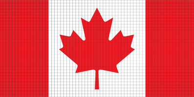
I don't have a template, but I started placing some red pixels around (499, 45)
🍁
Welcome to lemmy.ca's c/main!
Since everyone on lemmy.ca gets subscribed here, this is the place to chat about the goings on at lemmy.ca, support-type items, suggestions, etc.
Announcements can be found at https://lemmy.ca/c/meta
For support related to this instance, use https://lemmy.ca/c/lemmy_ca_support
I don't have a template, but I started placing some red pixels around (499, 45)
🍁
edit: We may need a better template than this one. It doesn't quite align with the canvas, and the size might be too big to create (and defend)
🍁
You can paste this in the settings to make things easier.

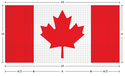
For reference, here are the proportions:
 (Source)
Might want to find a good pixel maple leaf to base the flag dimensions off of. I couldn’t find one centered on a pixel, but it’s a start:
https://www.pngkey.com/png/full/338-3380342_canada-maple-leaf-maple-leaf-pixel-art.png

Might want to widen the template by 1px so that the tip of the leaf is not between two pixels.
Can't seem to login. Getting "[200] Error while sending: Failed to send direct message"
I personally think just the rectangular flag is a bit boring, so I did this little mockup

Here is the template on the canvas.
https://canvas.fediverse.events/#x=472&y=73&zoom=9&tu=https%3A%2F%2Flemmy.ca%2Fpictrs%2Fimage%2F165e6e23-1abc-4719-9e41-b8e3ce743c7f.png&tw=64&tx=431&ty=41&ts=ONE_TO_ONE
I like it :)
Are we completely switching to this design, or are we placing this on top of the larger rectangular flag? Either way, you might want to consider editing your comment in the Canvas Group Finder thread to include the new template.
Good call, I'll edit it now
I love the fediverse. I live in Canada. I don't get what this is. Can someone do an ELI5?
It's inspired by a game / social experiment Reddit did a few years ago, where every account can only place one pixel every now and then. Over time, people can work together to make different designs.
Often we had a Canadian flag, and various symbols for different Canadian provinces, schools, or sports teams.
That's the idea here, only this one is open to the entire fediverse. I imagine it didn't get much advertising prior to the launch, and so it's quieter than the usual activity on the fediverse.
Right now I think we're looking for a design template to follow, so that we can work on something more effectively :)