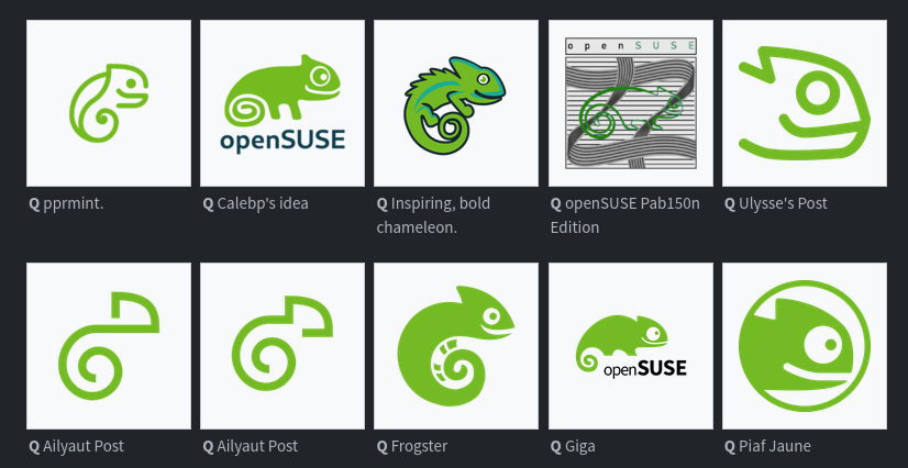
Please not another ultra minimal mono color logo
Linux
From Wikipedia, the free encyclopedia
Linux is a family of open source Unix-like operating systems based on the Linux kernel, an operating system kernel first released on September 17, 1991 by Linus Torvalds. Linux is typically packaged in a Linux distribution (or distro for short).
Distributions include the Linux kernel and supporting system software and libraries, many of which are provided by the GNU Project. Many Linux distributions use the word "Linux" in their name, but the Free Software Foundation uses the name GNU/Linux to emphasize the importance of GNU software, causing some controversy.
Rules
- Posts must be relevant to operating systems running the Linux kernel. GNU/Linux or otherwise.
- No misinformation
- No NSFW content
- No hate speech, bigotry, etc
Related Communities
Community icon by Alpár-Etele Méder, licensed under CC BY 3.0
I don’t feel like they’re inherently bad, but they’ve become so popular that they all feel like they’re blending together. I think it’s kind of stale at this point.
Too bad for you, they already have the logos for some of the variants and that's exactly what they're going for.

Yeah felt very obvious which ones will be chosen regardless of the survey...
Agony
Bottom row, 2nd from the left. Simple, clean, distinct.
Aliyaut’s logo? It is clean, but it’s hardly even identifiable as a gecko. It blends in too much with all the modern corporate logos we have today IMHO. It’s not a bad choice if they decide to go with it, but they could do better.
Agreed, it really stands apart from all the rest.
Even from the one right next to it that looks almost identical??
These are two variations from the same artist.
Especially that one.
Does the order get shuffled each time?

No
Ailyaut must be a debian fan :)
In the thumbnail?
In my opinion one of the full design themes should be picked because some of those single designs look very nice individually but would clash with others.
My pick would be Emiliano's theme, it looks the most like an evolution of the opensuse style. Imo the others are either a bit too minimalist or deviate too strongly from the original design.
Nikolayan's design is also good, but I prefer Emiliano's because that you can recognise the chameleon better in every logo.