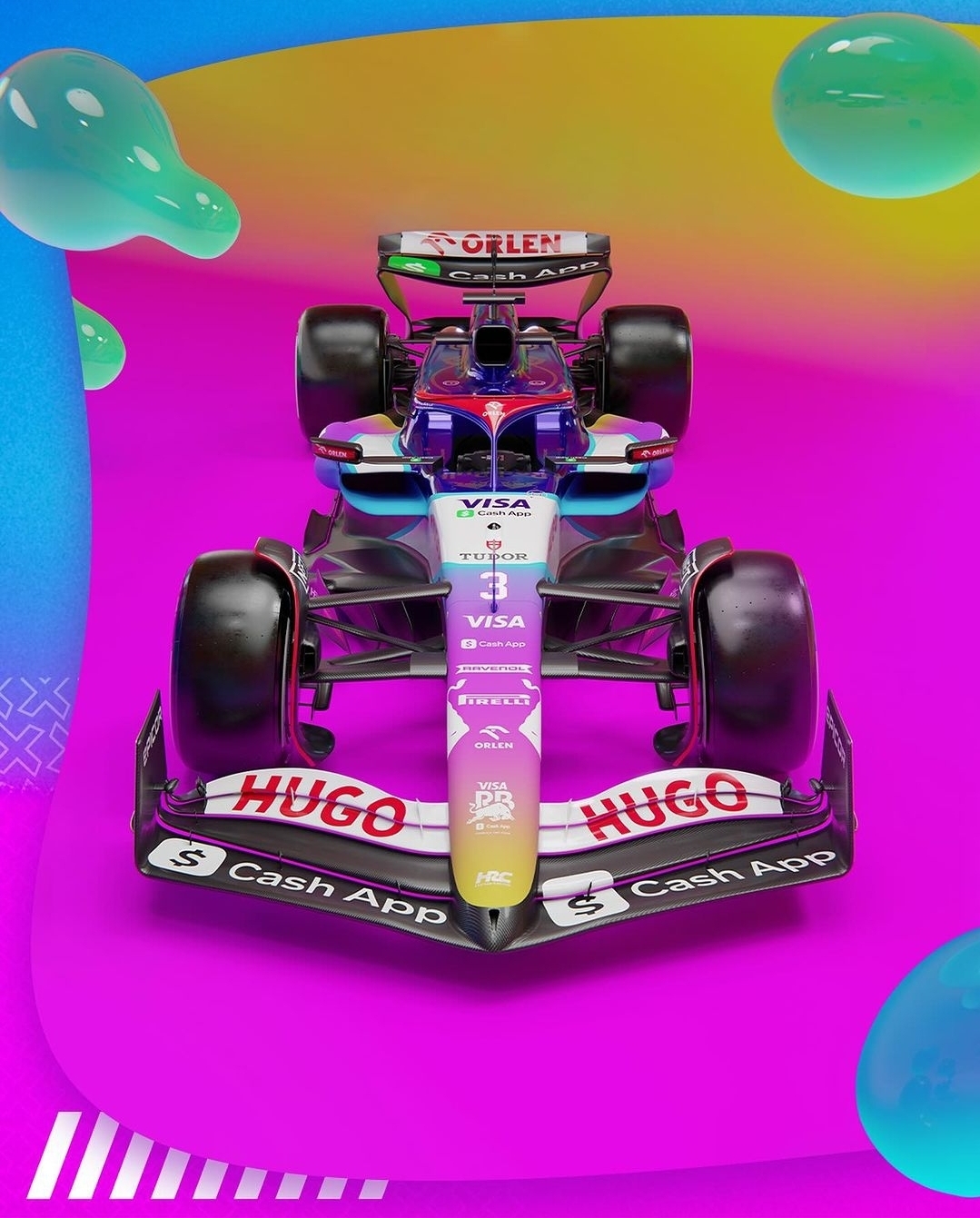
Need to see the side, but I like the gradient so far.
Formula 1
Welcome to Formula1 @ Lemmy.world Lemmy's largest community for Formula 1 and related racing series
Rules
- Be respectful to everyone; drivers, lemmings, redditors etc
- No gambling, crypto or NFTs
- Spoilers are allowed
- Non English articles should include a translation in the comments by deepl.com or similar
- Paywalled articles should include at least a brief summary in the comments, the wording of the article should not be altered
- Social media posts should be posted as screenshots with a link for those who want to view it
- Memes are allowed on Monday only as we all do like a laugh or 2, but don’t want to become formuladank.
Up next
2024 Calendar
| Location | Date |
|---|---|
| 🇺🇸 United States | 21-23 Nov |
| 🇶🇦 Qatar | 29 Nov-01 Dec |
| 🇦🇪 Abu Dhabi | 06-08 Dec |
I can't tell where the car ends and the background begins... Are F1 teams too poor to hire an actual graphics designer?
Also, fuck this "Cash App Visa it's everywhere you want to be, You are richer than you think, visa visa visa RB" team name... I know F1 likes to abuse branding space but turning the team name into ad space is a new low
Red Bull, Aston Martin, Kick Sauber?
Sure, name the team "Visa" ... I thought I was clear I was complaining about the ridiculously long name
I don't know if it is good, but I would say it is better than their normal livery.
Is the inflated condom on the top left supposed to mean something?
At least it's a real eye catcher
Ignoring the background and actually focussing on the livery, it looks like a late-90s website.
Now this is how you do a livery release. No hype, just drop it and let people admire it.
Somehow this even looks decent compared to the Ferrari
