Also nice the calligraphy used in Germany until 1941, the Sütterlinschrift

But one of the best is arabic calligraphy (I think that I can even read it ¬¬)

Also nice the calligraphy used in Germany until 1941, the Sütterlinschrift
But one of the best is arabic calligraphy (I think that I can even read it ¬¬)
New metal band font dropped.
eschew obfuscation
Keming is a bitch.
/s
Well played
Do they not dot their i's in calligraphy?
Russian cursive
Chinchilla in Russian cursive:
Hmmm, since when handwriting is called cursive?
Not all handwriting is cursive. Mine, for example.
Yeah, Russian cursive is terrible. It's so bad than on a rare occaion I have to handwrite anything, I don't really expect it to be read by anyone.
Does Russian "chinchilla" begin with a ч? Or a ш?
If it starts with a "ch" sound as in "ч," chinchilla would look like this:

Its шиншилла
Well yeah, but it's not a calligraphy, it's just bad writing (and cursed word).
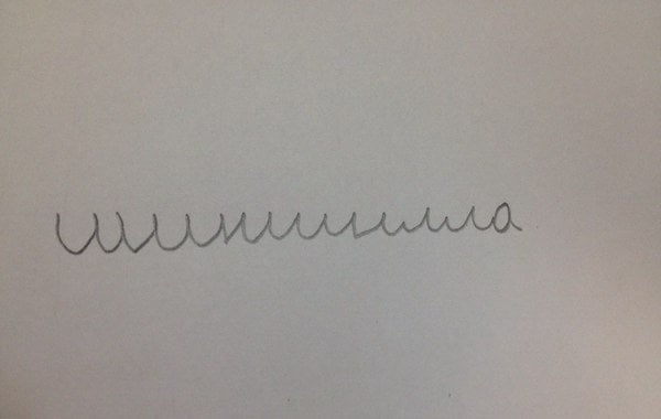
a

I don't know why that weird ass little gross thing is so appropriate but that is probably the best possible response lol.
Uma! He's a character from the Witcher 3.
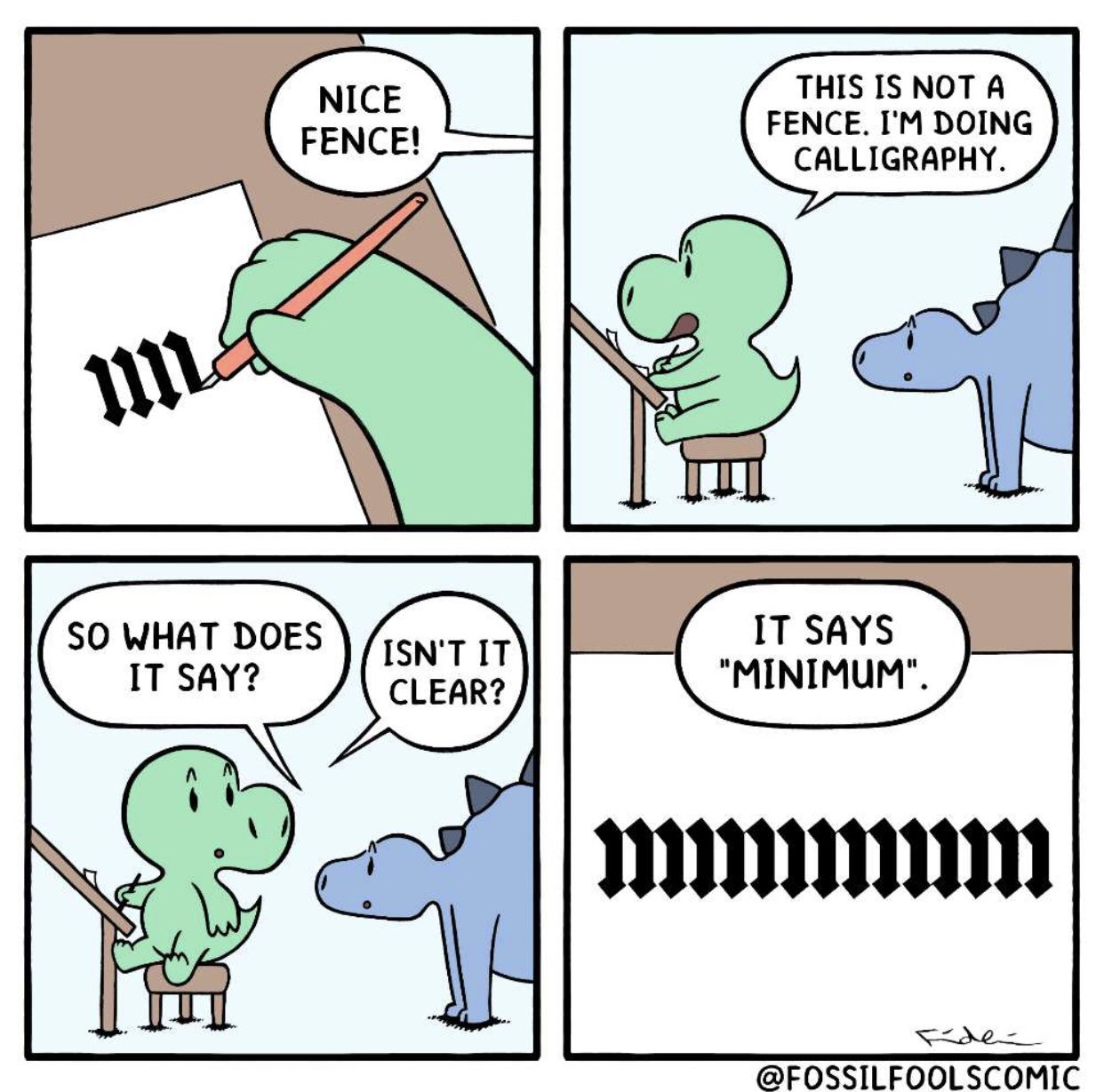
Isn't it clear?
No. :)
лишишь

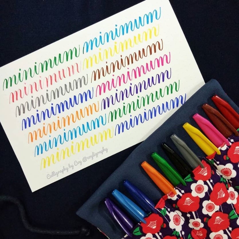
This is actually a thing. When learning calligraphy, it was one of the exercises we did. If you have good enough control of your hand and pen, then all strokes should be the same length, slanted the same way, and separated by the same spacing. When you manage this apparent “unreadable” thing, it means you nailed it!
The example below comes from this site (not mine)