I gotta say as an American I really appreciate some of these recent things the EU is doing with privacy. They seem to have a bigger impact here than any actions American politicians come up with, which is depressing, but still deeply appreciated
Privacy
A place to discuss privacy and freedom in the digital world.
Privacy has become a very important issue in modern society, with companies and governments constantly abusing their power, more and more people are waking up to the importance of digital privacy.
In this community everyone is welcome to post links and discuss topics related to privacy.
Some Rules
- Posting a link to a website containing tracking isn't great, if contents of the website are behind a paywall maybe copy them into the post
- Don't promote proprietary software
- Try to keep things on topic
- If you have a question, please try searching for previous discussions, maybe it has already been answered
- Reposts are fine, but should have at least a couple of weeks in between so that the post can reach a new audience
- Be nice :)
Related communities
Chat rooms
-
[Matrix/Element]Dead
much thanks to @gary_host_laptop for the logo design :)
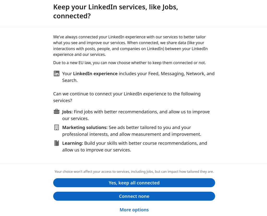
But still with dark pattens. Is that allowed?
How so? Does "more options" have better options?
All or nothing choices while "more options" is made easy to overlook on purpose.
Good question. AFAIK, it isn't in Germany, but many cimpanies don't care.
I have filed a complaint with the gdpr representative in bavaria this month. Have you done your duty yet? :)
(I‘m joking of course but how awesome would it be if we (Fedi users) challenged each other to strike back like this every month? Like the ice bucket challenge but for privacy?)
I'd say only the ads are the issue, but the 'more options' button is kinda hidden. As if it's trying to lull you into accepting all. Also good choice to put it in the middle.
"Connect none" is right there, though.
But I kinda glossed over it the first time I saw it.
Usually two opposing buttons will be next to each other, not be one on top of the other, won't they?
Yes but the other two services are desirable, so I almost clicked accept all. Also the consent button feels like it has a more attractive text than the reject button.
That gray text right above the buttons suggests there there won't really be any negative impact, despite their desperate pleas right above it. I don't know, if this was me, I would definitely click Reject All and then see how messed up the resulting website ended up for me.
The psychological profiling that went into making equivalently styled Accept and Reject buttons look different to a reader is almost certainly intentional, though. Reminds me of the Redact app and how they would show you a crying kitten if you didn't share using their (previously free, now expensive) app on your Twitter profile.
At the end of the gray sentence it says it impacts how tailored the service is. It's something that would be valuable to me in this case.
They should've shown a happy kitten instead.
