this post was submitted on 16 Jun 2024
0 points (NaN% liked)
Data Is Beautiful
6698 readers
1 users here now
A place to share and discuss data visualizations. #dataviz
(under new moderation as of 2024-01, please let me know if there are any changes you want to see!)
founded 3 years ago
MODERATORS
you are viewing a single comment's thread
view the rest of the comments
view the rest of the comments
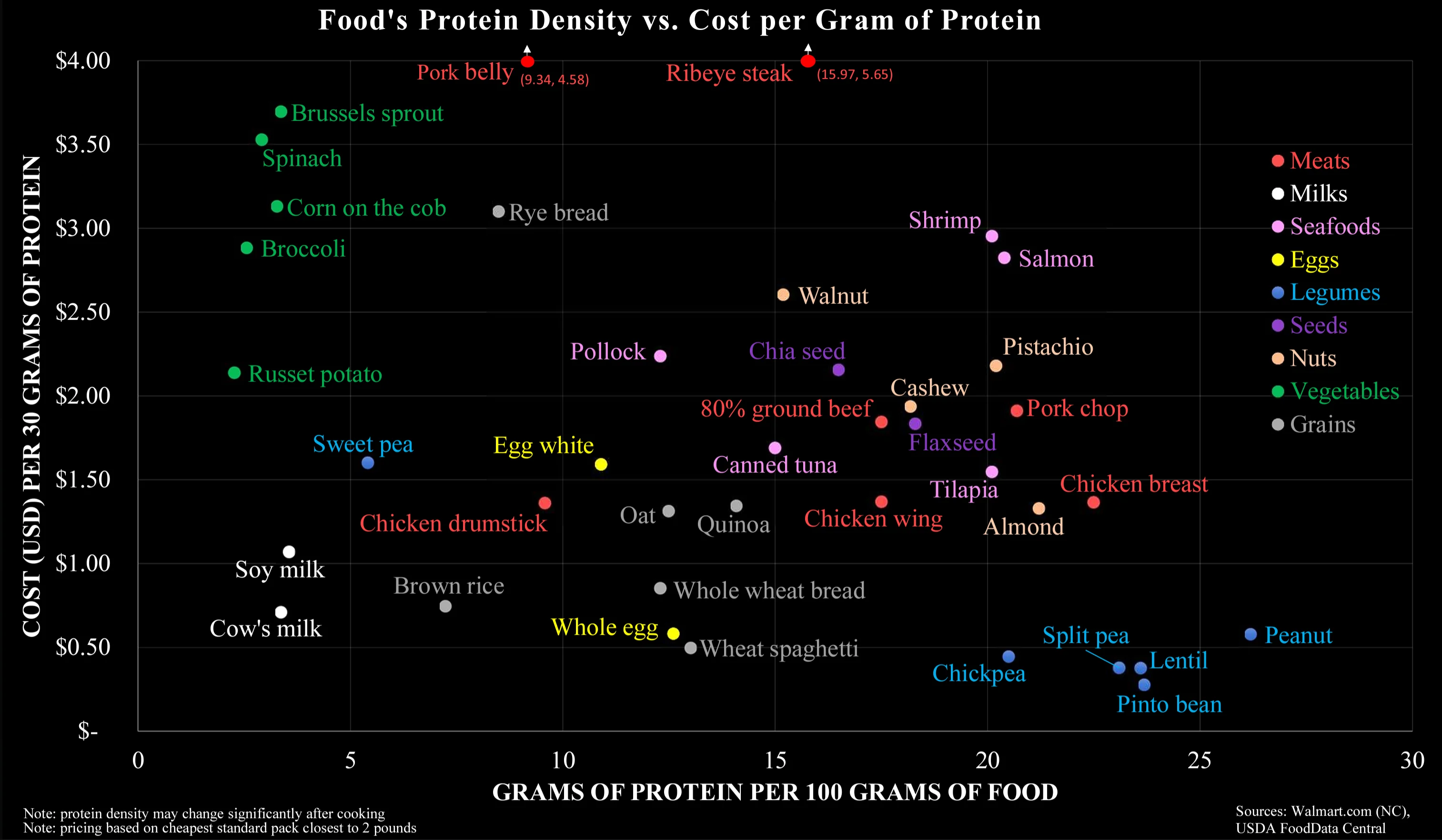
The Y axis is throwing me off a bit. If the X axis already shows the amount of protein per mass, why would you also couple the Y axis to the amount of protein? So all the products low on the X axis automatically increase along the Y axis. For example, the vegetables are probably that costly in this graph because they have a low protein content, not because they are necessarily that expensive.
I assume this chart is intended for people making an effort to eat as much protein as possible for as cheap as possible, I.e. bodybuilders, powerlifters, and the like. In that case you would want to avoid vegetables because of their low protein regardless of how much they actually cost, so the cost per gram of protein is actually more useful.
In fairness I may be reading too much into it; nothing about the chart actually specifies who it's for.