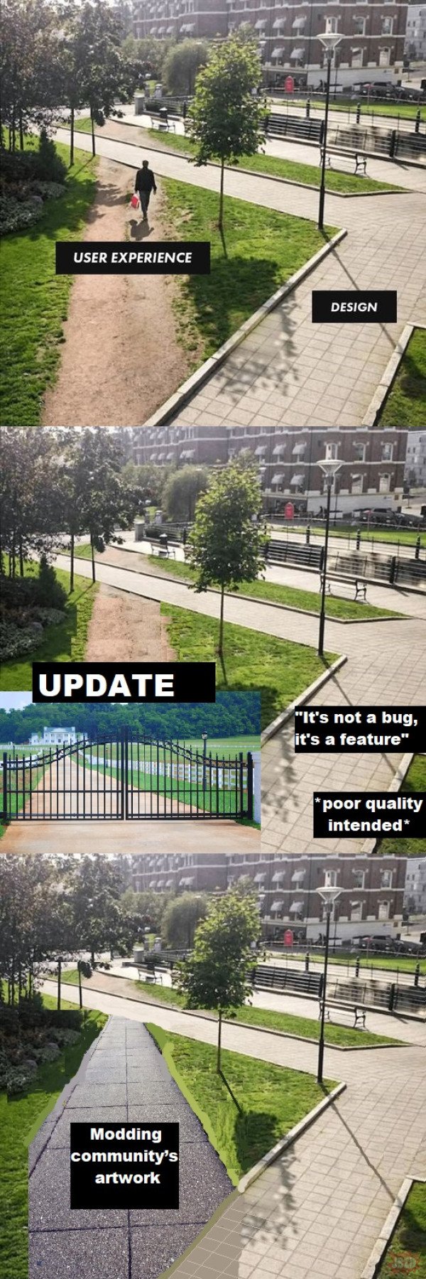
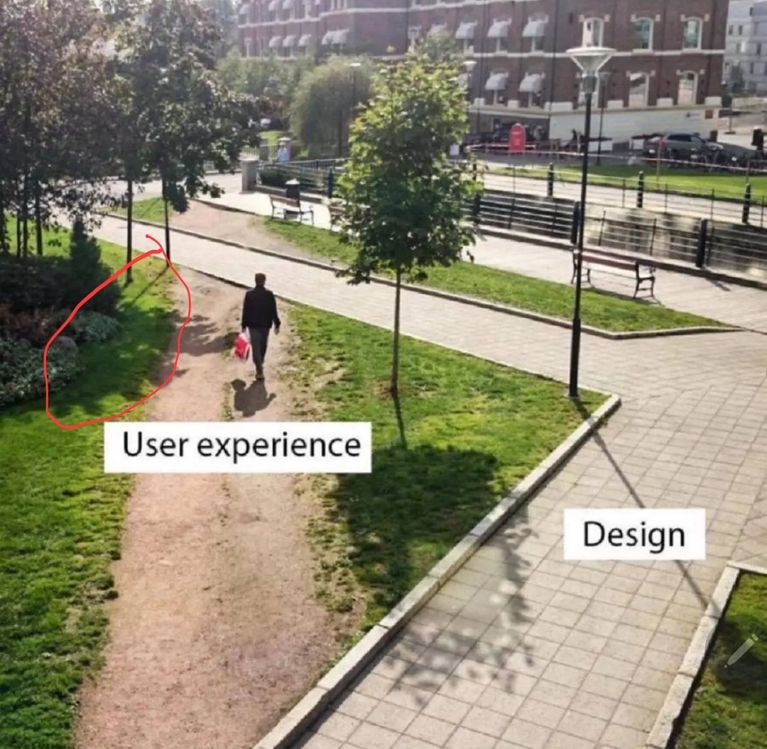
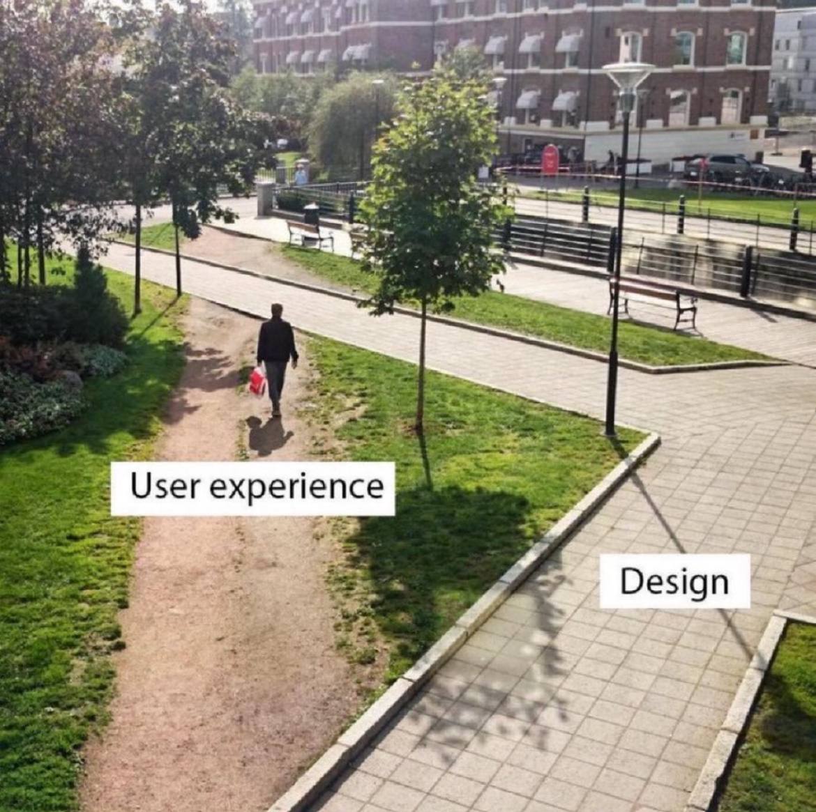
This is an opportunity with creative landscaping.
Programmer Humor
Post funny things about programming here! (Or just rant about your favourite programming language.)
Rules:
- Posts must be relevant to programming, programmers, or computer science.
- No NSFW content.
- Jokes must be in good taste. No hate speech, bigotry, etc.
Needs more plants.
Uhh, so looking carefully at the picture, it appears they shouldn't have bothered with the inner pathway at all, and should have just connected the bridge over the canal (?) in the background to whatever is under the camera.
Not only does the current design fail to provide a short path in demand, it leaves a goofy little boulevard behind the benches in what appears to be a dense, desirable urban area where you shouldn't waste space.
That’s right, it goes in the square hole.

Should include a concept to reduce impervious surfaces in modern times. User experience is not the only variable.
Designers need to wake up and realize their job is to understand what the user wants not what they saw in a wet dream.
Not a universal rule, however. Theres the whole concept of "optimizing yourself out of the fun" and what not in video games. Or the hardships being part of what makes a game fulfilling. It depends on what your goal is
Wake up Nee-Oh!
That's ancient.
What the shit happened to that tree's shadow?
Could be a watermark that got removed.
Probably the tree is shadowing the same area that a window in or near the building the picture is being taken from is illuminating.
Also, why is this shadow off from the others

that's just perspective, they're only parallel when looking for a perfectly top-down angle

The tree on the right has that block missing in its shadow, the trees on the left are casting their shadows in a slightly different direction, and they guy on the dirt path's shadow seems too dark and clear. Once you pointed out something was wrong, it's hard not to see other mistakes.
We are so paranoid about Photoshop and lately AI that we start seeing mistakes where there are none. All these things are perfectly normal.
The sun is fairly low in the sky, just a bit to the right of the guy on the dirt path, whose shadow is almost but not quite straight vertical.
The guy casts a darker and more crisp, or less diffuse shadow because he is less translucent, or more opaque, than tree leaves, and because the total distance from the heighest tree leaves to the ground is greater than the total distance from his head to the ground.
The lines of the tree trunk and lamppost shadows all converge toward where the sun is, if extended toward it.
The illuminated square in the one tree's shadow is likely a reflection from a window or some kind of metal fixture from a building or object behind the pov of the camera.
The lines of the tree trunk and lamppost shadows all converge toward where the sun is, if extended toward it.

I'm pretty sure that's not true
Edit: I'll concede the other points though
